Fever Reader Review
The last major hurdle for me is probably the second most vital.[1] I’ve been looking for a safe way out of Google Reader ever since the redesign they rolled out several months ago.
I’ve been running Shaun Inman’s Fever for over a week now and for the first time in years I have cleared my feed list completely every day for a week straight. It no longer feels like work.
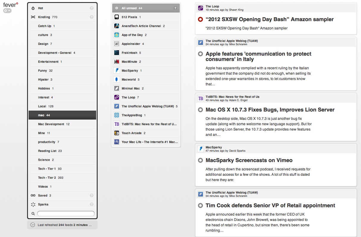
I’m not the first to look at Fever. There are other reviews. There is a good review by Brad Kellett in 2009 and a relevant look by tecznotes, also in 2009. The application has matured a bit since then but many of their criticisms are still relevant.
I have tested Fever with the following browsers:
<li>Safari for Lion</li>
<li>Firefox 9&10 for Win7</li>
<li>Safari iPad</li>
<li>Safari iPhone</li>
<li>iCab Mobile for iPad</li>
If you want to skip to the conclusion, I won’t blame you.
The App
Fever is a web application. It is a self install[2] on a host that you control on your own domain. That might be a problem for many people but it is exactly what I wanted. I wanted a feed aggregator that was completely under my control. Fever is it.
The application is not free. It’s a one time $30 fee, much like Shaun’s analytics app Mint. It seems steep but it’s a perpetual license and compared to the number of feed readers I’ve purchased for iOS, it’s pretty cheap.
The downside to the installation is that it is locked to a specific domain and only licensed for a single user. That means if I ever want to move Fever to another domain, I need to request a new license key from Shaun Inman. I don’t think it as big a risk as Google crapping all over Google Reader and ruining it, but it’s still a risk.
The application does provide security. To access the settings a Fever specific account (separate from the domain admin account) is created. All application settings are handled from within the app so setup is actually pretty easy.
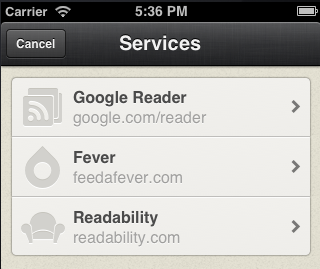
Fever is strictly a webapp. There is now a public API available but the reviews for the only iOS Fever reader are very discouraging. There is no native Mac or Windows app. However, the devs behind [Reeder Apps for Mac and iOS] showed a tempting screenshot of Reeder 3 with support for Fever. I think once I can move back to Reeder on iOS, I will never return to Google Reader.
To be honest, the web app on Mac is pretty good. I wouldn’t miss Reeder for Mac all that much with the Fever web interface. It is interactive and includes nice touches like drag and drop to organize feeds.
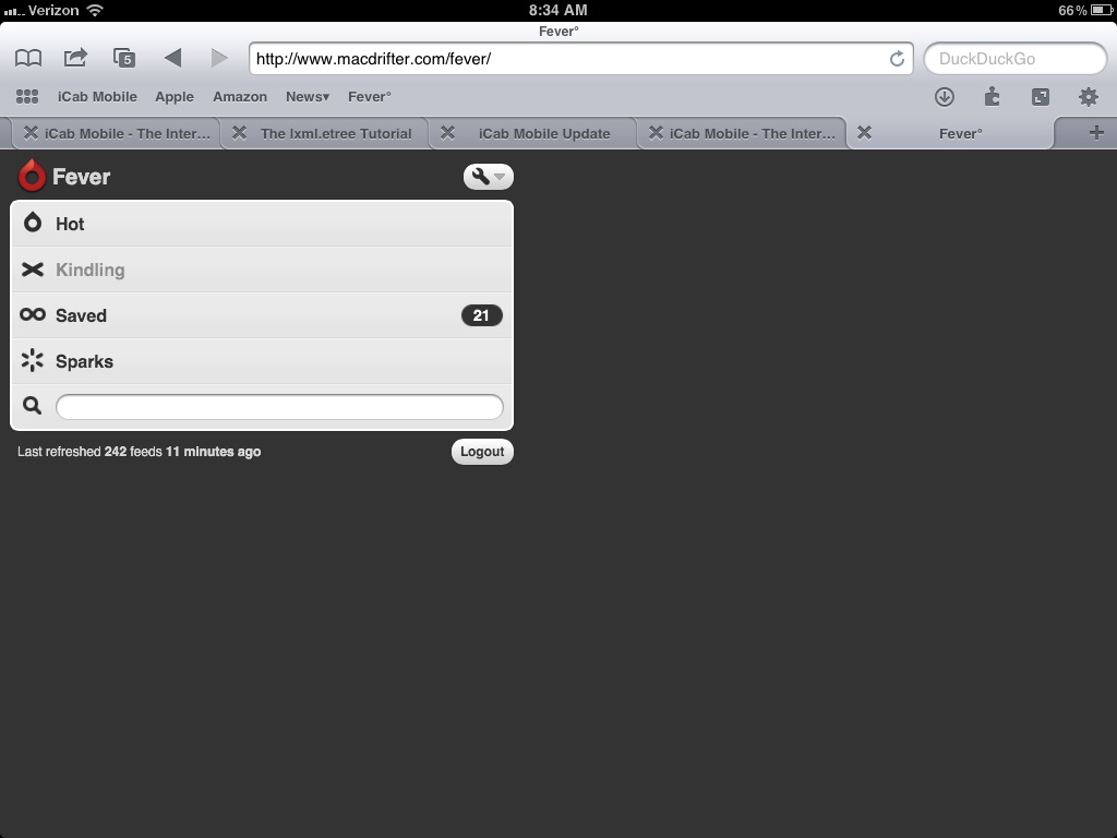
But the Fever app on iPad is very rough. The tap targets are extremely small and often do not respond. There are also visual glitches on iOS that require refreshes to fix. The experience is improved on iPhone since there is a iPhone specific mobile version that is much more useable on a small screen. There are a couple iPad specific touches that help. For example on iPad, Fever adds a “mark all as read” bar at the bottom of a feed list. The iPad version also supports two finger scrolling for groups.
Here is the iPad running with the iPhone user agent. The iPhone interface works well on mobile Safari.
The New Hotness
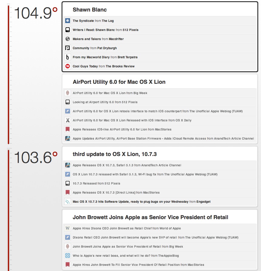
The feature that defines Fever is the Hot List. This is a 30,000 foot view of the news. Fever doesn’t just refresh a list of feeds and show an unread account. It performs an analysis on the linked articles to determine what topics are popular. The more sites link to the same source, the hotter it is and the higher it rates. This feature is much like Zite is for me. Rather than worrying about specific feeds, I can just look at what is being discussed a lot. I could use Fever just for this feature and be happy I spent the $30.
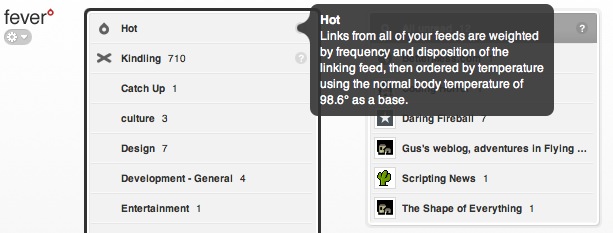
Fever encourages a large number of subscriptions but requires careful customizations. By having a large number of articles to index Fever can create a better “Hot” list to provide an overall impression of the current news. But unlike Google Reader, the granularity of those feeds can be hidden from view. As an example, I can now subscribe to feeds that generally just link to other articles. I don’t particularly enjoy reading those feeds so I add them to my “Spark” list. Now I don’t have to see them ever, if I don’t want to. However, they provide an automatic weighting factor to the hot stories of the day.
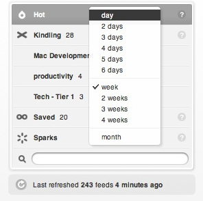
There is some control over the measurement time frame for the hot list. It’s a good way to see what’s hot for the week versus just today.
Sometimes the hot list is not what I am interested in. In my experience it can be a bit self selecting and really demonstrates the amount of cross-linking going on. The Hot list algorithm is not very intelligent. If 5 articles all mention the same person’s name, that name will become a hot item rather than the actual subject of the article. I wish there was a better mechanism for training the algorithm. But it is what it is. It’s still better than any other recommendation service I have looked at.
To help reduce the problem with self selection, I have removed my bookmark feeds. I previously had feeds for my Instapaper list, Macdrifter.com and my Pinboard list. I discovered that this was unduly weighting the Hot list and self selecting articles I already read. After removing these basic feeds the Hot list become much more informative.
The Blacklist
I have several feeds that I only check at the start or end of the day. For example, my local news. I also have my Instapaper and Pinboard feeds that I do not want to influence the Hot List. Fever provides an optional blacklist for preventing specific URL’s from contributing to the Fever score.
Unfortunately, the blacklist is difficult to use. While it supports direct URLs, the real power comes from the regex support which is not documented. I had to email Shaun to get an example and even then I couldn’t figure out exactly how it was working or what it was matching.
EDIT: Shaun is very helpful and replies came within a couple of days. He has done a great job on a niche product. I consider half of the fee for Fever to go towards his great support and half for his great work.
In theory the blacklist could be a great feature but without good documentation (or any) it’s just an unusable option.
Reading
Even if I never used the Hot List, Fever can also behave as a standard feed reader. Feeds can be organized into groups and individual feeds can be browsed as well. I think the web app is a superior reading experience to Google Reader, and not just because Google Reader is so fugly now.
Fever supports feed groups and can directly import the Google Reader OPML export. With little effort I was able to recreate my entire Google Reader list. In addition, Fever groups can be customized to display articles in a specific order or to excerpt more or less from each article.
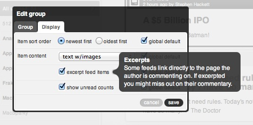
As articles are scrolled past the top of the screen, they are marked as read (this is optional) and each article is highlighted as it becomes selected. The article can be expanded in place for reading or redirected to the original content. Hovering over a specific feed in a group provides options for marking the feed as read or visiting the site. There are also feed level options for controlling the way a specific feed is displayed.
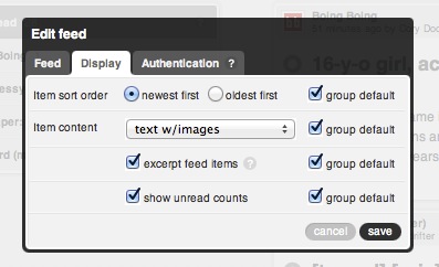
Subscribing to a feed is intuitive and provides some nice options. For example, subscribing to a source that is not an RSS feed and requires a login. Maybe it’s me, but that seems pretty fantastic.

There are few options to control the appearance of Fever. The one I recommend is to turn on the fluid layout. This locks the width of the group lists but horizontally stretches the article list with the window.
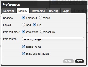
If you want to get down into the CSS, that’s there too. That may void any warranties (I’m not sure there is one) but if you got this far, you probably enjoy voiding warranties.
Hotkeys
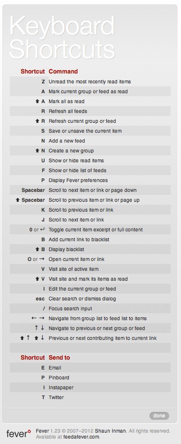
Fever can be navigated with hotkeys. The webapp can be used almost exclusively from the keyboard with almost no mousing. That’s pretty critical for working with a lot of feeds and groups.
Occasionally hotkeys are not recognized. For example, hitting “A” will mark the current group as read. Once out of 20 times, it will not be recognized. Clicking anywhere on the page fixes the problem but if I need to reach for the mouse, then the hotkey has already lost its value.
Reducing the Wait
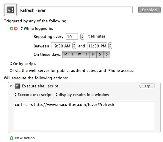
Refresh feels a bit slow. However, if you’re into cron, it can be scheduled to occur at a preset interval, rather than at a visit. The refresh is slower than Google Reader but that may be due to the analysis that needs to populate the Fever system. If the web page is left open, the list will automatically refresh. Since I use Keyboard Maestro to handle my cron-type work, I’ve incorporated a macro that is scheduled to refresh every 10 minutes.
Items are marked as read as they are scrolled off of the top of the list. They remain visible until another group is selected or the current group is refreshed. This can be a bit disconcerting if a group refreshes while reading. Suddenly the read articles just vanish. I’d prefer the list update to only occur when a new group is selected.
Collecting and Sharing
One of the great things about Reeder and even Google Reader is the ability to collect and share articles. Fever provides a solid set of features that can be customized to support almost any service.
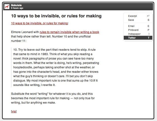
As long as a service provides a URL for posting, Fever can insert the article link, title or content using token replacements.
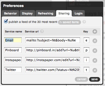
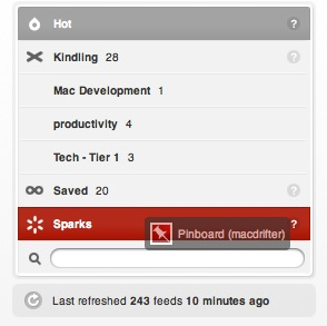
Sending to Pinboard behaves just like the Pinboard bookmarklet. I new window is opened with the title, link and summary already populated. I only have to add my tags. Instapaper and Twitter are the same. These features feel acceptable to me. They’re not as cool as Reeder, but they work well and are predictable.
Fever also provides a save button on each article which operates as Google’s favorite button does. Saved articles are added to the “Saved” list and display an updated icon to indicate the status. It’s as easy as Google’s star button.
Search
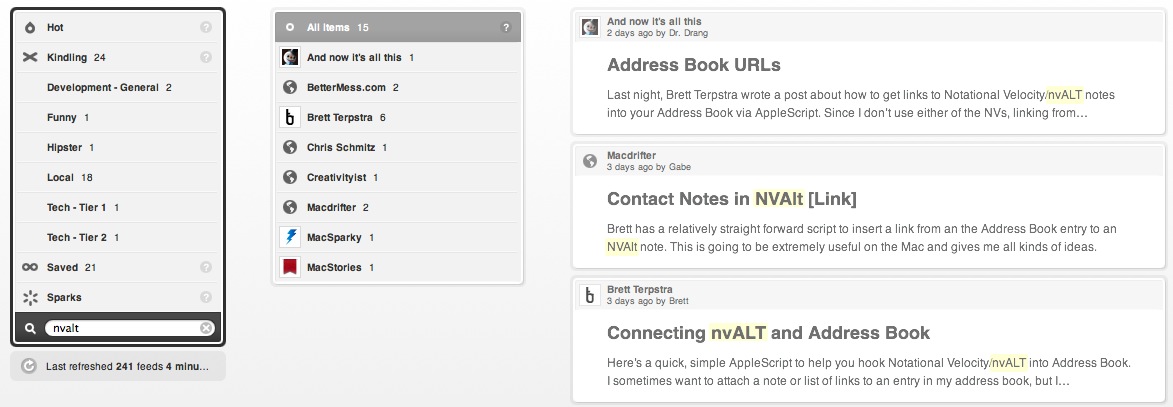
There is a single way to search in Fever: Search all articles. The interface is simple and easy to use. Feeds and article lists are displayed and matches are highlighted very subtly in yellow. The result list can be filtered by selecting the specific feed.
Wish List
Better documentation. The documentation for Fever is almost nonexistent. Most features are informed by a short pop-overs of one or two sentences. Even those can be painfully unhelpful.
I would like for the ability to add a shortcut button for Pinboard and Instapaper. This is a very minor wish since both can be bound to a hotkey.
I usually dislike mobile versions of websites but Fever icons are too tiny to tap on Safari for iPad. I’d like a iPad specific version of the application. From the change list, it looks like he is just starting to add iPad specific features. This may be a premature whining, like most of my posts.
As I mentioned earlier, more control over the hot list would be great. That could be asking a lot. I don’t imagine the Fever has a deep AI and expecting an option to train it is unreasonable. I’d still like it though.
Conclusion
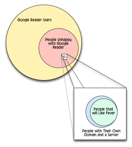
I’ll let this infographic sum up my experience.
<li id="fn:1">I think GMail was the most critical service I used. Those days are long over now. <a class="reversefootnote" title="return to article" href="#fnref:1"> ↩</a></li>

<li id="fn:2">“Install” may be a stretch. If you can operate FTP, then you can install this application. It’s really just 3 steps and the third is logging into the application. <a class="reversefootnote" title="return to article" href="#fnref:2"> ↩</a></li>
