The Color of Plain Text
I guess I have a common theme for my text editors. I prefer light text on a dark background. Without making a concerted effort, all of my primary text editors have ended with similar color schemes. Unfortunately Simplenote, which I use the most, does not support color schemes.
I'm sure many different people have different preferences. I always gravitate to the same sort of thing. I also prefer the night mode for Instapaper. Oddly enough, I dislike the DaringFireball.net color scheme. Maybe the background is not dark enough.
NVAlt
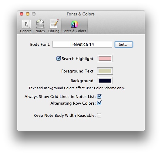
NVAlt provides a couple of options for text coloring. While there is an option for the foreground and for the background, NVAlt somehow decides on the link coloring without user input. I'd love another option to adjust the link color. I don't care for the blue colors that it defaults to.
Background Color: #010424
Text Color: #D4D4B2
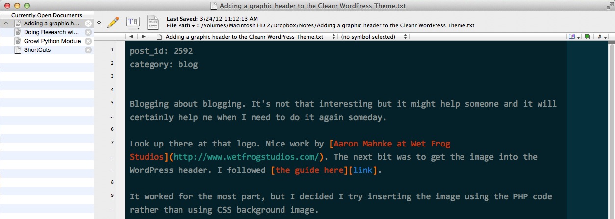
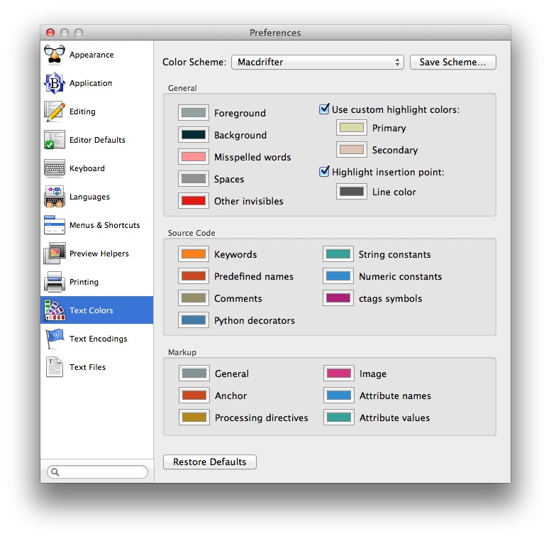
BBEdit
I write a lot in BBEdit. I've created my own color scheme and a couple of language modules. What I like about my BBEdit theme is that it's easy on my eyes but specific elements, like links, are highly visible.
Some of my BBEdit settings can be found on GitHub
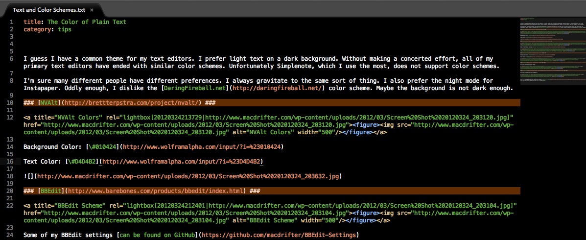
Sublime Text 2
I primarily use Sublime Text 2 when I'm on MS Windows. I still prefer BBEdit overall, but I take what I can get when I'm at work. I use the Sunburst Color scheme for Sublime Text. It's not the most attractive, but it packs a lot of contextual information into one window.
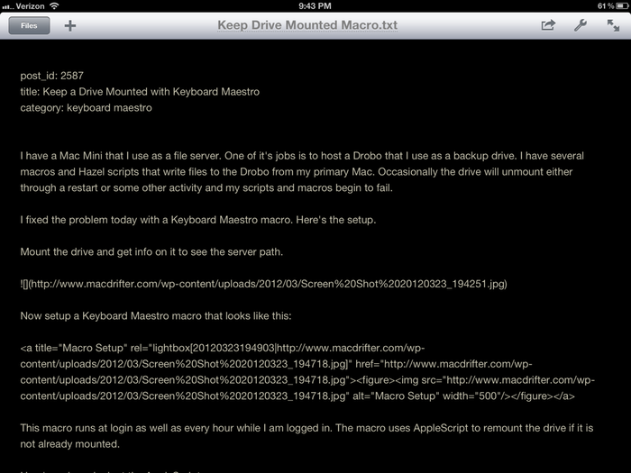
Nebulous Notes (iOS)
Nebulous Notes is the app I use for long form writing on iOS. I customized the colors manually.
Background Color: #000000
Text Color: #BEBBA8
Textastic (iOS)
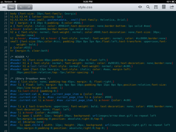
I use the "Solarized Dark" theme with Textastic. It's a built in theme and looks great with CSS, PHP, HTML and Markdown. Textastic is my default code editor on iOS.
Writing Kit (iOS)
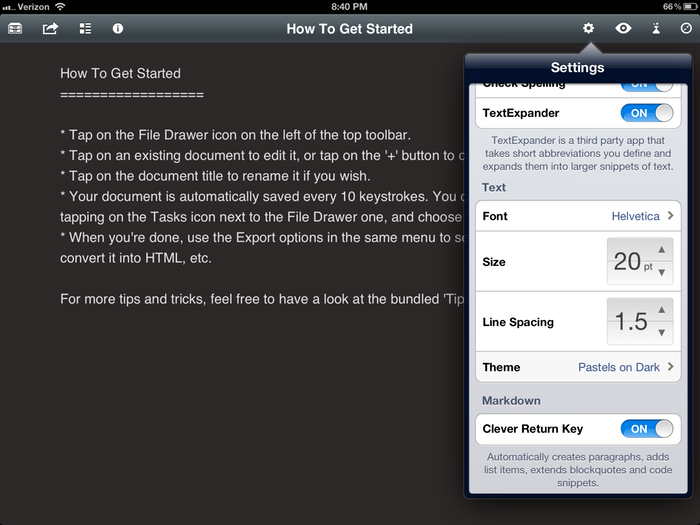
I use the "Pastels on Dark" theme.1
-
I'm giving Writing Kit another go based on Viticci's review. I do find it fairly buggy still but it's a nice editor. ↩


