Everyone's a Critic The Critic Markup Language Proposal
I like almost everything about working in plain text and MultiMarkdown. However, after trying to do editorial reviews in plain text, I realized there was a major problem. How do you indicate deletions, additions and comments in plain text without mangling the text or making changes laborious.
After some failed trials with Github and file diffs, I decided I needed a new markup language.1
Enter Erik Hess, my friend and part-time editor. We began a collaboration to solve our own problems. Within a couple of days of using the new markup, we realized that this was something that might have universal appeal. So it became a real project for us. CriticMarkup was born.2

What is it?
CriticMarkup is not a file format or proprietary application exchange format. CriticMarkup is a basic syntax that can be used in any application. Heck, it could be used with a typewriter. It’s like Markdown but for denoting editorial changes.
- Addition
{++ ++} - Deletion
{-- --} - Substitution
{~~ ~> ~~} - Comment
{>> <<} - Highlight
{{ }}{>> <<}
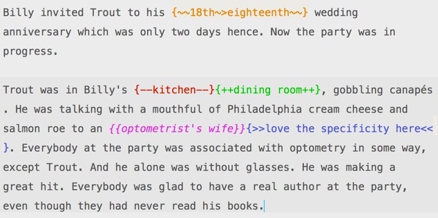
Here’s a view of it in the context of a plain text document (colored for emphasis)

We carefully chose our syntax to avoid conflicts with MultiMarkdown, LaTeX and HTML. We wanted to be good citizens but we also want the syntax to make sense. I also, personally, think there is beauty in symmetry.
Where is it?
CriticMarkup has a home at criticmarkup.com.3 Easy right?
Some Tools
Because we actually use CM to do editorial reviews, we realize that good tools make everyone happy. So we made some. There’s a Sublime Text package, which we demonstrate in the video. There’s a BBEdit CLM, Keyboard Maestro macro, TextExpander snippets and system services for the Mac. Finally, there’s a CLI tool that will convert a Markdown file that contains CriticMarkup into a really nice HTML document that can be used for reviewing.
Here’s what the Markup version looks like in the exported HTML document:

The page can also toggle between an “Original” view that hides all editorial comments:

Want to see how the article will read if you just agree with your editor? There’s a view for that too:

There are also nice JQuery enabled on-hover effects for editorial comments. Just hover over the double-dagger next to the highlighted text to see the editor’s comments.

Of course you can also override the builtin CSS/JS with your own file.
Oh, and of course, because CM is just plain text, it also works great in Kaleidoscope.app. The text is still readable but the markup is obvious.

Onward and Upward
We made this for us. We think other people that are like us will find it useful too. We’re considering how this syntax should evolve over time to make it useful to a broader group. There are a lot of gaps in the syntax that will be a problem for professional copy editors. We hope to reduce the number of gaps over time but we have our eye on simplicity as a top priority.
If you want to contribute feel free to drop by the Github or support discussion site.
The best way to support this idea is to make it work in cool ways. There are some great apps on the horizon that will make working with CriticMarkup even easier.
So, CriticMarkup is a thing we like and a thing we use. If you like it too, that’s cool. Either way, Erik and I are pretty proud of the results.
Thanks
There were many people that provided some great feedback as the project evolved. I’m very thankful that these folks exist and made time to provide feedback. They are all superheroes and kind souls.
Will Oemler
-
For the truly creepy and astute reader, you may have noticed a post with the CriticMarkup tag a little while ago. There’s also been many bookmarks on Pinboard that I’ve tagged with my project nomenclature. ↩︎
-
The acronym we like is CM ↩︎
-
Isn’t that site a beauty? Erik made the entire thing from scratch. He’s awesome and also available for hire. ↩︎
