Ulysses 3
My first acquaintance with Ulysses was brief and long ago. I tried it sometime around the end of version 1 and didn’t really like it.
Today, Ulysses 3 is available and I have to say, it’s a great application but still not for me.
I’ll get this out of the way now. Ulysses is very nice. It’s layout will be familiar to nvALT junkies but it’s far more attractive and brings some powerful features to bear on text files.
The Good
Ulysses 3 is full of subtle styling. It borrows heavily from iOS but only where it makes sense. Search highlights and menu popovers are all attractive and familiar.
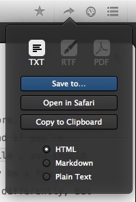
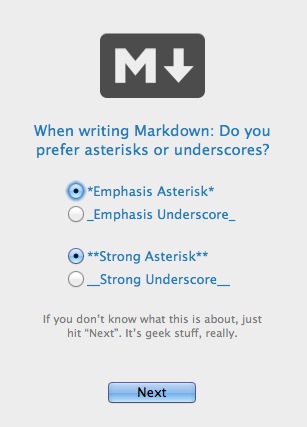
Ulysses is a plain text editor and has some great built in functionality to pair with the text. There’s such a heavy focus on Markdown that it’s one of the first things you configure when you start the application for the first time.
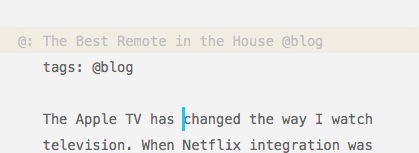
There are a number of original ideas in Ulysses. I really like how they handle file names. Each file name is shown automatically as a meta data field at the top of the file. That’s clever and just fits with the way I think.
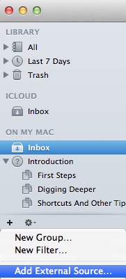
The sidebar in is also a nice feature for a plain text hub. Out of the box Ulysses comes configure with it’s own local file storage as well as an iCloud folder. Using iCloud for notes comes with a couple of the normal bonuses, like versions and auto-save. In addition, Ulysses gives direct integration with Daedalus Touch files from your iOS devices. Daedalus is a highly stylized iOS text editor that I’ve used but do not enjoy.1 That’s pretty interesting and immediately provides a multi-platform text editing system.
It’s very easy to add external sources to the sidebar and configure them with a custom icon. I added my complete note collection without any issue. Unlike nvALT, this means that I can have access to multiple directories of notes right in the unified sidebar. It’s elegant but familiar.
Where Ulysses shines is the text view for editing. Links are not displayed directly. Instead, the linked text is styled to indicate that it is either an image or link. This makes reading very easy. It allows me to write in Markdown without seeing all of the markup. I like Markdown, but the Ulysses view is a breath of fresh air.
The Bad
While Ulysses 3 has some wonderful polish, there are some broken bits that make it unusable for me.
The first major gap is the lack of universal search. While I was able to add several folders to the sidebar, I could not divine a method for searching those folders.
The second problem is that there is no auto-pairing of brackets. This is a required feature for a Markdown power user. I’ve become so accustom to this feature in nvALT and Sublime Text that I almost thought my Mac was broken when I started writing this article in Ulysses.
The last issue that put me off was the absolute distinction between a text file and a Markdown file. I’ve never used the .md file extension. It never made sense to me. It’s plain text! Why would I need a different file extension?
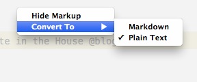
Ulysses really focuses on this distinction though. To the point that many of the best features aren’t available in plain text files. While it’s easy to convert from text to Markdown, they take it literal and convert the .txt extension to a .md. So, not only do I end up with a pointless file extension, but I also get the unwanted side effect of modifying my file modification time stamp.
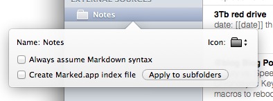
I’m not quite sure what this setting was intended to do, but it didn’t help me.
Conclusion
I’m an edge case. But I’m the only edge case I care about. Ulysses 3 is a fine text editor and would work great for an average user. It doesn’t work for me right now. I think it’s a solid app for people still developing their workflow or if their workflow already already fits with the Ulysses design. I’d say Ulysses 3 has a leg up on Byword but still no match for nvALT or a nerd-editor like Sublime Text or BBEdit.
-
Daedalus is very nice and would work great for someone with a small collection of notes. It does not work well with 2000 notes. ↩︎
