Editorial for iPad A Landmark in iOS Text Editors
Occasionally a new computing platform comes along that changes the way we interact with technology. The iPhone changed what a phone was to me and the iPad changed my definition of a personal computer. But with each of those shifts, I quickly settled into the opportunities and limitations inherent in their software. For all of it’s innovation, the iPad still felt like a limited little piece of glass. This was never more apparent than when I was writing.
When I write at a computer, I use Sublime Text or BBEdit, or MultiMarkdown Composer. These are powerful text editors and nothing on my iPad could rival them.
Then came Editorial….
Ole Zorn, the creator of Pythonista, already had my respect and admiration for creating one of my favorite Python development tools. Then one day he invited me to test an “idea”.1 From the start, I knew that Editorial was something special. Ole has an incredible design sense. He’s a master craftsman and the attention to detail in Editorial, even at that early stage, was jaw-dropping. There are ideas in Editorial I have never seen in another iOS app.2
Here’s a short teaser video of Editorial in action. Or skip ahead to the overview below:
If that gets you curious, then read on. I have something wonderful to show you.
The Basics
If you like Sublime Text and Python, then there’s no need for me to convince you. You will love Editorial. However, if you just want a really good text editor, Editorial is the best in class.
Words fail to describe the elegance and functionality of Editorial so I’ve created several demonstration videos. Here’s a demonstration of Editorial as a simple text editor:
Or you can skip the video and read about the what makes this iPad app so groundbreaking.
Scratching the Surface
Editorial looks beautiful. There are two themes, a light and dark. I prefer the dark but here’s what the light them looks like:
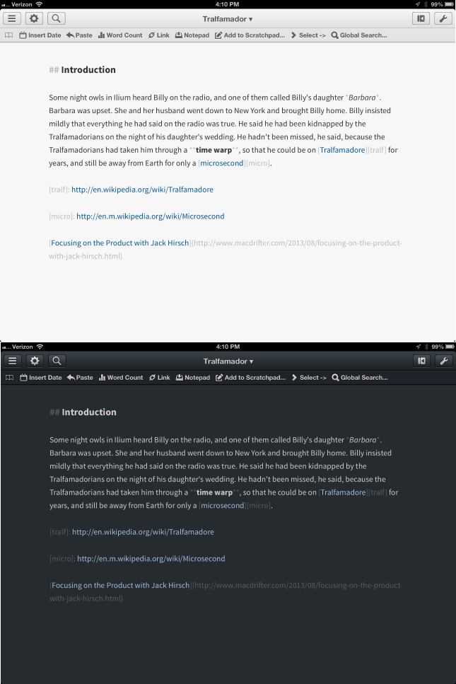
Editorial provides control over text size and font. There’s not a huge selection of fonts, but I like the options available. There’s also options for adjusting the line spacing and text width as well. Overall, the appearance of text in Editorial is great.
Interactions
Editorial relies on swiping to control most of the available views. Swipe left to right to show the file browser. Swipe right to left to show the multi-function window which includes the Markdown preview, Console output, Help documentation and the Browser.
The Keyboard
As is the fashion, Editorial includes a custom half-height keyboard row for working in Markdown. All of the necessary special keys are included. There are some unique variations, like tap and hold on the asterisk key to get the double and trip asterisk.
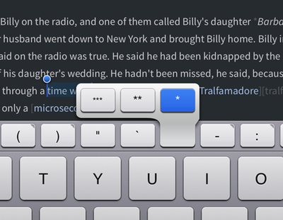
One of my favorite features of the custom keyboard row is that it also functions to move the cursor forward and backward. Sliding horizontally moves the cursor in the corresponding direction. Swipe with two fingers for extending the selection.
But it doesn’t stop there. Editorial provides a very powerful snippet system and provides direct access on the extra keyboard row.
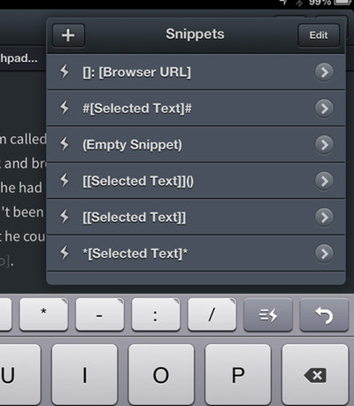
Snippets
Ole has a tremendous insight into how nerds write. Editorial’s snippet system is the first glimpse of his keen eye.
Editorial supports TextExpander snippets but does so with gusto. Once I turned on the “Suggest Snippets” in the settings, Editorial began showing popup bubbles of my snippets and their expansion. This is great with a medium set of snippets. If you use a lot of similar snippets and occasionally forget the characters to type, Editorial will show you.
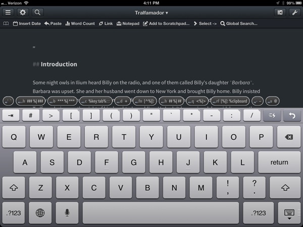
But Snippets go deeper in Editorial. Much deeper.
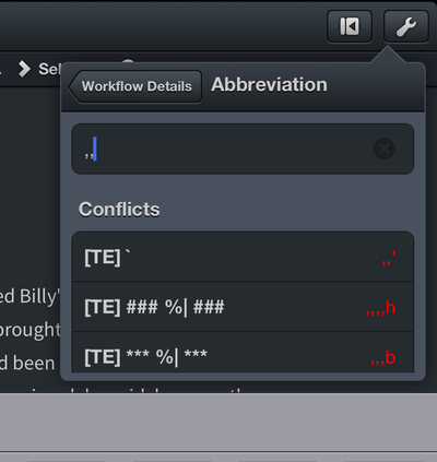
Every macro (more on these later) can be assigned a shortcut. When assigning the keyboard shortcut Editorial shows conflicts with other snippets.
But if you need more than what TextExpander provides, Editorial has it’s own snippet system that feels a lot like TextExpander on the Mac.
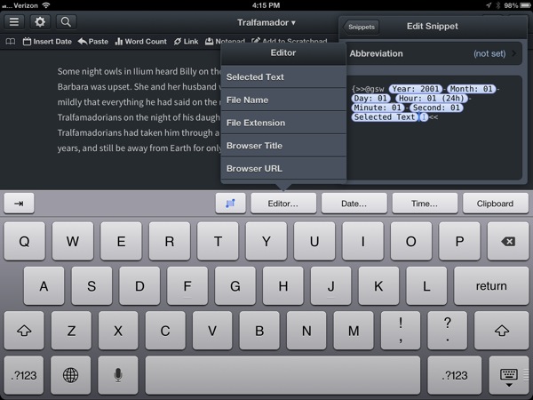
Editorial uses the concept of variable markers throughout the snippet and macro system. There is a wide variety of variables to choose from, such as date/time, editor selection, and file attributes. Combinations of these properties, along with the easy to use snippet editor, makes the Editorial snippet system feel natural on iPad.3
Markdown Preview
What would a modern iPad text editor be without Markdown preview? It’s just expected at this point. But Editorial goes one step further. Sure, you can slide the preview pane in from the right with one finger to see the fully rendered Markdown. However, there’s little need to do this while writing.
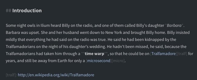
Editorial provides inline formatting of Markdown in an unobtrusive way. The original text is left in tact but the heading is formatted as a heading. Italic is made italic. Links are gorgeous too. The Markdown characters are still there but they are formatted in a color that allows them to blend into the background. It all looks so great that there’s almost no reason to look at the Markdown preview unless you want to see image links rendered.
Document Syncing
There are two file locations available in Editorial and both are accessible with a left-to-right swipe. There is a local file storage as well as Dropbox syncing. The Dropbox sync is fast and flawless in my testing. Sync is performed automatically without the need to manually initiate the process. If you are paranoid, just collapse the keyboard and Editorial immediately syncs the file to Dropbox.
I initially disregarded the local file storage and stuck with Dropbox syncing only. But I soon began to appreciate the local storage as a place to stash scraps and a scratchpad without cluttering my Dropbox notes folder.
The Dropbox support is the most complete I’ve seen in any text editor. Editorial includes options to multi-select and delete files. You can also move files to a different folder in Dropbox as well create a new folder in Dropbox. Documents can be sorted by name or modification date (like a sane person).
Versioning
Editorial’s versioning system is a step above most other iOS text editors. It uses the Dropbox versioning available to every subscriber but this is the first application I’ve seen with such an imaginative take on text versioning.
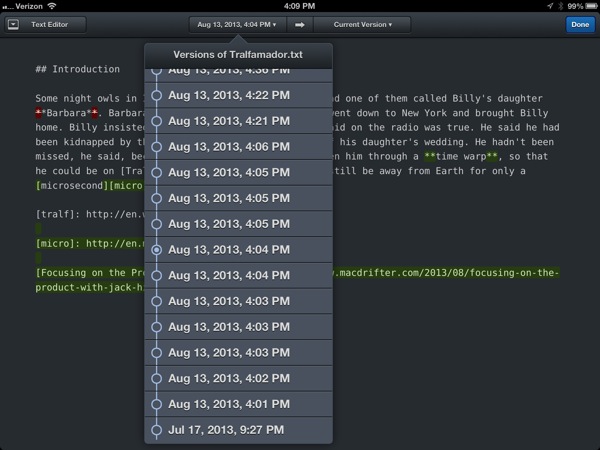
Select a Dropbox version on the left and another version to compare on the right. In the example above, I am comparing a previous version on the left to the current version. Additions are marked as green and deletions are marked as red. Only a single branch is available. This isn’t Git, but it’s better than any option I’ve seen on iOS.
You can collapse deletions to give a better representation of what has changed in the document. Alternatively you can restore a specific version to become the current version. What a wonderful touch in a plain text editor.
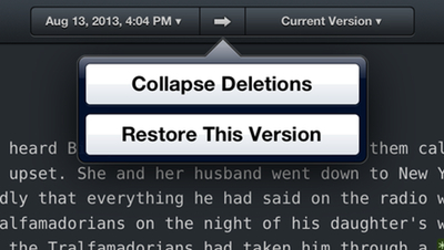
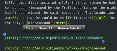
You can also do a selective restore of just a text fragment. Selecting the text provides an additonal popover option just to bring that bit forward into the current version.
The Web Browser
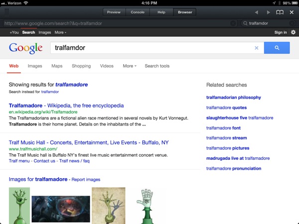
Without any customization, the Editorial web browser is a nice convenient resource. Slide the panel in from the right to access a simple webkit browser, complete with a standard address and search bar.
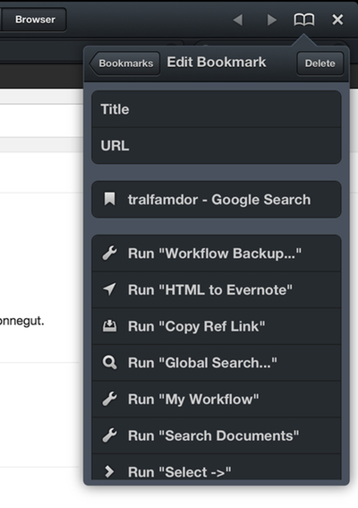
The browser also includes it’s own bookmark tool. Bookmarks can be as simple as a URL. But if you’re willing to dive into Editorial, bookmarks can include complex workflows complete with interactive JavaScript.
Documentation
To access the documentation slide from right to left to reveal the multi-function panel and tap the “Help” button at the top. Editorial shares the same documentation system as Pythonista. This is good and bad.
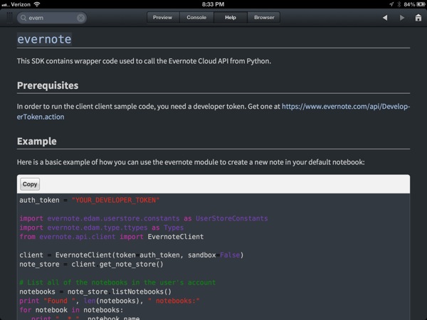
While the documentation for Python modules is beautiful and detailed, there are significant gaps in the documentation for how Editorial actually works. The search function in the Help section only searhces the Python specific documentation.
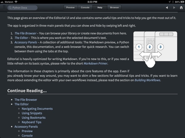
But if you’re curious, the Editorial documenation is also available online
The Nerd Threshold
You’ve reached the end of the basic introduction to Editorial. Beyond here is for the curious and nerdy. This is where true power lays.
Workflows
The heart of Editorial is the unique workflow system Ole has designed. Initial inspection would lead most people to assume it is a simple take on Automator. But it’s deeper than that. Not only are the actions more sophisticated than Automator, but many of them have more useful options to configure.
Editorial is a Python lovers dream but there’s plenty of substance for someone less familiar with programming. There’s a large number of actions available that operate on text, the editor interface and the browser window. Actions are arranged through drag and drop. Tapping on an action title displays any basic options available.
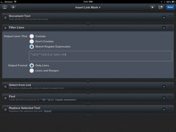
The above workflow looks simple but does something quite impressive. It scans through the text in the current document and grabs all of the link markers. It then shows them as a list to choose from. Here’s a quick demo:
That’s just a basic workflow involving a few actions. It’s a little difficult to describe what it’s like to build workflows in Editorial, so I’ve put together a short tutorial:
Workflow Sharing
Editorial introduces an elegant solution to that old problem of taking someone else’s work and making it work for you. Rather than forcing users to painstakingly recreate a workflow and all of the accompanying code, Editorial can export to an Editorial workflow sharing service.
Workflows are shared from their edit panel. Tap the “Share Workflow…” button and give it a description. The shared link is placed on the clipboard and you can open the link in Safari.
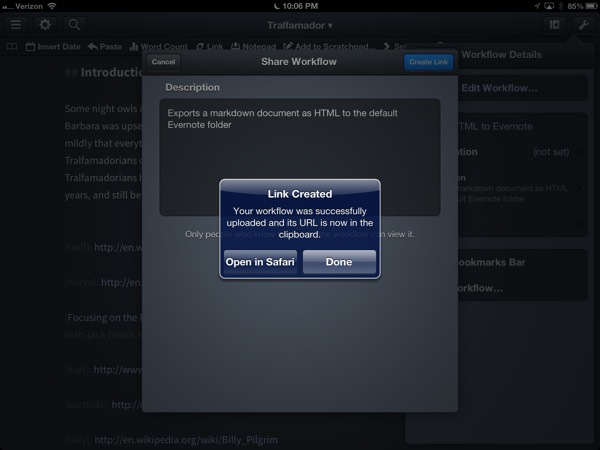
Visiting the shared workflow link not only allows you to see exactly what’s in the workflow, but if you open it in Safari on iPad you can import the workflow into Editorial and make it your own. If the workflow contains Python scripts, there’s an additional security warning before it’s installed in Editorial.
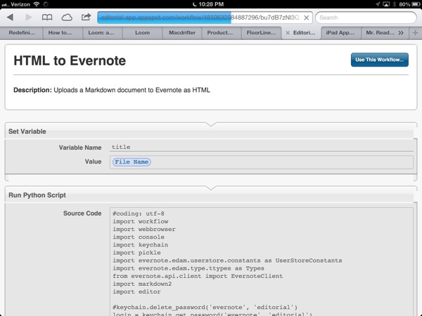
It’s as simple as that. Go ahead and take a look at one of my workflows in the browser. This one is described below but you can check it out in your browser. Here’s one with less Python.
UPDATE: I modified the Evernote workflow to more aggressively encode unusual characters to HTML entities. You can get the new version here
Python Modules
Editorial provides all of the same Python modules as Pythonista plus some additional modules that give you access to the internals of Editorial. That means if you are willing to go down the rabbit hole, there’s very little you can’t get Editorial to do. Here’s just a sampling of the modules I’ve found useful:
- Clipboard for interacting with iOS clipboard
- Dropbox for connecting with Dropbox API
- Editor for getting and setting the text, selection files in the Editorial editor window
- Evernote for working with the Evernote API
- Keychain for storing passwords
- Markdown2 for more controled markdown conversion.
- Paramiko for SSH
- Photos for interacting with the iOS camera and camera roll
- PIL for image manipulation
- ftpLib for connecting to an FTP host
- Workflow interacts with the Editorial workflow stack access variables.
If you are familiar with Pythonista, the Editorial code editor will feel obvious. There’s code completion, syntax highlighting and automatic indenting. double tap a function name to quickly bring up the documentation. Working in Editorial’s code editor feels great.
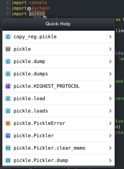
But what’s even better is that you can mix-and-match Python scripts with workflow actions. Actions can provide some quick jumping off points to request input or search a document for some text. Using the Python Workflow module makes it easy to pass variables back and forth between code and actions. All action variables are stored as globals so they are easily accessed by name.
Some Workflows
Here are just a few workflows to get you started with Editorial. Copy the URL’s and open them in Safari on iOS to import them into your own copy of Editorial.
Critic Markup Workflow
This workflow is useful for people that like to work with Critic Markup. It simply uses a custom Python parser and generates HTML with CSS to render a preview of the Critic Markup in the browser.
Pinboard List
I take no credit for this workflow. Ole Zorn provided this and it’s just too good not to share.
When triggered, it will show a selection list of your most recent Pinboard bookmarks. Tapping a selection inserts a markdown style link.
Lengthen URL
Short URL’s suck. This workflow un-sucks them. Select a short URL in the editor and run the workflow. The target URL will be inserted in its place. I made this so long ago I don’t remember the references for all of the code. Sorry.
HTML to Evernote
This workflow converts the current Markdown document into HTML using the Markdown2 module (with code and footnote support) and sends it to the default Evernote folder.
Select Forward
This workflow demonstrates how actions can be combined to control the cursor and text selection in the editor. The workflow extends the current selection forward one whole word at a time.
Reference Links from Browser
Here’s a simple workflow that I’ve demoed several times in the above videos. Copy a link in the browser and trigger this workflow to insert a Markdown style reference link at the bottom of the current document. I use the heck out of this. It’s great for gathering researching into one text file.
The
Drafts to Editorial
The Editorial URL scheme allows for documents to be created (locally or inside Dropbox) and for a workflow to be run after the file is created. I created a simple workflow to get text from Drafts for iPad into Editorial.
Using the Drafts x-callback-url scheme, I created an action in Drafts that sends the current text to Editorial by creating a new file in Dropbox named with a timestamp. Here’s the Drafts action:
:::html
drafts://x-callback-url/create?text=[[draft]]&action={{Copy to Clipboard}}&afterSuccess=Delete&x-success={{editorial://new/[[time]]?root=dropbox&command=Paste}}
Here’s the dead-simple Editorial “Paste” workflow:

I use this workflow in many other ways too. It’s much easier than trying to double tap in the exact right spot to trigger the paste popover.
UPDATE: The Get Clipboard action was deprecated sometime during the beta. Use this workflow instead. It’s one action shorter.
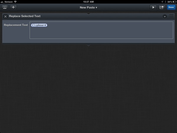
You can modify the Drafts action to use a different workflow by replacing the command=Paste bit at the end. For example, to use this new workflow, change it to command=New Paste
The Beginning
Expect many more workflows in the future. Editorial is my favorite iPad tool and changed the way I use my iPad. Becasue, the great thing about Editorial is that it’s a solid workhorse for text editing when I need to get stuff done, but it’s also a fun toy when I just want to fiddle with making something interesting.
Editorial | iPad | $5
-
To be honest, I begged him at least a couple of times to make a text editor right after Pythonista came out. He was secretly already working on one and he surpassed everything I could have imagined. ↩︎
-
Some will call it hyprebole. I call it enthusiasm. ↩︎
-
I hope this concept makes it back to TextExpander for iOS. This is a far better experience. ↩︎
