Slack for Collaboration
Glassboard, Google+, Viber, Patter, Wordpress, Basecamp, I’ve tried a lot of collaborative messaging services. Every one of them has been a terrible experience for what I needed. They either lacked native clients or notifications or basic document sharing.
Slack just sucked the oxygen out of the collaborative work-room.1
I collaborate on several personal projects. Back when Erik and I were working on Critic Markup, we looked high and low for a collaborative messaging system that supported code syntax highlighting, file sharing and threaded messages with notifications. The closest we came was the Wordpress P2 theme but it was such a resource hog we abandoned it and moved everything to Glassboard.
Now, I’ve been using Slack for a few weeks and I’m worried that I’ve missed some major catch. It’s just so perfect for what I need that it can’t possibly be real. There’s a terrific modern web app as well as functional iOS and Mac apps with notifications that actually work. They have a business model and reasonable privacy terms.
This review would be longer if I wasn’t using Slack so much. However, I’ll attempt a quick summary of some of the best features available in the service.2
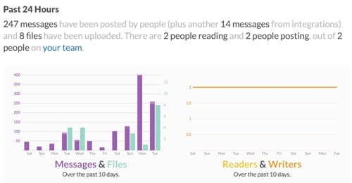
First I’d like to clear up a strange interpretation that isn’t wrong but rather misleading. A couple articles portray Slack as a chat service or social media aggregator. While it can be used for that purpose, it would be like calling Twitter a dating service. Slack is a collaborative working environment that also provides a chat service.3
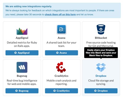
Some of the confusion with Slack may be caused by the integrations available for Slack. You can hook up Twitter, Github, Asana and many other services to automatically aggregate information into a “channel”. This can mean Tweets are imported into Slack and become searchable within the group archive. If you don’t have a team, it might be a good general aggregator but that wouldn’t be worth the price of admission in my opinion.
Slack Structure
You can be a member of multiple groups in Slack and each group can have a different login email yet still be accessible from the apps and web site with a single menu selection. The only shortcoming is that I only received notifications for the selected Slack group.
Inside a group, there are channels. Think of channels as an organization for hash tags. For my group, we’ve structured the channels to discuss various aspects of the project like design, data handling or business decisions. We also use a “random” channel that Slack initially creates for all new groups. This is convenient for talking about all of the other non-project related stuff without polluting the real work.
The entire team has access to the main channels in Slack but separate “private” channels can be created by the group administrator. Users are granted access to a private channel individually. That’s a great option if we want to bring in outside collaborators but we want to maintain some private areas for business-y talk.
Chat Messaging
Each channel is it’s own chat board. Messages are associated with only one channel but files can be associated with multiple channels. Chat is not threaded in Slack but you can link to a specific comment if needed. The linking process is a bit tedious but works well enough.4
Marking messages as a favorite (starring) also makes them more easily accessible in the sidebar. This was helpful for referring back to specific statements or files.
Chat posts feel instant in Slack. Posting from iOS causes the message to refresh dynamically on the web page in under a second. I initially thought that we were benefiting from the beta status and low user count. However, as Slack moved out of beta and received a lot of press, I have not noticed in difference in posting. It’s fast.
The notifications in Slack work great. The work on iOS, Mac and with a web browser that supports notifications. They are also almost instant. As soon as a message appears on the web page, I receive a notification on iOS. If a Slack instance is open and active, there are no notifications. Imagine that.
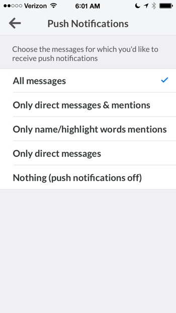
Slack also provides a separate option to turn on additional notification options like email, or turn notifications off completely.
While direct messages receive a slight highlight color, I could imagine an active channel with many contributors could be a bit confusing. The only differentiation between users is the avatar. I’d like a way to add some subtle call-out coloring to a particular user. But that’s a minor complaint when I consider that Slack already provides an option to selectively highlight user selected keywords.
I also really like the option to delete or edit a message in Slack. One of the most frustration aspects of Glassboard is the inability to fix a typo on a group board. Slack solved this from the start. The option to delete a file attachment or even an entire channel is great too. No need to clutter a board unnecessarily with mistakes.
Files and images, as well as Emoji, are displayed in-line and with obvious indication of the file types. Clicking an in-line object opens the instance in Slack for viewing or opens the external file for editing where appropriate.
File Handling
The Slack Mac and web apps both support dragging any file into the window to upload it to Slack. The item is tagged to the current channel for easy browsing but you also get a complete list of all files available to the group.
Files like PDFs, text files and Word documents are indexed for searching. They’re not just embedded chat links, they are working documents.
Paste in a Google Doc link and that also becomes searchable within Slack and directly linked from the group chat and search results.5 The Slack file organization and browsing is also well considered. Browse just your private documents, a single channel or all documents across all groups. You can also filter attachments by file type and favorite status.
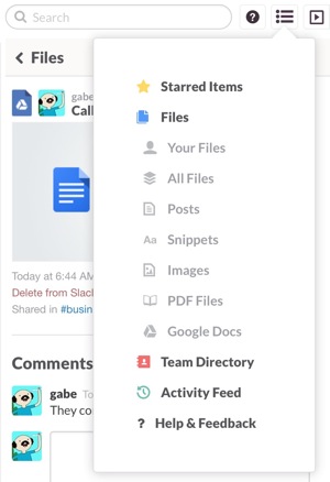
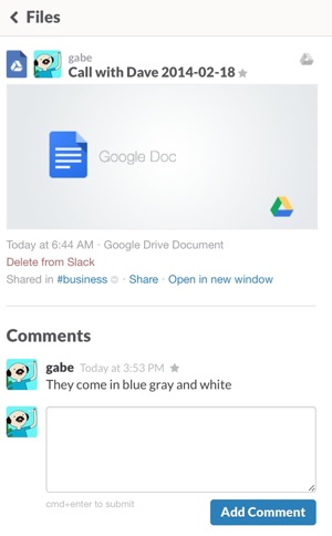
While you can easily reference a file in a chat, each file also has it’s own comment thread. This is nice when working on a document together, even a Google Doc. It makes it convenient to discuss changes and make them at the same time. Or use the comments as a reference for reviewing changes.
Files in Slack have a title and comment field to provide additional context and meta data. You can paste directly into the message box to upload an image or drag a file to the browser (or app) window.
iOS Apps
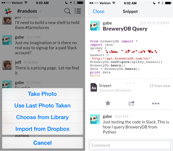
The iOS apps work generally well. They replicate most of the web app functionality but integrate basic gesture control of views. The iOS apps provide several convenience functions for working with files and they went the extra mile to make it all universal. I’ve been pretty happy with the feature parity across the apps. Even the inline files and code snippets behave properly.
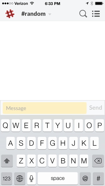
There’s plenty of attention to detail in the iOS apps. For example, when there’s no network connection it’s very obvious. The logo changes to red and the text entry box becomes yellow.
Search
The search function in Slack is a huge win. Not only is it exhaustive but it’s fast too. Finding files is easy with the file browser but finding a specific conversation thread is just as easy.
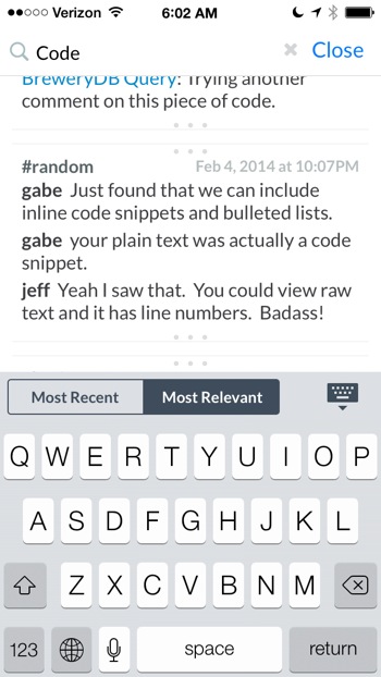
The results aren’t just the exact sentence or word that matches, but rather a few messages above and below the match. I think this is pretty important for search in a message-centric application than can have thousands of messages. After a couple years of use, search results could become useless otherwise.
As I mentioned above, the content of attached files are also searchable. While the file hits are obvious in the search results, there’s no way to know exactly where in the file, the term was found.
Messaging and Code
Slack knows its audience well. At any time I can send formatted code as a message. Just start typing in the chat box and hit ⌘ + ⏎ to bring up a code entry screen. There’s a good variety of syntax highlighters available too.
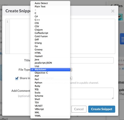
The thing I really like about this implementation is that a bit of code can be given a title as well as its own comment thread. This helps with search and context. So great.
Business Model
I’m happy to see that Slack has a real business model from the start. A free account is available but limits include, a maximum of 10,000 messages stored in the archive, a maximum of 5GB of file storage and a maximum of 5 integrations. That’s pretty generous.
The standard account are $8 per user per month. That seems reasonable for something that I’ve used every day since joining the beta. This removes most of the limits but raises the maximum file storage to 10GB. It will eventually grant guest access and email forwarding to Slack as well.
The “Plus” account is not yet available but will will add 20GB of storage and a future feature of external channels for $15 per user per month.
You can check out their billing FAQ for more info.
Privacy
The Slack privacy statement is pretty direct and respects the reader.
At the outset, we want to be clear that Tiny Speck is not in the business of selling your information. We consider our custodianship of your information to be a vital part of our relationship with you. There are, however, certain ways in which we will use your Personal Data, as set forth in more detail in this policy.
I’m hosting a plain text version if you want to check it out. Note that it will not be updated with future changes.
Slack also provides a separate Security and Confidentiality statement.
By default, anything you post to Slack is private to your team. That is, viewing the messages and files shared within a specific team requires authentication as a member of that team. You may also post things (such as files and messages) which are only available to you, or to a restricted group of other team members, but not the entire team. We attempt to clearly label all privacy controls and explain their function.
Here’s a hosted version of what’s available today (2014-02-20).
I’m pretty happy with the terms so far. They reflect the fact that they have a real business model.
Conclusion
Slack is one of the best services I’ve used in the past year. It was an easy commitment to make when the beta ended and paid accounts became available. Since we were in early, Slack offered our team a $250 credit toward signup, so in the end, we didn’t have to pay anything. We’ll ultimately use all of the credit and then some as our team grows and I’m happy to do so.
If you signup through this referral link by April 15th, you’ll get a $100 credit toward the costs.
-
That’s a referral link. Anyone that uses it will get a $100 credit and so will our team. ↩︎
-
Checkout the Macworld review but be sure to block auto-play video and pop-over ads first. Man, that site is really breaking my heart lately. ↩︎
-
I’m biased because I’m using Slack for collaborating toward a group goal. I’m using it for business and some social communication. ↩︎
-
Click the time-stamp for a message to see a unique link to it and copy the URL. On iOS, tap and hold on a message to copy the link. ↩︎
-
Slack will ask you to activate the Google Drive integration when you first attempt to paste a link. ↩︎
