Things 3 From an OmniFocus and TaskPaper User
I spend a lot of time with my task manager. My day job is a little bit of technical development and a little bit of project management. The project management piece is a capital “P.M.” I manage a dozen large projects spread over several years. Each project has between one and twenty different people on the team. This review is written from that perspective. I’m not a productivity blogger or a guy that just likes to try out software. My task manager is my primary tool like a hammer is a carpenter’s.1 I have lots of edge cases that aren’t relevant to other people.
Because I make a living by the effectiveness of my task manager I don’t switch tools very often. I usually require a year with a new task manager before I consider switching again. Four years ago I moved away from OmniFocus to TaskPaper. Two years ago I moved back to OmniFocus after they brought back many of the core v1 features lost when they upgraded to v2. I’ve stuck with OmniFocus since 2016 and I’ve been mostly happy with the results. Those previous Macdrifter links have a lot of complaints that are still valid today.
All The Nerds Are Talking About It
Things 3 was out for many months before I even looked at it. Slowly, many of my friends started the transition to Things 3 from OmniFocus 2. I held fast and refused to interrupt my process. As more of the people that I knew had jobs like mine (technical leads and project managers) switched I asked them why. I immediately disregard answers like “the design is beautiful” or “it has this one cool feature” but those weren’t the answers I got. In general the answer was “it feels easier.” I like easier. That’s the entire point of using a task manager. It should make work easier. Not fun. Not pretty. Easier.
So I rebuilt my task list in Things 3. I also rebuilt it in OmniFocus to give me an equivalent comparison.2
This is my opinion after using Things 3 for two months.
Design
I’ll cut right to the chase. Things 3 is a more productive design than OmniFocus. It’s also prettier but as I said, I care much less about pretty and a lot more about making sense of a project view.
The Things 3 Today view is very nice. It’s most similar to the OmniFocus Forecast view. Until recently both displayed my work calendar along with my tasks.3 The OmniFocus Forecast view is the best design in their app. The Things 3 Today view is their worst design.
Things 3 leverages whitespace in a meaningful way. The separate between projects in the Today view is a good example. The whitespace clearly delineates where categories and projects split and which tasks are defined within the project. I quickly scan the Today view throughout the day. It’s my primary working space.
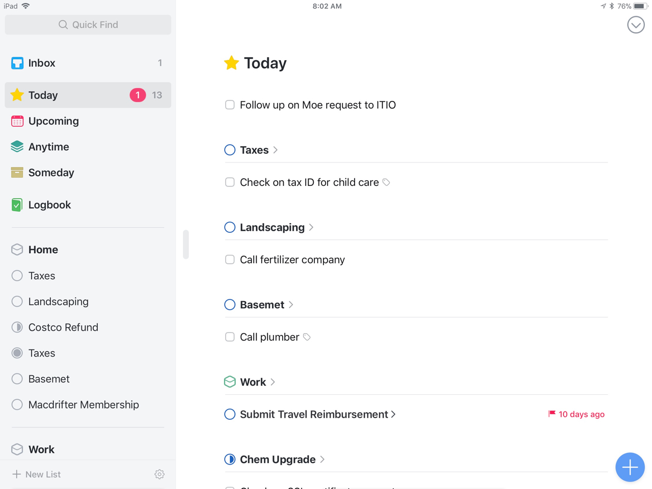
Within a project I like the Things presentation of start dates (which they call “when”). The date precedes the task. I don’t think their tags are surfaced well enough though. I also think they cut-off task names for the sake of more whitespace. I understand this but it feels wasteful. It also makes me self conscious about how I name tasks because I don’t want to have to tap through a task to see what I need to do.
Compared to OmniFocus, the Things project view is much more helpful. I can see immediately that I have dates and that there are “contexts” on the items, even if I can’t see what those contexts are. OmniFocus reveals the context but not much else when browsing a project.
I do greatly prefer the OmniFocus dark theme over the bright whites of Things 3. On the other hand, I think Things 3 uses color in a more helpful way. Red dates really stand out as well as starred “Today” items. There’s no mistaking what’s important and there’s no deciphering a colored check-circle4
While I like the project pie-graphs that represent percent completion, I don’t find them particularly helpful. The only attribute I really care about is whether a project is done or not done. In that way, I think Things still does this better. A full pie means there are no more tasks to do in a project. Easy.
Project Organization
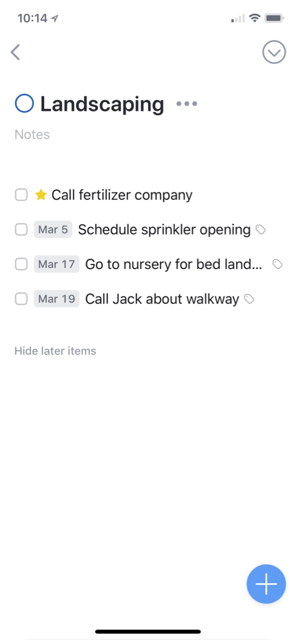
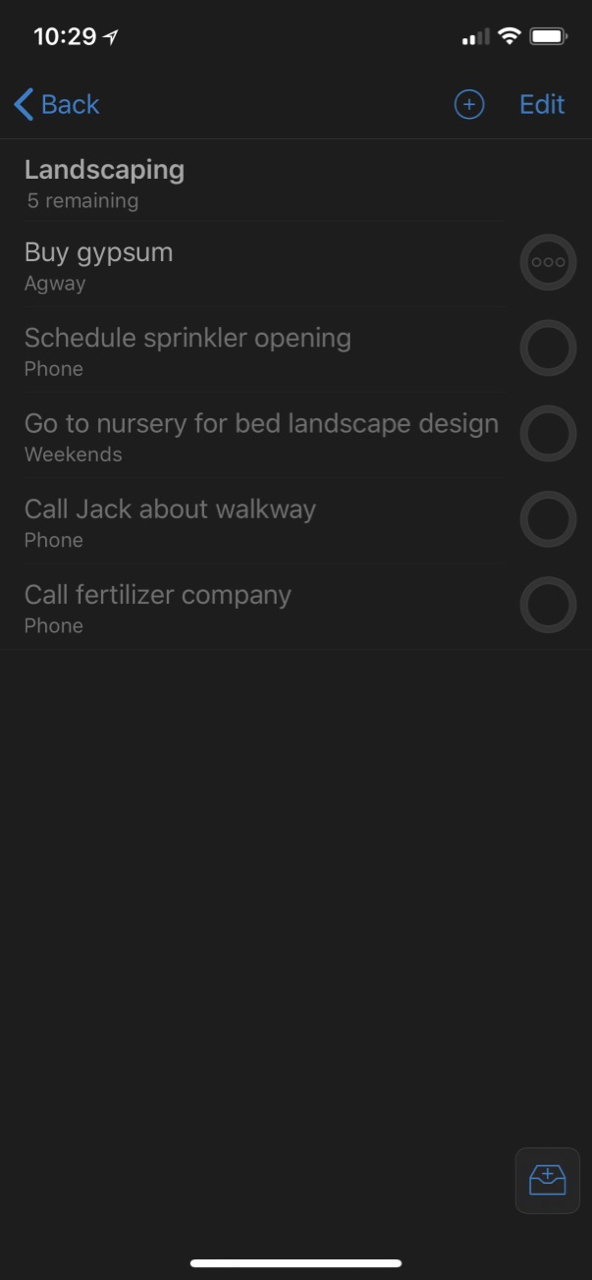
Project organization is a critical feature for me. I have a lot of projects with a lot of subtasks. I’ve become accustomed to OmniFocus' nested folders and projects and struggled with Things' shallow depth. I can have an area and one level of projects in that area of Things. If I want deeper nesting, I can use check-lists within a task but otherwise a project is one-level of tasks.
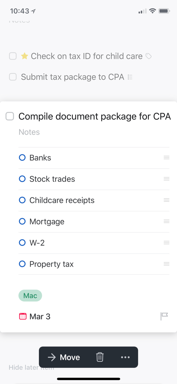
I do like the simple list feature in Things tasks. They can be manually re-ordered and don’t really need dates or flags. I use these almost like reminders for what I need to do to complete the given tasks. These checklists are not surfaced to the project or Today views so they stay out of the way and keep minor steps from cluttering up the interface.
Things 3 leans heavily on what they call “Headings.” At first I thought these were like sub-projects but they are not. They are spatial separators of information within a project, which is nice but also a lost opportunity.
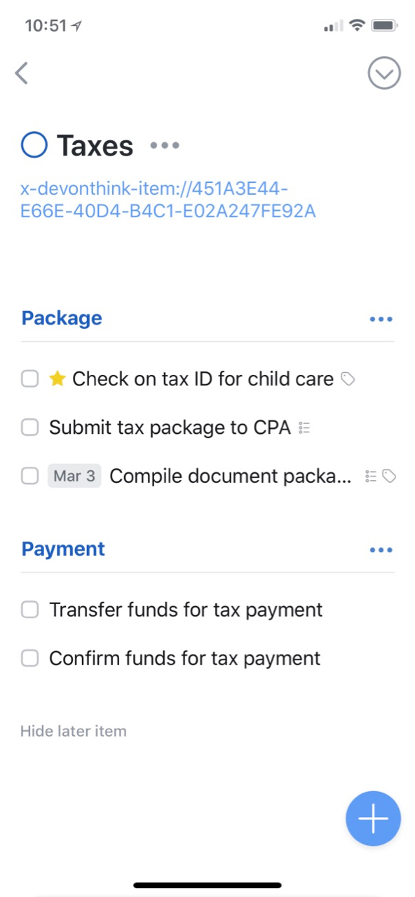
Tasks are grouped within a header and the header can be used to move them as a group. Unfortunately, there are no dates on headers. They do not have separate notes. They also do not show up in tasks lists. If I use a header to add some additional information around a task, that’s lost in the Today view because headers don’t show up in that list. Headers are also not found in search. They are unmoored from all interfaces other than the project view.
I like the design of headings in Things. The create a nice separation of tasks within a project. It reminds me a tiny bit of a kanban board. It’s too bad headings feel more like a design element that never got a functional feature list. I like where it’s going but find it less useful than it could be.
I settled on prefixing related projects with a parent project code and square brackets. I then manually arrange them in the project outline to be in the order I want to review them. This also lets me search for all related projects easily. While I could the exact same thing in any task manager, Things 3 gives me the power to manually order most tasks and projects to be exactly how I want to see them.
Tags
Maybe OmniFocus 3 will figure out tags one day but the Omnigroup definitely understand nesting right now. Unfortunately Things 3 does not. Tags in Things can be nested but nesting them does not provide any value and in fact creates a lot of friction. In my world, using a nested tag also applies the parent tag. That does not work in Things. Nesting is purely for visual organization of tags.
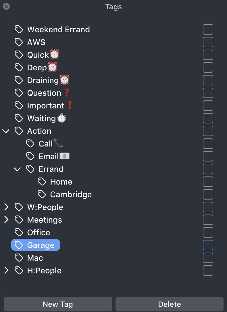
Nesting tags in Things 3 also has no value for search. If you want to find a tag for someone at work, searching for the parent tag of “work” does nothing. The tag implementation in Things 3 really feels like it was designed by people that don’t really use tags or use them very thinly.
Tag completion is also lackluster in Things 3. When adding a tag to a task on iOS there is no completion. Tags are applied by browsing the tag list. On the Mac, tags can be added by search but there is no substring matching. If a tag is “W:Gabe” then you must type “W:G” before finding it. Typing “Gabe” will not match the tag. Again, this feels less like a low priority feature and more like a feature designed for people that don’t really use tags for anything more than contexts.
Tags could be a powerful differentiator for Things 3 but it falls flat for me. I like the option to use tags as a replacement for OmniFocus' more rigid and less relevant “contexts.” However, the Omni Group have already declared their future support for tags in OmniFocus 3. I’m hopeful their tags work with proper nesting.
Repeating Tasks
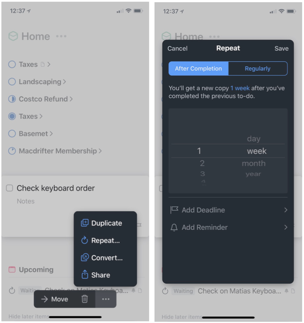
Repeating items in Things works but I find it more tedious to create than in OmniFocus. I don’t do this often so it’s a minor inconvenience. I keep a few repeating maintenance tasks in Things but most of my repeating alerts are handled in the Reminders app. I don’t like trivial actions like “Take the Garbage Out” in my task manager.
Repeating tasks in Things 3 are harder to create than OmniFocus because task creation and setting the repeat are two separate things. To create a repeating task, first you create a task. Then you tap the task to set the repeat interval.
Task Entry
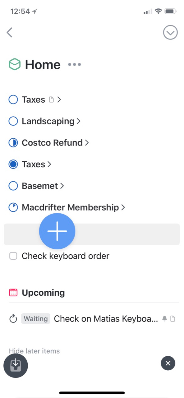
This is where Things 3 beats the pants off of OmniFocus. Through clever design, Things 3 makes task creation very efficient. The “Magic Plus Button” really takes advantage of the iOS drag and drop feature. Tap and drag the plus icon in the lower right corner to add a new task to any on-screen project or heading. Drag the plus button to the left edge of a project list and create a new header. Drag the plus button to the Today or Inbox sidebar items and create a new task in that context specific area.
In contrast, the OmniFocus model hides almost all of the task detail between view tabs in the app. The OmniFocus categorization of attributes feels anachronistic with modern iOS design. It feels especially awkward after using Things 3 for several months.
Even editing in Things 3 feels more natural than OmniFocus. Slide left to right on any task to get a date picker. Slide the other direction to select the task or start selecting multiple tasks. Select a bunch of tasks and move them as a group.
The OmniFocus model of hiding projects and sub-projects is burden for managing items. Each area of OmniFocus is a little rabbit hole of friction. I dig into one project and it’s multiple interactions to move a task to another project. Even with the OmniFocus touted drag and drop for iOS, I can not drag a task from one project to another project in the sidebar. I can only drag through the long main project task list.
On the Mac, Things makes working with the Inbox easy. I can click the Inbox and see everything I dumped into the app throughout the day. I can then easily drag the tasks to an existing project in the sidebar. Alternatively, I can click the move arrow and select a project from the full list.
In OmniFocus, clicking the Inbox immediately punishes the user for such presumption. You lose all sight of your project list. If you want to see your projects then you should have opened a new window first. I find this decision to be baffling. The number one thing I want to do with Inbox items is move them out of the Inbox.
Notes
I’ve never been very happy with the way task managers handle notes and supplemental information. OmniFocus provides note fields for both tasks and projects but the information is generally hidden away from view.
Things 3 exposes the project level notes right on the project view. I keep a lot of my supplemental information in DEVONthink so I often have a URL to a file or folder in the project note.
The task notes in Things 3 are less obvious and also hidden away. Once a task is tapped the note is immediately visible, which I love.
Task Priority
OmniFocus adheres to the GTD methodology very strictly while Things does not. You feeling here will depend mostly on whether you need your app to moderate your next actions.
Things does not have the concept of sequential or parallel project execution. You can put in start dates and the app will order tasks accordingly. If you don’t put in any dates you can manually order tasks in the way you want them.
Because I spent multiple years working with TaskPaper I know that I don’t need the parallel or sequential feature for most of what I need to get done. I mostly just need to know what I have to do today and what is overdue. Things handles this well.
Things does not attempt to hide future tasks in most views. I can choose to limit what I see but by default I see all of the tasks within a project.
Conclusion
There are many other aspects of the two apps that I’ve skipped over in this painfully long article. Features like Siri integration and project reviews are relevant but less critical to me. Reminders and integrations are also important but rarely a deal breaker for me.
After a couple of months, I still prefer Things 3 for managing projects and tasks. It’s less about the sum of all the feature check-boxes and more about how makes my work feel more efficient. It can be hard to accept new ways of doing work but sometimes the new way gets more done. That’s really what I care about. The design is only worthwhile if it doesn’t hold back the purpose.
Culture Code has done a good job at designing many of the Things features around input efficiency. I like that. I still worry that Culture Code may stop development or go for years between releases. They lost a lot of credibility in my book with how they managed Things 2. I never thought I’d spend another dime on their software, but I also never thought they’d beat OmniFocus at their own game.
I’ll eagerly await OmniFocus 3, but every time I refactor how I use a task manager, I get further away from the Omni design. Unless the new set of OmniFocus applications improves task creation and organization I don’t see a compelling reason to leave Things 3.
-
I’m also not a carpenter. A saw seems more like the primary tool for a carpenter. Or even a tape measure. I’m also not good with metaphors. ↩︎
-
I think people often trick themselves into thinking a new application or system is more effective. Making the switch often involves clearing out all of the cruft and organization from an old system and starting fresh. This gives us a false sense of accomplishment right from the start. Then we start the six month long process of meticulously rebuilding our bad habits until the new app feels just as inefficient as the old app. ↩︎
-
Without getting into it too much, my work secures my calendar in ways that make it nearly unusable. ↩︎
-
Check-circles are my bugaboo in OmniFocus. They are more clever than helpful and feel like something invented for designer satisfaction. ↩︎