OmniFocus 3
I’ve had a frustrated love affair with OmniFocus for many years. My bonafides with GTD, task managers, and OmniFocus is easily discovered here on Macdrifter. This article is concerned with the latest version of OmniFocus for iOS. I dedicated myself to running my home and work projects with nothing but OmniFocus 3 for the past month. It’s been mostly successful.
TL;DR: Tags and new Perspective options are highlights of a dated user experience. OF3 is incredibly powerful for anyone with a large complex project but Things 3 is a UI joy for average work.
Core Features that I Missed from OmniFocus
After switching to Things 3 I really missed the task nesting in OmniFocus. I have deep projects with multiple sub-projects. This was hard to fake in Things 3. In OmniFocus I can put projects in folders and even nest actions inside other actions. Structure is dictated by me, not the application. I will admit that the option to nest tasks inside other tasks is a little non-obvious. Nesting projects and folders works perfectly though.
Location alerts were one of my favorite features of OmniFocus but after a long time without them, I don’t find them all that important to me now. If I have something that I need to do as soon as I get home, I’m much more likely to use a Reminder through Siri. I stopped putting shopping lists in my task manager so it doesn’t matter as much if I get an alert from OmniFocus when I get to Home Depot or the grocery store.
Unfortunately, I rarely get notifications for my tags even after increasing the perimeter for the location. I suspect this is an issue with iOS and has less to do with OmniFocus. When it does work, it feels futuristic.
Reviews! I missed the review process in OmniFocus the most of all. It’s the only task manager that forces me to systematically and repeatedly review my projects and tasks. Sure, I’ve rigged up a lot of crazy systems in order to force myself to review tasks in other applications. It just feels more organic in OmniFocus 3, if still a little tedious.
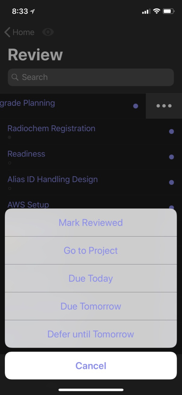
There are some surprisingly awkward interactions in the OmniFocus review system. One of the most common things I want to do during a review is to change the review period for a project. That process takes a lot of taps still. It’s so many taps that I usually just skip changing it and just review it the next week anyway.\
I love the ability to force press on a project in the Review list to take a peek at the tasks but then there’s no simple way to mark that project as reviewed without drilling down and marking it as reviewed. It’s a minor gripe but another rough edge where interactions feel inconsistent.
Now on to some of the new hotness in OmniFocus 3 (and some old busted too).
Tags
I’ve been ringing the “tags, tags, tags” bell for a long time. Contexts lost their value for me around iOS 6 when I had a super computer in my pocket every day that also connected to my work email. It was the lack of tags in OmniFocus 2 that eventually drove me to TaskPaper several years back. It was this long unscratched itch that made me curious enough to return to OmniFocus 3 and give it a serious try.
Tags provide more flexibility than contexts simply because each task in OmniFocus can have multiple tags. The Omni Group did a nice job making sure that tag hierarchy is respected for search, so this means all of the nice context nesting from OmniFocus 2 works perfectly with OmniFocus 3 tags. Parent tags inherit child tags. One of my most used set of tags relates to a project team and the the individual people on it. This team has about 12 people spread across six different work-streams. I have a team tag with the sub-teams as a nested tag. Inside each sub-team I have tags for the people. This is pretty similar to how I used contexts in OmniFocus. When I’m in a team meeting I search by tag and bring up a view of tasks related to that team. If I’m in a one on one meeting I can search by the person’s name and still see the individual items they are working on.
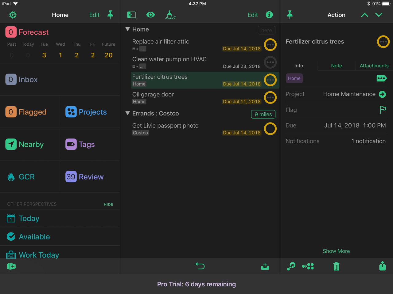
I’m also using tags in the traditional context model too. I have a tag for my office because some things can only be done there. I have a tag called “easy” which gives me a great way to blast out a few tasks in the morning from my Forecast view. That’s because Omni has improved the Forecast view to include tasks tagged with one user specified term. So my Forecast view shows what’s coming due plus a collection of “easy” things I can do in under a minute each. They don’t always have due dates but even if they do, they show up.
Project tags are also inherited by the tasks. If a project has a collection of tags, any task added to that project automatically gets the same tags. I haven’t found a use case for this feature yet.
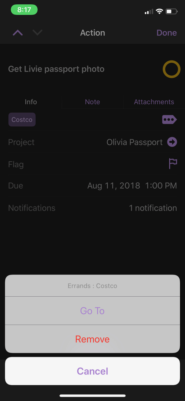
When viewing a task, I can tap and hold on a tag to quickly jump to view all tasks with that tag. This is very nice but all of these features lack keyboard shortcut equivalents, which makes OmniFocus 3 very touchy.
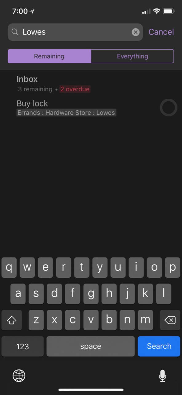
Tags are easily searched in OmniFocus 3 so it’s easy to quickly surface information. Just type part of a tag (or it’s parent tag) to get a list of tasks. It’s really great when I just want to quickly knock out some work.
Progressive Disclosure and the New Design
Much of the new design in OmniFocus 3 is either subtle or purposefully hidden. Task details are now minimized unless the user taps for more detail. For the most part this works better on the iPhone where space is more limited. But, on the iPad it adds more friction with no real benefit. For example, with the new three pane view, to get to a project’s details I must tap the project and then tap the “Show More” link at the bottom. Notice in the screenshot below how much space is empty yet still hiding details.
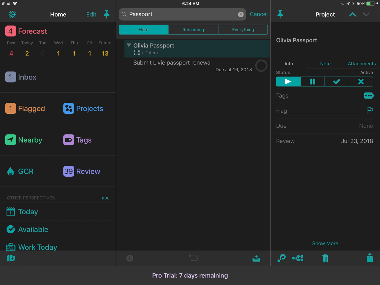
The three pane view on the iPad is an interesting decision. If you like things separated and structured then this is going to make you happy. If you like a more open layout, such as in Things 3, this feels like a waste of effort and space.
Moving items in the new three pane OmniFocus is confused to me, because Drag and Drop doesn’t work everywhere. When I am trying to arrange nested tags, my first thought is to just drag them around. This doesn’t work. Instead I am required to select a tag in the left browser column, tap the specific tag in the middle column, and then tap the move icon in the bottom bar of the right most column. This then brings up a tag list on the right to select the parent tag.
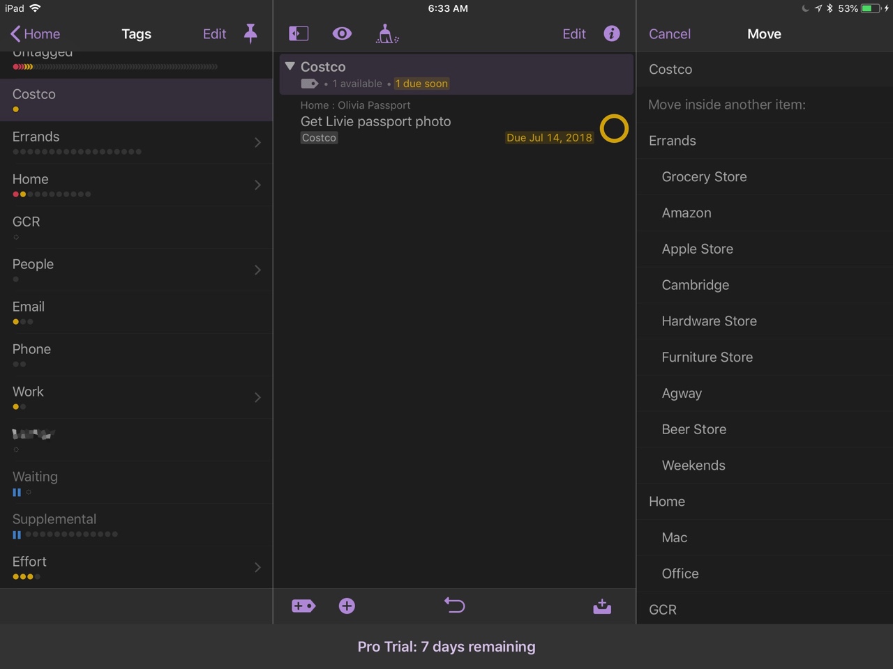
I prefer the dark mode in OmniFocus but both options (white and black) feel dated to me know. This might be psychological since I used OmniFocus for so long. However, the new design kept the old problems. For example, the decision to layer information around the check circle still seems poorly implemented. Just look at the help screen for the check circle.
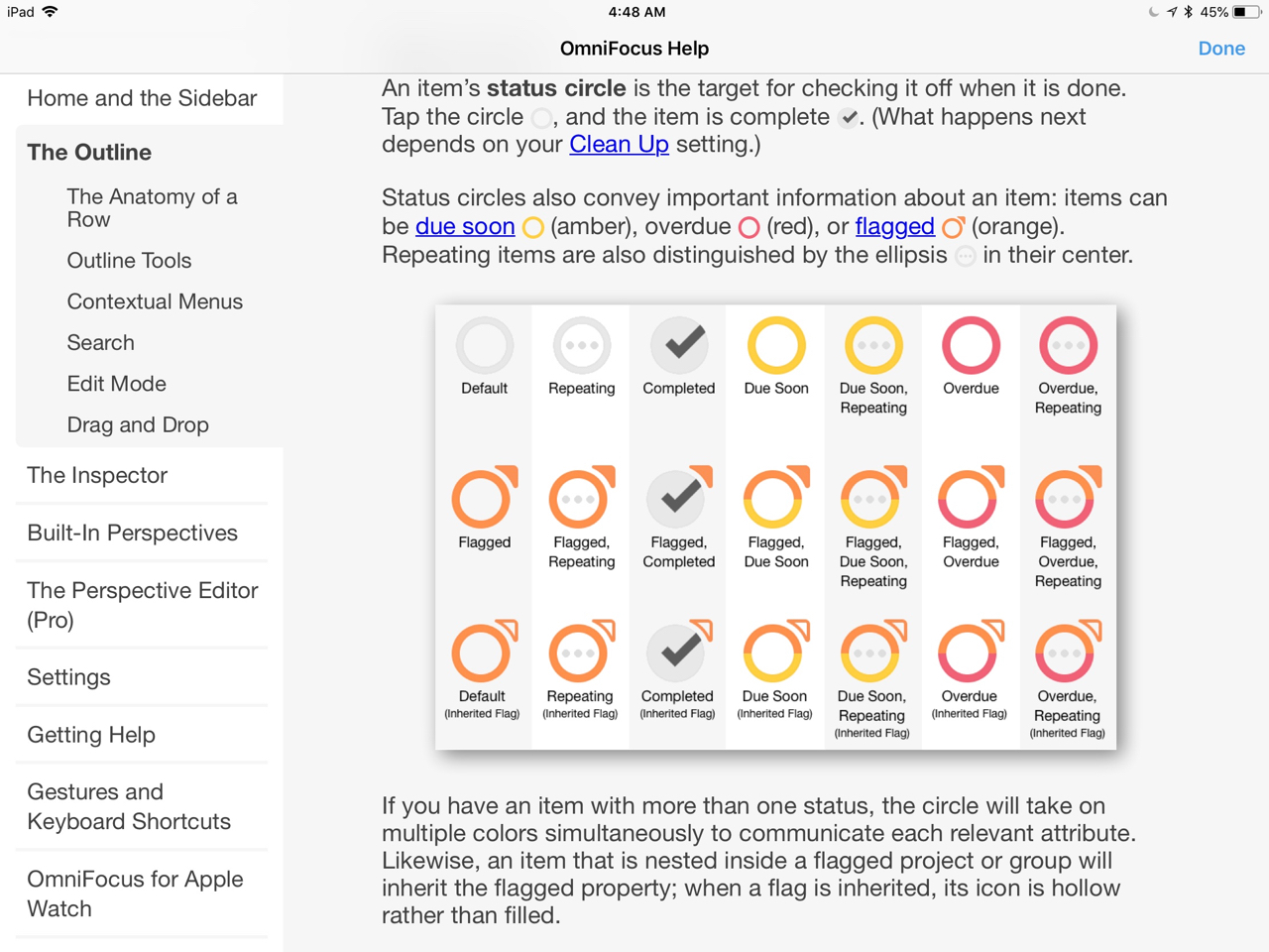
When the check box needs a grid like that, I think it’s time to give up on the design.
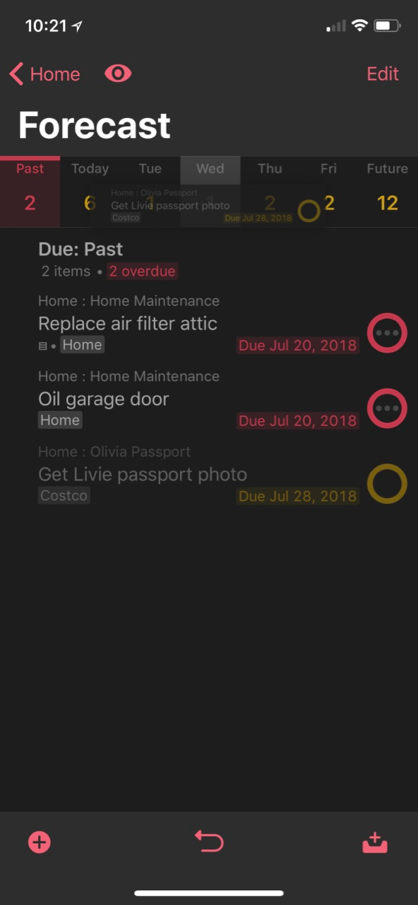
While I do like it overall, the new Forecast view isn’t perfect. I don’t like the new model of interleaving OmniFocus tasks with calendar items. Most of the time my due dates only accidentally have specific times. Usually I just want a list of tasks at the top with calendar events below that.
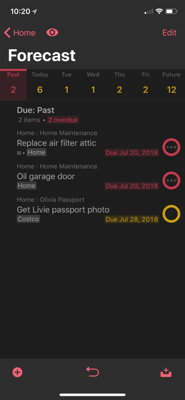
The drag and drop feature in the Forecast view is a very convenient way to postpone tasks. By simply grabbing a task that’s due today and dragging it to one of the future dates, I can reset the due date. This allows me to quick re-prioritize my day when things aren’t going as planned.
Perspectives
With all of the new support for tags, OmniFocus really beefed up one of their flag ship features. Perspectives now have many more ways to filter tasks. This is an area where OmniFocus is amazingly helpful. While the Things 3 search is fantastic, these OmniFocus perspectives I use mean I rarely need to search.
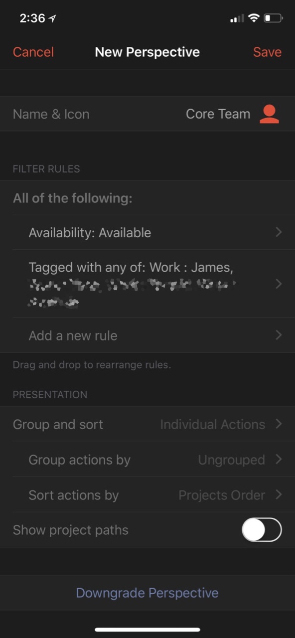
I’m still a bit disappointed that Perspectives didn’t gain more power. They are still mostly the same with a couple of new filters. I’d like more options to create custom boards or even drag tasks to a perspective to force it to co-exist without fiddling with the task details.
Other Highlights
The email-to-OmniFocus service works well. Unfortunately, the Things 3 email address is so “clever” that the corporate email filters at work never allow outgoing messages to the address. This means emailing myself tasks from work doesn’t work with Things 3 but does work with OmniFocus.1 This is not a new feature, just one I missed.
I’ve been spoiled by Things 3’s magic add feature. From virtually anywhere in that app I can add tasks. In OmniFocus 3, if I search for a project and then want to add a task to it, I need to then tap and hold a select “Go to Project” before adding the task.
Adding tasks with Siri works as well as it did in OmniFocus 2. I occasionally forget the syntax to get Siri to send a task to OmniFocus at which point I regret even trying. This is not OmniFocus’ fault.
This version of OmniFocus is very buggy. I experience crashes several times a week. It feels incomplete. Which, I think is my conclusion about this version. The new Mac app is not available yet. The Omni Group just announced the beta access for the web version of OmniFocus 3. These new iOS apps feel a bit like previews of what might be a great task management stack. I’m not sure it’s the best app for most people right now.
The lack of keyboard shortcuts and the incomplete drag and drop support across the app leads to points of confusion and friction for me. These problems are only tolerable since I really need the deep structure that only OmniFocus (and plain text) can provide. The Perspectives are wonderful for anyone with a complex project list that just needs to bounce from meeting to meeting and also get some work done.
If my work simplifies and I no longer run projects with a dozen different sub-teams then I would happily return to Things 3 and its keyboard driven interactions. I also prefer the airy design of Things 3 over OmniFocus 3, which feels simultaneously cluttered and empty. Even with all of these flaws, OmniFocus 3 is still helping me get stuff done, which is really the best summary I can provide.
-
Seriously, folks. I know you startups and indie shops think these domains are clever, but when you work in a huge corporation, that stuff is blocked left and right. Just use reasonable TLD’s for customer email end-points. ↩︎
