Re-Review OmniOutliner for iPad 3 Months Later
It’s been 90 days since OmniOutliner (a.k.a. OO) for iPad was released. You can find my initial impressions here. One thing about “initial impressions” posts is that they only scratch the surface of a complex app. My post was as much about my expectations as my actual usage. But I would argue that any “review” that is posted within a couple of days of the product release has the same slant.
To do a real review you need to live with an application. You need to integrate into your workflow to see how it all fits together. Superficial application warts like the icon appearance or the display font are easy fodder for quick reviews. That’s precisely why I like to live with apps for awhile before I write about them. But I made an exception for OmniOutliner for the iPad due to my anticipation for the release and my love of Omni Group.
The First Review
To sum up my conclusions from my first review, I thought that OmniOutliner was a well designed app that had large chunks missing. The biggest hole was the lack of document syncing. After the long wait for OmniFocus syncing and the subsequent relief when it finally came, I thought the Omni Group would nail OmniOutliner sync out of the gate. They didn’t. It felt like they didn’t even try. The Dropbox api may not work for OmniFocus, but certainly it should work with more static data like OmniOutliner files.
I also felt that the custom templates were a let down. They aren’t so much templates as they are lovingly crafted documents that you can reuse by deleting all the data and adding your own. That’s not a template.
Finally, I was hoping for some features specifically aimed at portable devices. For example, with little effort, I can turn a document for Numbers on iPad into a survey form. It leverages the portability to provide a new way of getting data into spreadsheets. I had hoped for something similar in OmniOutliner.
Review Two
My second review of OmniOutliner was really more of a review of the landscape around note-taking apps on the iPad. I put a large number of apps through their paces at a conference and OmniOutliner was one of the winners. While I still have the same complaints about the lack of sync and the predictable interface, the app is a champ at taking notes.
OmniOutliner for iPad shines in the same ways that OmniOutliner on the Mac does. It is great for hierarchical information. In someways it is even better than it’s Mac sibling. There’s no accidental creation of nested rows in the iPad version since there is no tab key on iOS. On the Mac, I am forever trying to tab to the next field in OmniOutliner, just to realize later that I indented a bunch of rows.
This Review
Now we have come to today. I’ve lived with OmniOutliner on iPad for three months. I’ve incorporated it into my workflows. I’ve attempted to bend it to my will with varying success.
I haven’t changed my mind about any of the complaints I had but I have softened a bit on some and steeled my resolve on others.
The Bad
I don’t want to focus on what’s wrong, but I want to get it out of the way. I’ve always been a “bad news first” kind of guy.
Sync
Sync is still the Achiles Heel of OmniOutliner on iPad. I would honestly use OmniOutliner (both Mac and iPad) more if there was true syncing. The problem is that I have to store documents in MobileMe if I want them accessible to OO iPad. By accessible, OO will allow me to COPY a document from MobileMe and edit it. When I’m done, I can EXPORT it back to MobileMe and overwrite the original. Copy and Export does not constitute a document syncing solution.
iOS 5 is purported to provide a native sync mechanism. I have no experience with it and I do not follow the “leaks” pushed as news across the web so I can’t tell you if it’s a viable solution for OmniOutliner. If it is, then I suspect that I will be pleasantly surprised and I will quit my complaining when the Omni Group rolls out an actual sync mechanism.
Templates
OmniOutliner has the ability to create beautiful outlines. Through combinations of text formatting and row coloring a user can create an outline that is elegant enough to be projected in a meeting or used at a kiosk.
However, as I described in my first review, it takes too much effort to take advantage of these options. To use a “template” you select one of the documents that already has the styling you want and then you delete all of the content and replace it with your own. That’s too bad, because it simply makes it too fiddly to create attractive outlines. As a result, all of my outlines use the default (and rather bland) document styling.
TextExpander
I feel bad dinging Omni Group for not supporting a third party app but that’s a common nerd-tool for Apple aficionados. I would be surprised if the folks over at Omni Group do not use TextExpander (TE). It’s way to useful to be ignored. The lack of support makes OmniOutliner more tedious to use. For example, the common “ddate” shortcut in TE is very useful but painfully absent when I’m in OO.
Notes
(EDIT: See the update at the end of this post. Also see Ken's explanations in the comments)There are features in OmniOutliner for iPad that feel like a peek into the development path. For example, there is a toolbar button to add a note to any row. That sounds nice, but in practice it’s not feature complete. The notes only allow plain text. There is no formatting or image pasting allowed. The note shows a globally formatted sub-row that can be hidden or revealed easily. I’m not sure what the use case would be that I would not simply add another column to my outline for notes. There might be one, but my various workflows have not needed that feature yet.
The Good
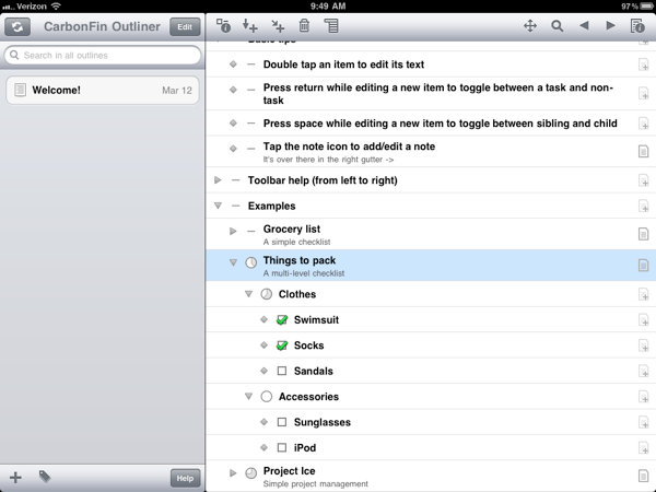
OmniOutliner is much more than an app for simple lists and outlines. CarbonFin Outliner is a great app if you just want to create quick lists and hierarchical outlines. In fact, if you want a flexible task list it’s hard to beat CarbonFin Outliner.
It’s Not Just For Outlines
OmniOutliner for iPad is a more full featured text editor with outline styling. The app can be used to create entire documents with a hierarchical structure. With the support for extensive text styling, and pasted images, the end product can look very much like a large formatted report.

The indent and outdent functionality is easily accessed at any time. This means that it is very easy to control the document structure. In addition, the view editor allows column display to be toggled so that row details can be shown during editing but then hidden for display later. For example, when taking notes during a presentation, I have a “Questions and Followup” column shown so that I can make notes to myself for for later. I can then hide that column when I am reviewing the notes with a collaborator or exporting the document. This let’s me have as simple or complex view of my document as required. The data is all still there, it’s just invisible for a specific context.
Columns
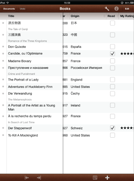
Any OmniOutliner for Mac user will know that multi-column outlines are far more useful than simple indented and numbered single-column outlines. OO for iPad brings the same versatility with a similar user experience. Instead of a dumb single text-column view, outlines can have complex meta-data through formatted multi-column designs.

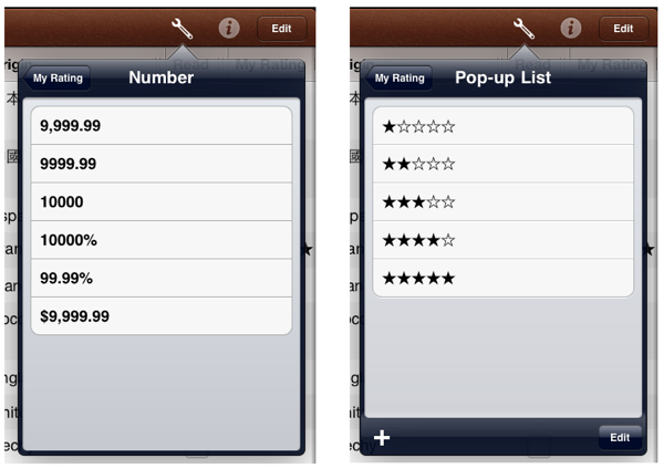
Columns come in six different types: Rich Text, Numerical, Date, Duration, Pop-up List and Checkbox. The data types go further too. For example, Numerical columns can have decimal, dollar, and percent formatting (too many combinations to list). Pop-up lists can use unicode characters for stars or emojis to create a custom rating scale. Date columns can use some natural language like “Today” for inserting dates.

My multi-column format for meeting notes includes several columns. Each project is its own document. Each document has several fields for the outline:
- Topic
- Meeting Date & Time
- Attendance
- Notes
- Followup Check-box
- Questions and Comments
When the meeting is over, I can simply hide all columns except “Topic” and email the notes to the attendees. My OmniOutliner document retains all of my meta-data but the export is simplified for everyone else.
Undo
Many apps have an undo function (only evil developers omit an undo function in an editor). The undo function in OmniOutliner has a nearly instant response to a tap. From what I can tell, the undo history has no finite limit. This is crucial since mindlessly changing a column data type will completely erase the values that already exist.
Unfortunately, there is not a matching redo button. Holding down the undo button presents an option for redo. It would be more direct to show the button alongside the undo button.
Export
Unlike CarboFin Outliner, OmniOutliner gives many options for exporting an outline. The most versatile format is OPML but the easiest way to share is via simple HTML in an email. It gives me a simple conduit for sending a meeting summary to a group of people within minutes of completing the meeting. The text retains the formatting and hierarchy and all visible columns are included.
As I posted previously, OPML means that I can take an OmniOutliner document and export to iThoughts HD for mind mapping. In fact since OmniOutliner supports OPML file formats, I can go from any app on iOS or OS X that supports OPML into OmniOutliner.
Unfortunately, since the Syncing is so bad in OmniOutliner, it’s tricky business to make the leap from app to app. OO forces me to email the document to myself or use a WebDAV service for upload and download. That’s too bad since it really makes me stop and consider whether I want to go through the trouble of transferring a document, or just stick with the app it’s already in. The only app on my iPad that makes the process of transferring a document to another app is the terrific iThoughts HD. I’d like to see OmniOutliner follow their lead.
On the Mac, I find the export to Excel plugin for OmniOutliner terrifically useful. On occasion I need send an outline to a collaborator that does not use OPML and needs more flexibility than HTML. The plugin is a separate download for the Mac and unfortunately not available for iOS. Excel or CSV export makes more sense to me than several of the built in options. OmniOutliner’s strength is in quick entry and exit for content creation but it’s by no means a final destination.
Conclusion
The best endorsement I could give for this app is that I keep the app in my springboard on my iPad so that it is immediately available. I use it nearly every day for many different purposes. It’s flexible and easy to use. It’s a great start and I am confident the OmniGroup will continue to evolve the features into a truly unparalleled experience.
This should be my last review of OmniOutliner. I promise.
Update August 22, 2011:
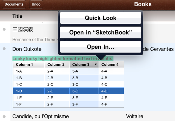
If you check the comments below you'll see that Ken Case from the Omni Group replied to some of my complaints. First and foremost he corrected my take on the Notes field. I was completely off the mark. There is text formatting and image pasting support in the notes field. My hang up was knowing when to use the style button and when to use the info button. After selecting some text, tap the Info but to adjust the formatting.

More importantly, the object support in the notes field is really great. After an image is pasted in, it can be selected and sent directly to an app that supports the format or simply viewed at a larger size.

Additionally, version 1.1 of OmniOutliner for iPad came out a few days after the review. The update add a really powerful option for outlines. They can sent directly to other apps that support OPML, HTML or text. That means OmniOutliner can now be used as a conduit for organizing information and then further modifying it in another app.
Finally, Ken promises that iOS5 will indeed bring syncing to OmniOutliner. That's music to my ears. I really hope Apple's syncing solution works. No one is happy with iDisk so the iOS5 syncing has a long way to go before they gain my confidence that my files are safe with their sync. That said, if it does work, I'm sure the Omni Group will exemplify how sync should be done.
