Paper App Review
If the Courier project is remembered for anything, it will be for being the only non-existent Microsoft product to generate so much media attention for Apple. In one week, the notebook app backed by a Courier project lead and a sketching app developed by former Courier engineers were both released to much hype and media attention. I reviewed the Taposé notebook app, so it seemed appropriate to review Paper.
Short Story
Paper by FiftyThree is a good sketching app. The technology is solid but it's a data silo. I have no need for the app until I can select, copy and export the drawings. The lack of zoom is a major shortcoming for me. The user interface is overly clever and frustrating. I haven't deleted it, but I will revisit it after updates to see if it gets any better. I give it no more than 3 months before I delete it for good.
The UI
Paper is too clever. I appreciate good UI design. I like novel ideas when they work. However, Paper's concerted effort to remove all chrome has created an app that makes users dumb. The drawing tools are only revealed after swiping from the bottom of the screen. This is not obvious. If a user misses the instructions at the beginning or forgets the gesture, they are left with an app that can only draw black lines.
My rule of thumb is that if an app has multiple pages of instructions when it launches, the UI is going to be overly clever. A good design informs the user naturally as the app performs its functions. It does not need an introduction slide show.
Paper has a clever UI element for undo. To rollback changes, the user twists two fingers. The problem I had with this control was that my hand covered the drawing as I was reversing, which made it difficult to see what was changing. The undo was also limited. The stack of changes was fairly small.
I could swear I was able to zoom in on one drawing, but I could never repeat the action, which sums up my UI complaints. The entire UI feels like it was designed as a college entrance exam. There's no right answer, they just want to see how you attempt to solve the problem.
These are pretty significant issues for me. Paper almost redeems itself by having one of the best ink systems I have used.
The Ink
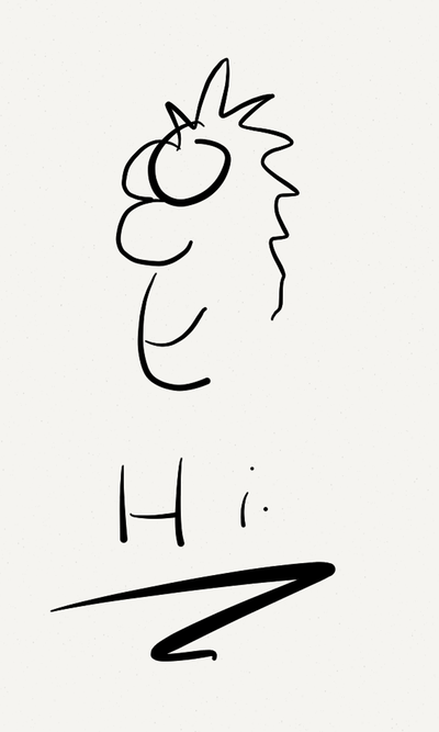
The ink is fluid and a joy to use. The drawing rate is high enough to feel like it perfectly matches the motion of my hand.
The faster the stroke, the thicker the line. That seems a little counter intuitive to me. With real ink, which I believe Paper is trying to mimic, drawing faster produces lines that are thinner and lighter. It does not feel like real ink to me but that's ok. It takes some getting used too in order to make the pen behave how I want it to. That's not ok.
I also bought the "pencil" tool as an In App Purchase. The pencil behaves much more appropriately. Drawing a line quickly produces a thin and light grey textured line. Drawing slowly produces a slightly thicker and dark black line. The drawing effects are very well done.
Data Portability
My second biggest complaint about drawing apps (next to ink quality) is data transportability. Paper fails here too. There is no way to select all or a portion of a drawing and copy it to the pasteboard. That means the only way to get a drawing out is to email it, or more ridiculously, share it on Facebook or Twitter. That's silly. iOS has a pasteboard. Why not use it to allow me to copy a drawing and paste it into a Pages document? Or how about if I wanted to paste just a piece of a sketch into an email?
I rarely sit down and sketch out a single idea. A page may have doodles or areas where I play with a thought. I certainly don't want to capture all of that in an email.
Paper is by no means the only sketching app that omits a copy and paste tool but it's still a reason for me to not use it.
Getting to the Details
There's no zoom. There's one view to a drawing. It's like they tried to cut out all of the benefits of Paper's digital nature and make it as close to analog as possible. What's the point of using a piece of software then?
Death By In App Purchase
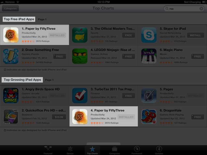
I don't like IAP. I've made no secret of that opinion. This image is really all I need to say about IAP and Paper app.
I would have simply preferred an honest version of the app with all of the tools for a single price. Yes, through IAP, I can get all of the "essential" tools for one price. It feels sneaky to me though. It's like advertising a cash price for gas but charging more for credit purchases. You know damn good and well people are going to use credit most of the time, just tell them what it will really cost right up front. Right now, that is $8 for Paper
Here's the rub with IAP: I'm left wondering if cut-and-paste as well as zoom were omitted only to be added as additional purchases. When an App is dependent on IAP, I'm doubtful that much attention will be given to updating the core functionality. As I always tell people, buy the app for what it is now, not what you hope it will be. Right now, Paper is not worth the price for me.
Audience
The advertisement for the app implies that it was designed for artists to finally get out with their iPads and get back to creating art. In my opinion this app is aimed directly at people that wish they were artists and some how think this app will make them more creative. It will not make anyone more creative or insightful than carrying around a $0.50 notepad and a couple of pencils and pastels. I'm not trying to be "minimal" or austere. I happen to think that real artists would not fiddle with this app. If you don't regularly sketch, this app will not make you do so. If you do regularly sketch, this app will piss you off.


