The Feed Reader Reviews Newsblur
Introduction
Google Reader is essentially dead. Its passed on. This reader is no more. It has ceased to be. Kicked the bucket. Shuffled off its mortal coil.
I’ll miss the syncing service, but I was never really thrilled with the interface so it’s a minor loss.
Rather than throw out a bunch of alternatives that I’ve never used more than five minutes, I’ll give you my opinions from the ground up. This post begins with the winner, Newsblur.1 Future posts will discuss alternatives in the context of Google Reader, Fever and Newsblur.
Newsblur
Newsblur has been around for awhile but, like all RSS readers, received a huge influx of new users over the past two months. I tried it awhile ago before going back to Fever. Let’s be honest, it wasn’t great. There were bugs and it was ugly. But I liked what it had at its core. What it had was an honest and eager developer with some good ideas. So I kept up with the Newsblur blog and I’m glad I did. See this Verge article about the developer and the recent Newsblur redesign.
Before I get into the review and tutorial, let’s get this out front. Newsblur offers a free account that will sync 64 feeds. Forget that exists. If you care about your feed reader, go buy the $24 annual subscription to the premium service.2
Getting Started
Newsblur offers direct import from a Google account. The import preserves all of the folders (or tags). After the import, I ended up with all of the subscriptions I had in Google Reader.
Newsblur can also import from an OPML file. I exported my feed data from Fever and imported directly into Newsblur. This worked perfectly. Every feed came over organized just as I had it in Fever.
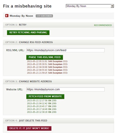
But here’s where Newsblur already starts to impress. Browsing through the feeds, I noticed several with a yellow exclamation mark. Clicking that icon shows that the feed is broken, but Newsblur offers up a couple of solutions. You can choose to either retry or use a new feed. If Newsblur already knows about another feed for the site it will suggest the alternative. This fixed several of the dead Feedburner feeds cluttering up my list as people flee Google.
The Reading Experience
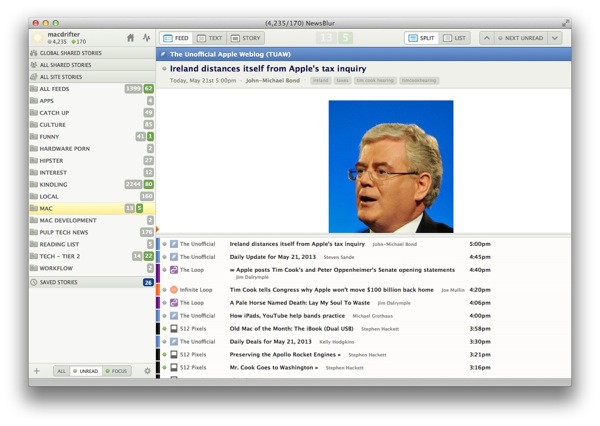
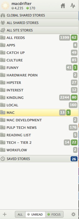
Newsblur presents a similar yet more effective design than Google Reader or Fever. While feeds are grouped by folders, Newsblur also allows nested groups.
The main feed list may be toggled between two different modes, a simple List View and a Split View. The List View is a continuous stream of full articles. Scrolling through articles marks them as read.
I prefer the Split View, which presents an adjustable list of articles on the bottom and a full article view on the top.
I also turned on the option to show unread counts on the feed groups.
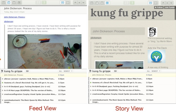
Newsblur provides three reading modes:
- Original: The website home page
- Feed: The article feed source. This is the feed as generated by the site
- Text: A readable plain version of the article parsed from the website
- Story: The article as read on the website
Each feed can be configured with its own preference. That way pretty sites like The Mindful Bit can be read as it should be. Ugly and offensive sites can be viewed in a simple readable format.3
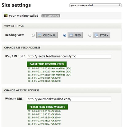
Newsblur has a good number of keyboard shortcuts to satisfy the Google Reader user. They are familiar enough to be proficient within a day of switching.
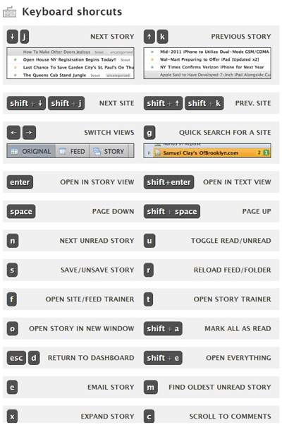
The careful placement of tools is welcome in reader. The Mark All as Read toggle is available right on the reading list bar.

Changing what is displayed in the feed list (unread, newest first, etc.) is easily accessed right on the list bar as well.
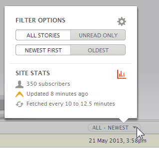
There’s even an option to fix the marker that is used to set an article as read when scrolling. Slide this little arrow up and down. When the article title passes this marker it is automatically set as read. Basically, it allows me to tailor whether I need to see the entire article or just the title before it is marked as seen.
General Aesthetics
I started this review before the latest update to Newsblur. I’m glad I waited to publish because the new Newsblur is much more pleasing to the eye. Everything is cleaner and easier to use. There are nice animation effects and overall non-news information is less distracting.
The service has a number of general settings to help customize the experience.
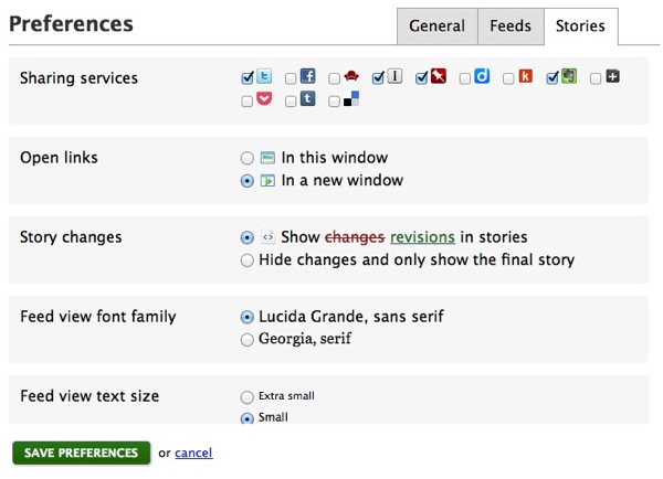
Newsblur incorporates font adjustments right into the application. Helvetica or Georgia can be used and the point size is adjustable from 12pt to 17pt.
There is one little bit of visual clutter I actually turned on in Newsblur. I like the way it captures edits to articles over time and show the additions and deletions. This is an option.

The Great Intelligence
Where Newsblur departs from the crowded space of mediocre feed readers is with the customizable Intelligence training feature.
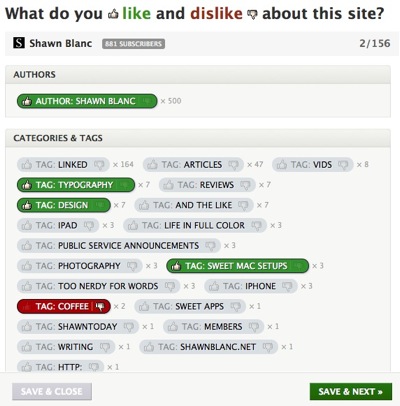
Out-of-the-box, Newsblur is just a typical feed reader. Click on a group and see all of the new unread articles. Click on a large collection and give up. But right click on an article and choose Intelligence Trainer. In the Trainer window, select a tag, author or word from the title and mark as thumbs up (green) or thumbs down (red). It’s a simple process of selecting a word or phrase in a title. Topic tags are generally recognized from the source, as well as author tags. As a publisher, there are a couple of ways to make more information available to Newsblur and it’s all in the FAQ.
Here’s the magic: Articles that contain a thumbs-down term are hidden from the feed list. Switching to the Focus mode shows only articles that contain thumbs-up terms, hiding both the undesireable and unrated. Only articles that contain a positive attribute make it through the Focus mode.
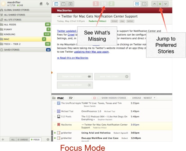
By casually training Newsblur I’ve given myself a very easy way to get to just the news I want to read. This may seem insular, but in reality it has made high volume sites like TechCrunch and The Verge useful to me. I can now subscribe to them and get just a trickle of articles from writers I like or topics I care about.
If I want to see everything, it’s easy enough to switch modes and show every article in a feed or group of feeds. Newsblur provides visual cues throughout the interface to indicate stories I should like. There is a green count indicator in the folder view and items in the article list receive a subtle green dot. Words in titles that match my preferences are highlighted in green, as well as authors in the bylines.

Entire feeds can be marked as Thumbs-up. There are several feed sources that I do this with. This allows me to quickly toggle to the Focus mode and select a feed group. Every article is visible in the list.4
You know what is a pleasure? Selecting my All Feeds category and only seeing 20-30 articles that fit exactly what I’m interested in.5
The Dashboard
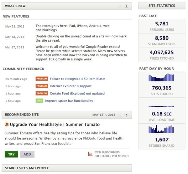
The Newsblur Dashboard is superfluous but has some small value. It’s a place to see information about the service, like new features, community feedback and the total feeds and users on the service. The Dashboard also provides some suggestions for feeds to follow but it feels like these suggestions are purely based on popularity because they had no relevance to my taste.
Hooking Up the Pipes
While Newsblur has an option to export feeds as OPML, there are few good ways to get information back out. The web interface has several options to invoke bookmarklets but the experience is tedious and takes the user out of the reading context.
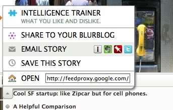
The iOS apps have a slightly better experience for sharing but still not great. There are some aspects I really dislike. See below for further discussion.
The big problem is that none of my favorite feed reading apps support the Newsblur service. I hope that changes. They make a great API. Get to it Mr. Reader.
The Social Hour
Newsblur has a number of social features built in. You can follow users and share stories to your “Blurblog”. I do not use these features because I don’t like social networking.
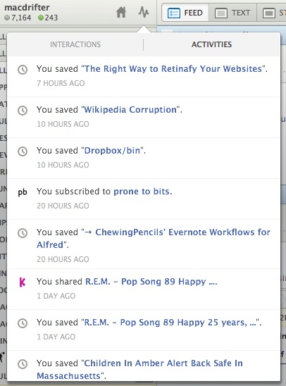
I do like the activity monitor. Newsblur keeps track of what I do. If I saved an article it shows up in my activity monitor. Clicking an activity takes me to the article. It’s not terribly useful but it’s also not intrusive.
The Apps
Here we are, at the real deciding factor for most services. How can someone use Newsblur? Well, I’m happy to say that the iOS apps are really good. They load fast and have almost all of the features as the Web site.6
iPhone
The iPhone app is laid out well. The app launches to the list of feeds and folders. Tapping a folder instantly shows the list of articles. Best of all, the Focus mode works perfectly. It’s a great way to dive in quickly, read some interesting stuff and get out.
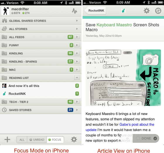
Tapping on a story shows the feed view with a great layout that highlights the tags and authors. Stories can also be viewed in the built-in browser by tapping the compass in the upper right corner.
The Send To functionality is nice but limited. I was disappointed that there was no option for Pinboard or Pinbook sharing on iOS. The Copy function is also a little odd. It doesn’t copy just the address of the current article. It copies the title and the URL. This could be great for Drafts actions but stinks for getting articles into Pinbook.
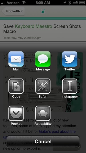
After sharing an article on the iPhone, the screen smoothly scrolls to the bottom of the page to show the sharing summary. The experience is nice and feels like a lot of thought went into how people actually read.
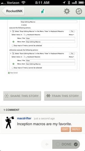
The reading experience is nice. Quickly plowing through stories with the big NEXT button is smooth. This feels like a native app with no delays at any point.
I noticed a couple of bugs in the iPhone app where the next-button overlapped the Training-button. Given that the training function can be accessed by a dropdown menu, this wasn’t a deal-breaker.
iPad
The iPad app is also great. It makes appropriate use of the space and isn’t just a web view or an upscaled version of the iOS app. As with the iPhone version, the iPad version is responsive. Articles open instantly. The feed list refreshes in just a couple of seconds.7
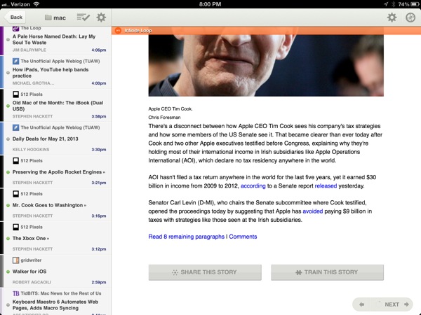
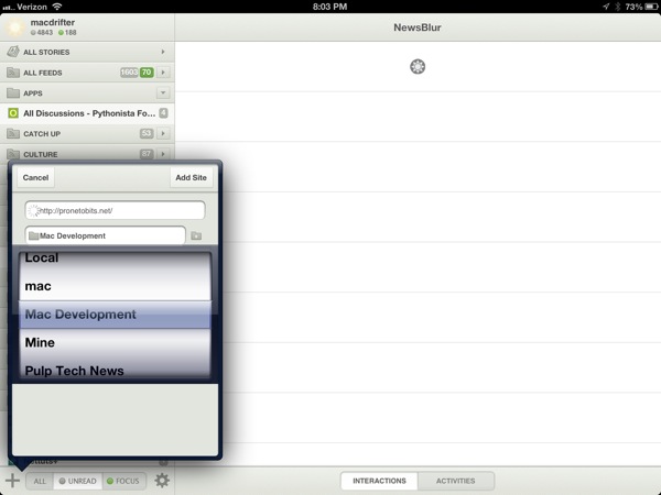
All the functionality is still there on the iPad. Adding feeds is easy. Just fill out the URL and set a folder for the new feed. Move feeds and share articles just like on iPhone or, for the most part, the web.
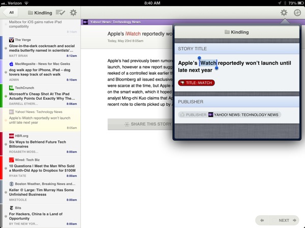
The Intelligence Trainer works just as well on iPad as on the web. Select title text or tags to filter by tapping and swipping. All of this filtering data is sent back to the Newsblur service to improve the reading experience across your account.
What’s Missing
The big gap is search. There isn’t any. I can save articles until my heart is content but I have to browse through them to find anything specific.
The second big gap is that lack of integration with IFTTT or Zapier.8 In Fever, I used the RSS feed of my favorites to pump articles into Pinboard. There’s no such option in Newsblur.
While the Trainer is excellent, I’d like more control over the system. I’d like a way to see everything I’ve ever given a thumbs up or down to. I’d like a way to manually add terms without needing to see them in an article first.
Conclusion
Newsblur may be the best feed reading service I’ve used. It certainly feels better than Google Reader ever did. It’s faster and the Focus mode is terrific. Newsblur sets a standard that is hard to beat and I’m happy to pay to support something so valuable.
-
If you like Newsblur, then congratulations. If you chose some other reader, then you probably settled but I’m still happy for you. ↩︎
-
Are you sad Google Reader is dead? Then pay to keep stuff you like. The only free services are dirty services. You’ll pay one way or another. Often, not in the way you’d like to. ↩︎
-
I feel no guilt about filtering garbage on the internet. If you make no effort to be kind to a reader, then I make no effort to help you monetize. I’m happy to click your ads if you are willing to not smear feces on my screen. ↩︎
-
I can finally read my local news without wading through a bunch of crap about sports I don’t care about. NFL? Nope. NHL? Nope. Underwater Basket Weaving? Nope? ↩︎
-
Before I get comments about how this can be accomplished by just following fewer feeds, let me clarify. The material coming from small thoughtful sites is what I care about most. It’s not typical link bait and not the common churn on high volume sites. But there’s still a lot of noise. ↩︎
-
The Newsblur web app is excellent. Much better than either Google Reader or Fever. I still prefer a native app on iOS. ↩︎
-
I have over 300 feeds I’ve subscribed to. A refresh in Newsblur never takes more than a couple of seconds because most of the work is done server-side. ↩︎
-
I’ve been informed by Sam, the Newsblur developer and owner, that they are working on adding OAuth. Once that goes live, services like Zapier and IFTTT should be able to interface more easily. ↩︎
