The Feed Reader Reviews Feedly
This is part three in a multi-part series.
Part one: Newsblur
Part two: Feedbin
Feedly is the only “free” service I’ve examined in this series. It is at least partially ad supported. The ads aren’t particularly obtrusive, but I would still prefer to pay for the service and not worry about how they are mucking with my reading. In this way, it’s very reminiscent of Google Reader.
As with other Google Reader alternatives, there is an explosion of development and advancement happening with Feedly. This review will cover the features that exist at this moment. I will not return to update this review with new feature highlights in the future.
The Ads
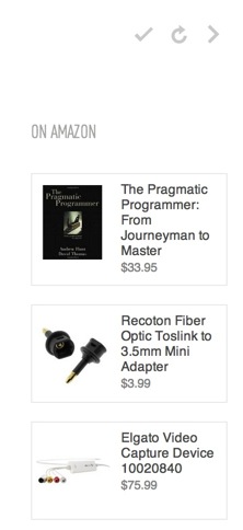
Let’s get this out of the way and move on. The ads I’ve seen in Feedly are always on the home page. There are Amazon links in the lower right corner. They seem relevant1 so maybe they are spying on my reading habits. I don’t know. I’m not particularly concerned if that’s all they document.
Getting Started
There’s one way to get going with Feedly. It connected to my Google account and slurped in all of my subscriptions and folders.2 But it’s better than that. It also pulls in all of my saved articles. That’s pretty great.
Feedly just recently switched from syncing with the Google back-end to using their own web-sync. I haven’t noticed any difference since my account was switched. However, there is no obvious way to import an OPML file of feeds. When Google Reader goes away, I have no idea how someone would get started with Feedly other than adding one feed at a time.
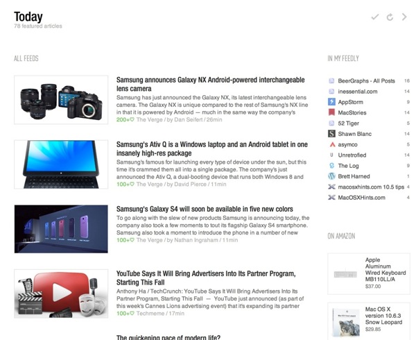
Upon entering the Feedly experience, I was greeted by a “Today” page of irrelevant miscellanea. The Feedly Today page is nice looking but I just don’t care about it. It shows a few of the articles from my collection along with several Amazon ads.
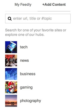
Feedly follows Google’s lead and also offers ways to find new sites or quickly add an old favorite simply by searching for it. I didn’t use this service since I already have a rather sizable list of sites I like to read.
Managing Sources
Feedly has one of the best interfaces for working with feed groups. It’s 100% drag and drop. Organizing feeds is very easy in Feedly. The card view isn’t just more elegant than most other services, it feels more effective. Within a couple of seconds I was able to improve my collections and clean out my feeds.
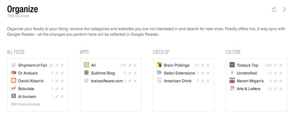
Grab a feed and just drag it to a new category. Or drop it on an empty card space to create a new category. Rather than clicking open 50 different folders, all feeds are visible in one flat view.
The Reading Experience
Feedly comes in several flavors. There is a web application that can be accessed through a Chrome or Safari plug-in and there are mobile applications for many devices.
I really hate the plug-ins that Feedly seems to force on me. When visiting the Feedly site, I was left with the impression that I had to install the plug-ins in order to use Feedly. I still think that is the case. Every visit to Feedly in Safari requires re-authentication of my Google credentials.
I found the web app to be unresponsive in Safari. Occasionally clicking a button performed no action or the widget would fail to load the articles.
The “magazine” layout is popular right now and Feedly jumps right on that bandwagon. The default Feedly views on the web and iOS were not pleasant. Content is laid out in pages of small, medium and slightly larger than medium squares. If there’s an image in the article, then that is used as the content preview on the page. I just want to plow through the articles in my feed aggregator, not roll around in pile of thumbnails.
Fortunately, Feedly provides a number of other views that can be set globally, per group or per feed. These views include the following:
- Titles Only
- Magazine
- Cards
- Full Article
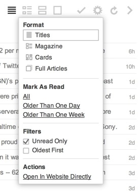
I greatly prefer the “Titles” view because I’ve been conditioned to quickly scan articles and mark them as read. The most efficient way for me to do that is with a long list of titles with the site name under it.

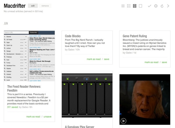
The card view of a feed can be a nice way to browse a site with a lot of screenshots. It gives me a quick feel for what I can expect. But, similar to the “Magazine” view, I just don’t like browsing feeds this way. A simple article title list is usually enough to get me through my RSS articles in the minimum amount of time.
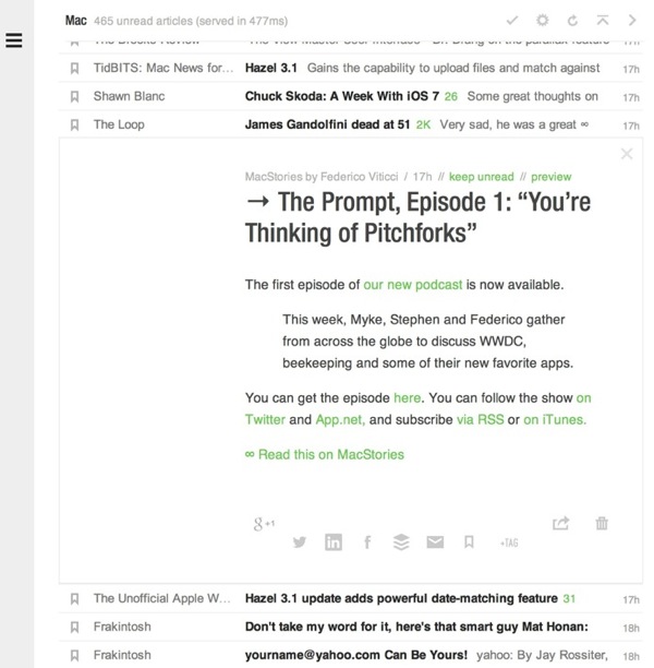
Clicking on the article quickly opens the plain view of the article. I’m not a big fan of all of the green links, but Feedly allows for some minor customizations of those colors in the preferences.
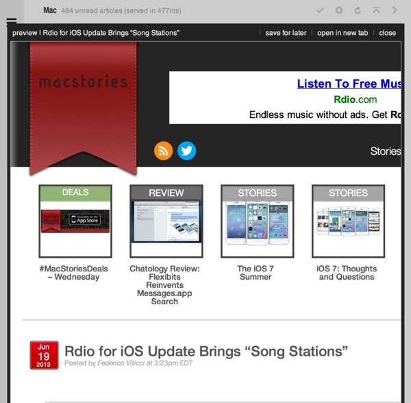
I really appreciate the embedded full view option for articles. Clicking the “preview” link at the top of the article opens and embedded frame with the full article view. No separate tabs or browser windows required. When I move on from the article, the frame closes with the feed item.
Marking feeds as read needs to be easy and Feedly gets that. There are several methods available. Keyboard shortcuts work but they are not the shortcuts I’m familiar with.
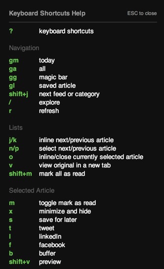
There are also convenient links under article groups to mark all above the current line as read. At the end of each feed group there is also a giant “Mark all as read” link. Overall, it works well.
The iOS Experience
Feedly is promising a public API but right now there isn’t one. There is an API that has been made available to several services and a couple of app makers. I have to judge it based on what I see now. There may never be a public API. It is what it is.
As a consequence, I’m stuck with the Feedly apps on iOS. They aren’t terrible but they aren’t my favorite either.
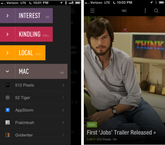
There is an option between two themes, of course, I prefer the dark theme. There are also a number of other settings to control the overall feel of the app.3 For example, I switched the list transition to the “Scroll” animation. The Feedly iOS has abandoned logic and implemented their own list browsing animations. Instead of a smoothly scrolling, rubber-banding, list, you get a stack that swaps out a screen full of list items at a time. I hate this.
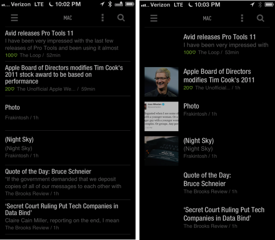
I also found the iOS apps to be unresponsive at times. Tapping on a group would show a wait-animation for several seconds and occasionally require me to kill the app and restart before the list would display.4
Rather than perform a single, long article cache, the Feedly apps cache single groups when tapped. I just didn’t like the experience of waiting for the articles to populate the view.
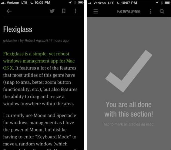
There are some good things about the iOS apps too. They put the sharing features front-and-center with easy access to Twitter and saving features. Feedly also embraces gestures quite a bit. Groups can be marked read with a swipe and there are few forward and backward buttons cluttering the UI.
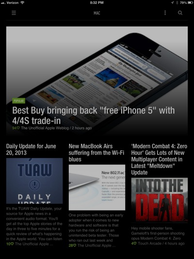
The reading experience is very nice on the iOS devices. The font choices are good and the article layout is well done.
Sharing
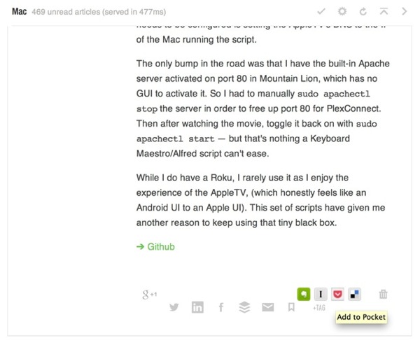
There are several ways to get articles our of Feedly. There’s little customization but it does work, if the Feedly has decided to add. For example, Pinboard is missing from Feedly. There’s no option to add it as a sharing service either.
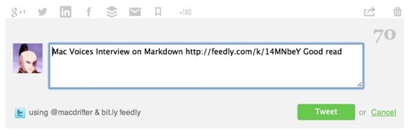
However, the integrations that are there work great. For example, Twitter sharing opens an embedded Twitter compose window, complete with character counter.
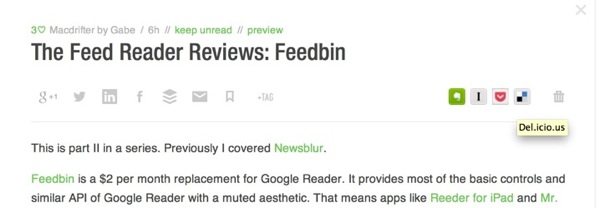
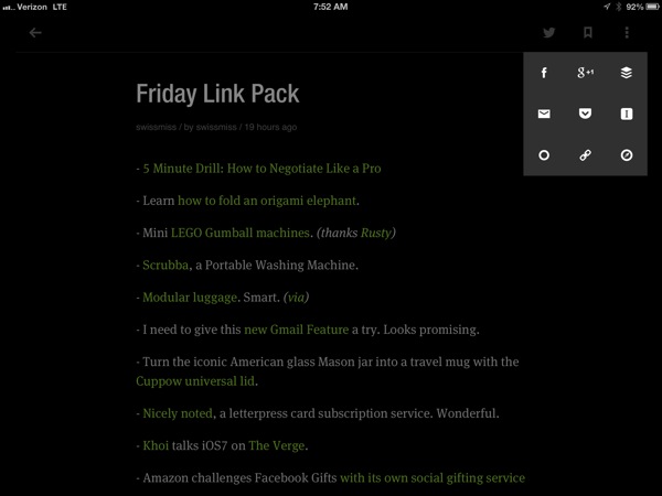
Accessing the sharing services in Feedly is very easy. They’ve pushed all of the toolbars right to the top of the article view in the web. Alongside the “Save” and “Tag” feature, there are options to share by email, Twitter, Google+, Facebook, LinkedIn and Buffer.5. Then there’s a second toolbar with Evernote, Instapaper, Pocket and Delicious.
On iOS, the three vertical dots at the top of the article view immediately display all of the sharing functions.
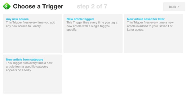
Being the biggest fish in this tiny pond6 means Feedly has some advantages. There’s already planned integration with feed reader apps like Reeder. But there’s also an IFTTT trigger already. Previously, I pushed my Google Reader favorites into Pinboard using IFTTT. Every favorited article triggered IFTTT to create a new bookmark in Pinboard. That same power is available for Feedly now. In fact, the Feedly triggers are better than the Google triggers for the way I would want to use them.
Other Bits
Feedly have some unique features that set it apart from some of the other Google Reader alternatives. There is built in support for tagging of articles. If that’s your thing, it’s easy to use and Feedly shows all tag options when you click to add one to an article. The tags then act as groups in the article sidebar. I don’t use this.
There are also Stock symbol trackers. I don’t even want to know what this is for.7 I don’t live in the world of financial-fixated day traders pretending to understand how the market works.
Conclusion
Feedly is a nice alternative to Google Reader. Now that they have their own syncing service, it’s a reasonable replacement. I’d say it’s better than Google Reader in many ways. But some of their design choices don’t fit with the way I want to read news.
The lack of a public API also means the apps I want to use on iOS just aren’t there. I also really dislike their browser plugin requirement for connecting with Feedly in Chrome.
Like most of these alternatives, there are still some missing Google Reader features. For example, Feedly sorely needs search.8 Importing my Google Reader favorites was wonderful, but not having a way to search makes it almost useless.
While I can recommend Feedly, if you already like it and are too cheap to pay for a service you use everyday, it’s not for me. I still prefer built-in filters provided by services like Newsblur. Feedly is good, but it’s not the evolution of RSS. It’s good enough.
-
They are usually for nerd toys and mostly nerds would be using Feedly right now. ↩︎
-
Feedly is only accessible by login with Google credentials. Kind of lame. ↩︎
-
For some reason these are not in the standard settings menu but rather are in the “Advanced” settings. ↩︎
-
It feels like the iOS apps are not handling article caching very well, but who am I to criticize. It’s better than the feed reader I built. ↩︎
-
Really, there’s a ton of ways to share crap these days. Too many ways. Do people actually share articles on LinkedIn now? I’m old. ↩︎
-
From anecdotal twitter searches and various recent articles, it appears Feedly is receiving the most attention. I’m also seeing a lot more Feedly links on Twitter. It feels like the majority of people and sites I interact with have chosen Feedly. ↩︎
-
Of course, I do know what this is for. I wish I didn’t. ↩︎
-
They claim it is planned. It does not exist now. ↩︎
