MindNode 3 Update
MindNode 3 for iOS is out now and it’s a huge update.

I’ve been working in concept maps on a daily basis for several years.1 Any project or reasonably complex endeavor starts as a concept map. So I am very particular about the applications I use. MindNode 3 for iOS is one of my favorite applications for working through an idea. It has fluid action for panning and zooming, a gorgeous design and an unbeatable outline view.
The Design
I want to start with the design of MindNode, because right now that is where it has no equal. Concept maps in MindNode 3 are beautiful. The application also provides many controls for customizing each node or all child nodes of a map.
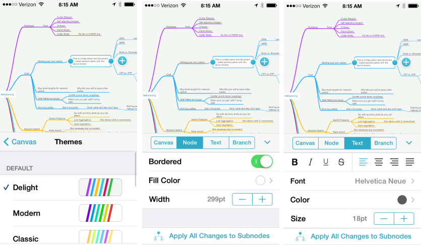
When it comes down to it, a concept map is a visual device. While it is extremely functional, it should also be nice to look at. MindNode really delivers on that.
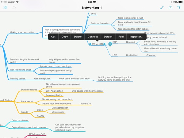
MindNode 3 is a universal app that feels at home on the small screen of an iPhone or the larger screen of an iPad. My example screenshots are all done with an iPhone because I think that’s the more difficult interface for connecting mapping. MindNode 3 gets that right. Here’s an example from the iPad. It’s also right.
Sharing
MindNode 3 has one more leg up on the competition: Sharing. MindNode the usual options like sending to other apps and uploading to Dropbox. But my favorite feature is the ability to share maps through the MyMindNode service.
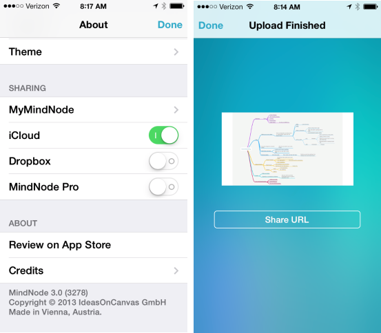
Once uploaded, you get a URL to a web version of a map that you can share with anyone. No account or login is required for viewing. The map is read-only so you don’t have to worry about someone else editing your map. But the recipient can download or embed the map.
Here’s an example link: https://my.mindnode.com/StDzK6mJGt8o8ac3duTtyQk3DV6gxEHjtqTB6bRT
And here’s an embedded map:
How it Feels
As a long time iThoughts user, I have high standards for how a concept map should feel on iOS. iThoughts is smooth and fluid when working with a map and node creation is easy. MindNode 3 achieves the same high standard.
Zooming and panning is mesmerizing in MindNode 3. There are few apps on iOS where scaling and moving objects is seamless. There’s no pixelation or image redrawing artifacts. Maybe I’m just particular but I don’t want to feel the application or OS at work when I’m focused on a map.
Creating nodes in MindNode 3 is easy. There’s the standard tap to select from a menu, but it follows the iThoughts design of 3 quick returns after text on a node creates a new sibling node.2 I also like the extra keyboard row for adding child and sibling nodes.
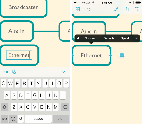
You can also tap or drag the plus symbol next to a node to create a new child node. That seems like a tedious way to create a node until you appreciate that you can drag and attach it somewhere else. That functionality is a time saver when I come up with a new idea that belongs somewhere else in the map. It’s a small feature, but then again, great apps are really just a bunch of small features done really well.
Outline View
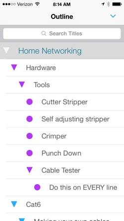
The outline view in MindNode 3 is a nice way to interact with a complex map. It displays all of the nodes in a collapsable view that is colored just like the source map. This view is read-only but it really helps for finding my place in a large map. The outline is dynamically filtered as a search term is entered. Tap on a the node and the view instantly changes to the map and selects the corresponding node. I love this feature.
Conclusion
MindNode 3 is a dramatic improvement over the previous version. If you already own it, then you get all of the new awesome for free. If not, it’s the first worthy competitor to iThoughts.
iThoughts still wins in the functionality categories but MindNode 3 wins in design and sharing. In my daily use I regularly share between the two apps. Both support sending a map as OPML which makes it a breeze to work between many different applications (like OmniOutliner for example).
MindNode 3 | Universal | $10
-
Many people refer to them as Mind Maps. I’m old school and don’t like it when things get a copyright symbol for no reason. Also, a Mind Map typically only has one central node. That’s too limiting for my needs. ↩︎
-
I’m not sure if this was first introduced by iThoughts, but iThoughts was the first iOS concept mapping application that I used and it had it years ago. The major difference is that iThoughts uses it to create a new child node, which makes more sense to me. ↩︎
