Freeform Project Timelines in Curio for Mac
I’ll admit it. I’m a project manager that really hates Gantt charts. I dislike them because they surface a project schedule at that cost of depicting dependencies and details. They have their place but I prefer that place to be on someone else’s display.1
I prefer to draw timelines myself and I like to capture more than just task sequences. I create flow diagrams for an entire project and include details like milestones, risks, trigger events and team functions. I’ve found OmniGraffle on the Mac and Visio/PowerPoint on Windows moderately good for creating project flow diagrams. I also really like Lucid Chart as a web app.2 But the application that feels the most flexible and organic continues to be Curio for the Mac.
When we started on TapCellar for iOS, I did the normal project manager stuff like sketching out timelines and determining dependencies and risks. I created those rough timelines on paper and in OmniPlan. But the timeline that informed most of our decisions was made in Curio.
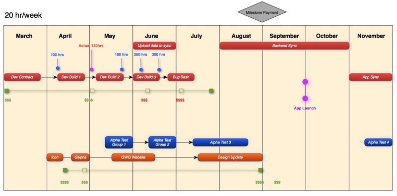
The Basic Timeline
This is not that complicated and works the same in many applications other than Curio. For a reasonable timeline I like to break the project down into quarters, months, or whatever is the appropriate timescale. I’d suggest starting with the really high-level view that covers the duration of the entire project in one glance and then creating additional views as needed.
First, create a tall and skinny rectangle with whatever styling suits your taste. Be sure to have an outline color that stands out prominently. This will become the time points. Hit ⌘+D (duplicate) until there are enough time points. Select them all.
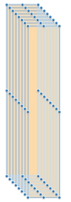
Then use the distribute horizontally command followed by the align top edge command to finish building the calendar plane. Now use the Group function to seal the deal.
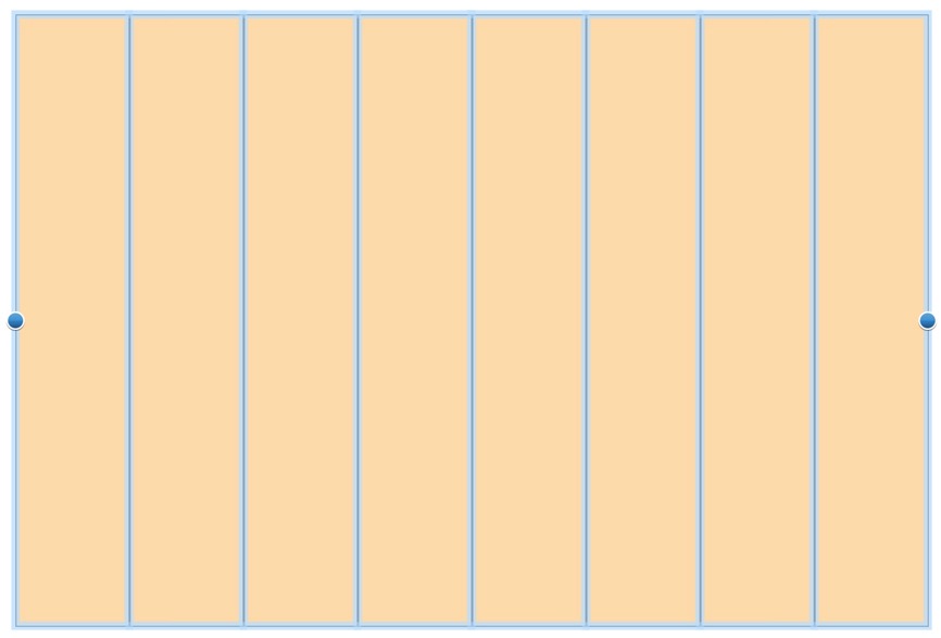
Throw whatever labels on the timeline that help. It’s just text. Format things that need to standout and leave off markers that have no actionable work or risks. Now, select everything again and group it again. Follow this up by using the Lock function. Now you can add and move other things around on top of the timeline without moving the timeline or markers.
Project Flow
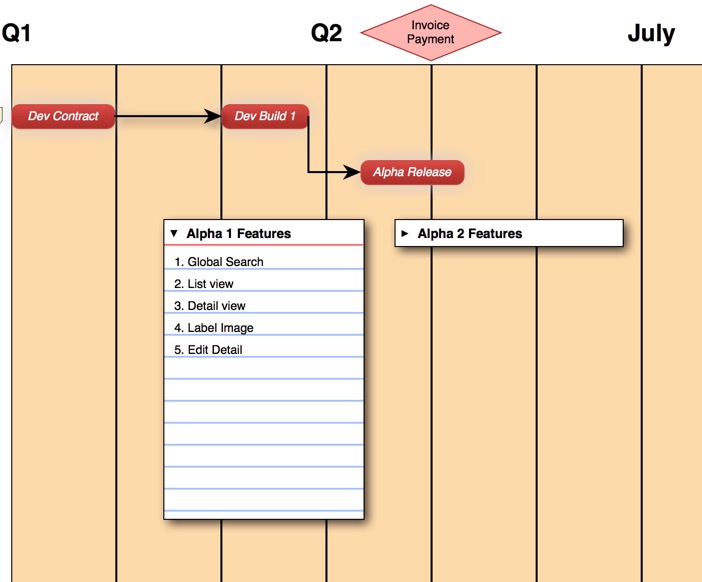
This is the meat and potatoes of the project plan. My project flow diagrams highlight major events connected by arrows. But I add a lot of other information that directly impacts or is an outcome of the tasks. This is where the fun begins, and I really mean that. I actually enjoy sitting down and unpacking a project from the top level down to the nitty-gritty.
In Curio, I create a formatted shape that I find appealing and start stringing together the plot points. Along the way, I annotate major events and let my neurotic worst-case-scenario lizard brain run the show. Sketching out failure points gives me an early sense of the quality of a plan. I’ve heard people say that the best plan is to take your worst case schedule and double it. I’d suggest then taking that schedule and doubling it again. Humans suck at planning. Well trained humans suck even more at planning.
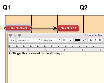
Now, I’ll deviate from what every other diagramming application can do, and jump into why I like Curio. Just about any object in Curio can have a note attached. It’s not a hot-pink Sticky note of some meandering sidebar text. It’s a big giant block of text accessible through an obvious icon on the object. A Curio note even hovers on-top of other windows so it’s prominent in the diagram when it needs to be. Search in Curio is useful enough that text buried in notes is easily surfaced and highlighted. Notes in Curio are on equal footing with the objects they are attached to and become part of the story.
I accentuate the timeline with Curio index cards too. These are essentially formatted text boxes but they add character and call out the content. They can be formatted in meaningful ways and collapsed when not helpful. I like them because they add valuable context to a timeline without detracting from the the milestones and pacing of the project diagram.
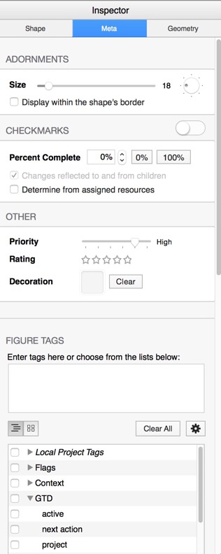
If I were only using a Mac, I’d probably even leverage the built-in Curio task management options. Zengobi has put a lot into this aspect of Curio and it doesn’t feel like a hack or afterthought. Any object can be assigned a priority, deadline, resourcing, percent complete or various other tags. Curio then provides a task-management view into the attributes to show how things are progressing. In Curio, a simple diagram becomes a real timeline that has meaning.
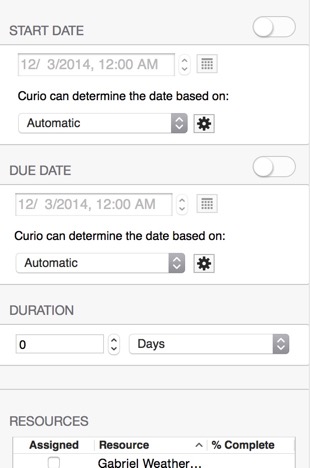
Curio even gets Start Dates right. How many task managers on the market don’t even consider that a complex project can have hundreds of tasks. Why look at them all right from the start of an 18 month project?
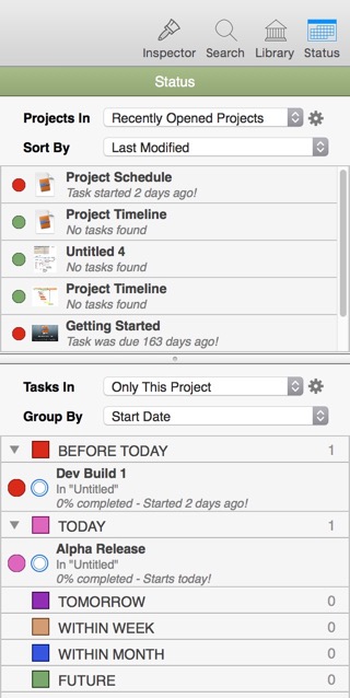
None of this information would be of much value without a way to see a relationship to the project. There are a few options in Curio to surface the start and due dates through the Status panel. While working inside the Curio project, the Status sidebar provides a quick way to see anything overdue or upcoming. There’s a lot of thought that’s gone into this product.
By selecting the background of the Curio project canvas, the Inspector gives access to several valuable options for being a bit more proactive about project scheduling. Curio can sync with both the Calendar and Reminders on the Mac which makes project schedules even more meaningful. Due dates get alerts and live outside of the Curio application.
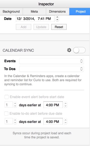
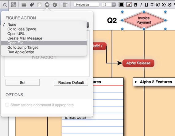
There’s plenty more to Curio. It brings the best of PowerPoint and Visio but adds something new to the mix that’s really powerful. Without even getting into the options for actions or the extensive mindmapping and outlining options, Curio is still one of my favorite planning tools on the Mac. It can hold reference documents, links, notes and a project schedule in one single place and tie it all together in a meaningful way. It’s an incredible achievement.
If Zengobi brought Curio to iOS, I’d be the first to open my wallet and pay anything they wanted for it. Unfortunately, it’s been long enough that I don’t see that happening and it’s the biggest pain point I have with using the application full time. Without quick access to my project details on my iPhone, I’m hesitant to put too much effort into maintaining my Curio project file as a hub of information for my work. Instead, I plan and then output to PDF or some other dead format. I then keep that in something universally accessible like Dropbox or Evernote.
In short, if you manage projects I can recommend Curio as a great toolkit with a lot of power. If you manage projects and work on a Mac all day, then it’s a no-brainer. Go get Curio.
Curio | Mac Only | $100
-
This will likely raise the ire and comments of other PMs. A smart man once told me that it’s not the tools that make the successful project manager. It’s understanding your risks. I guess rambling comments are my risks for this post. ↩︎
-
Lucid Chart gets extra points for being able to import OmniGraffle files. ↩︎
