Fresh Air and WeatherNerd
I’m not sure why, but I love iOS weather apps. They are a playground for data visualization plus the weather in NE fluctuates between unlivable and moderately nice so it’s important to know how many jackets to wear.
The latest two weather apps to catch my attention are Fresh Air and WeatherNerd. Both are packed full of information, don’t require subscriptions and have surprisingly useful hooks.
Fresh Air
I’ve been checking Fresh Air every day for a couple of months and it’s slowly making its way to my home screen.
The first hook in Fresh Air is the design. It’s beautiful. There’s an ambiance in Fresh Air. The display changes with the time of day and transitions smoothly from a warm pink in the morning to a cool blue at night.
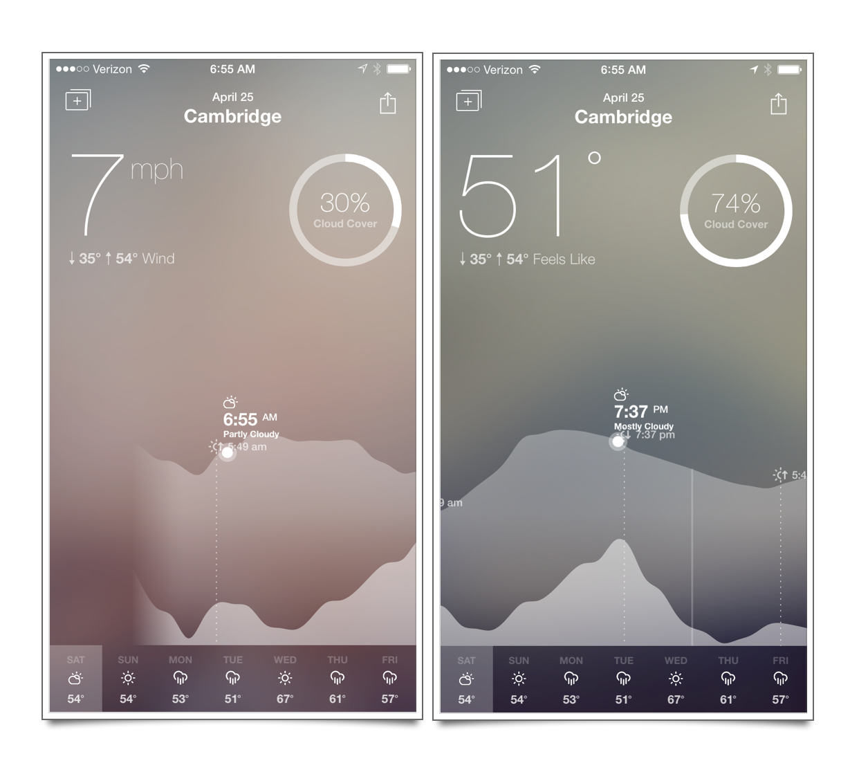
The second hook is the scrollable weather graph and abundant data. The view in Fresh Air is a continuously scrolling graph of the week punctuated by informational icons in the upper portion of the display. Tapping an icon changes the displayed metric, such as humidity, cloud cover or wind speed. I’ve found the information to be accurate
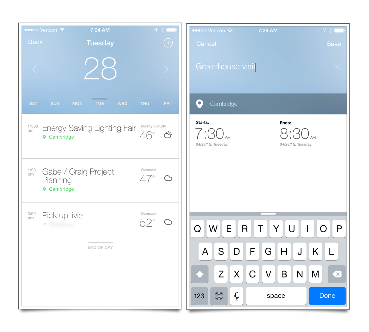
The final hook in Fresh Air is the Calendar integration and view. First off, you can see your calendar right in the weather app with the forecast for each event based on the event’s location. That’s pretty nice if you travel or have a bunch of meetings around town. You can also add events with new locations from within Fresh Air and they are added to the default iCloud calendar. It’s a surprisingly useful option.
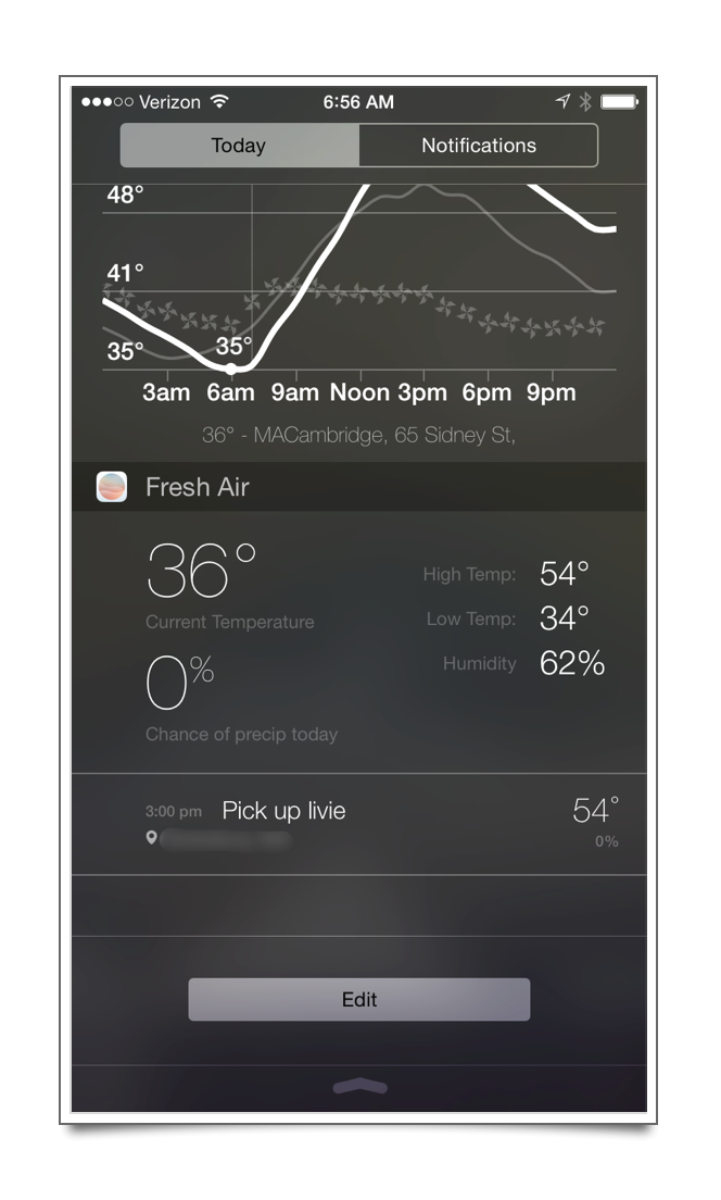
The Today widget for iOS 8 is also very nice. It displays the current weather as well as the calendar events for the day.
Here’s a demo video of the app which shows the UI and interactions.
WeatherNerd
WeatherNerd is new to me but I think it lives up to its name. It is chock full of data in a pleasant way and has a boat load of its own hooks. As with Fresh Air, the design of WeatherNerd is impeccable and beautiful. There are also several new ideas I didn’t expect to find in a weather app.
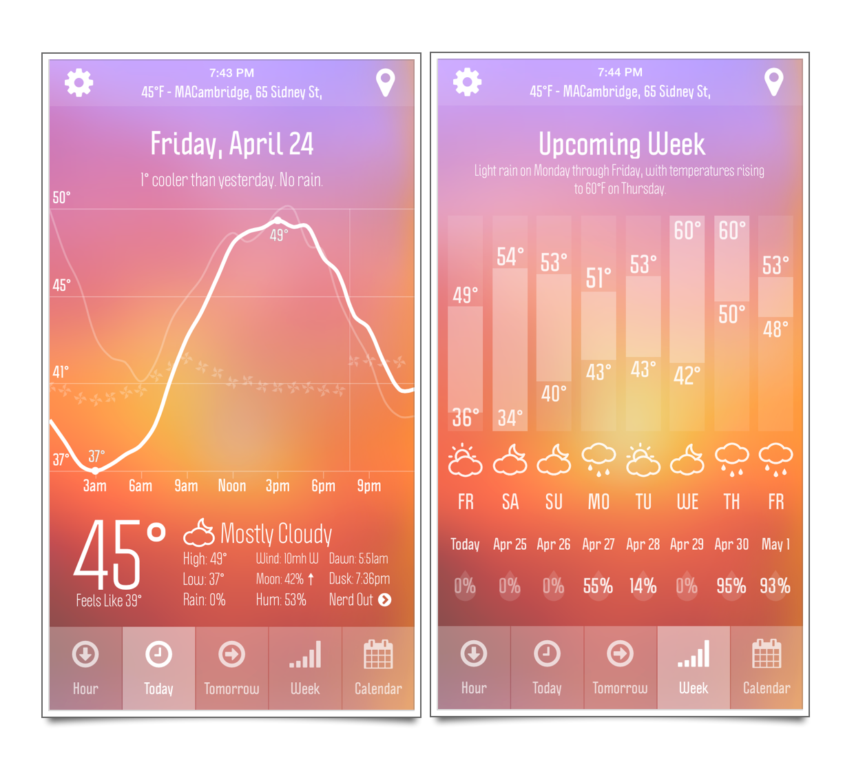
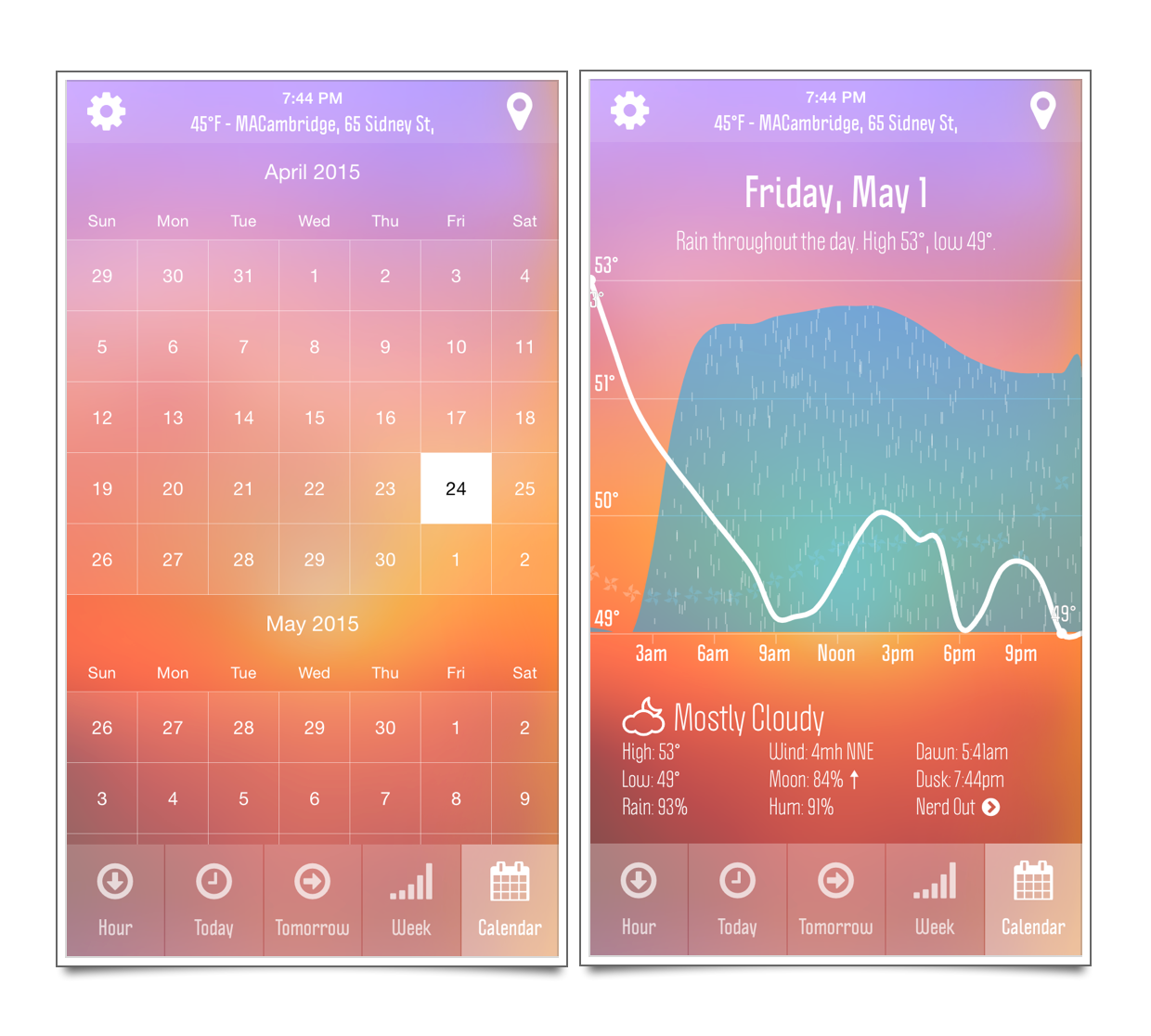
As the above screenshot demonstrates, WeatherNerd is pretty. The color scheme changes with time of day and always looks nice. There are several different animations on the weather chart to indicate meaning, such as spinning windmills or falling rain.
I also really like the buttons to switch between modes. I know that it’s classy for weather apps to use swipe gestures to switch between multiple different views, but as a user, it’s really much more convenient to tap on a button that says “Tomorrow.” You don’t have to use the buttons to switch views, but I usually do.
The calendar view in WeatherNerd is a bit different. It lets you look at past weather conditions as well as weather predictions far out into the future. It’s not clear to me how they estimate the weather 3 weeks away. I haven’t made the effort to verify the accuracy.
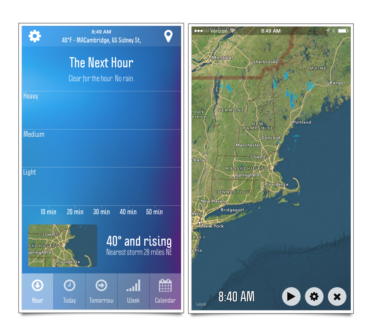
The hour view is very nice. It’s large and readable and provides quick access to a customizable radar view of the area.
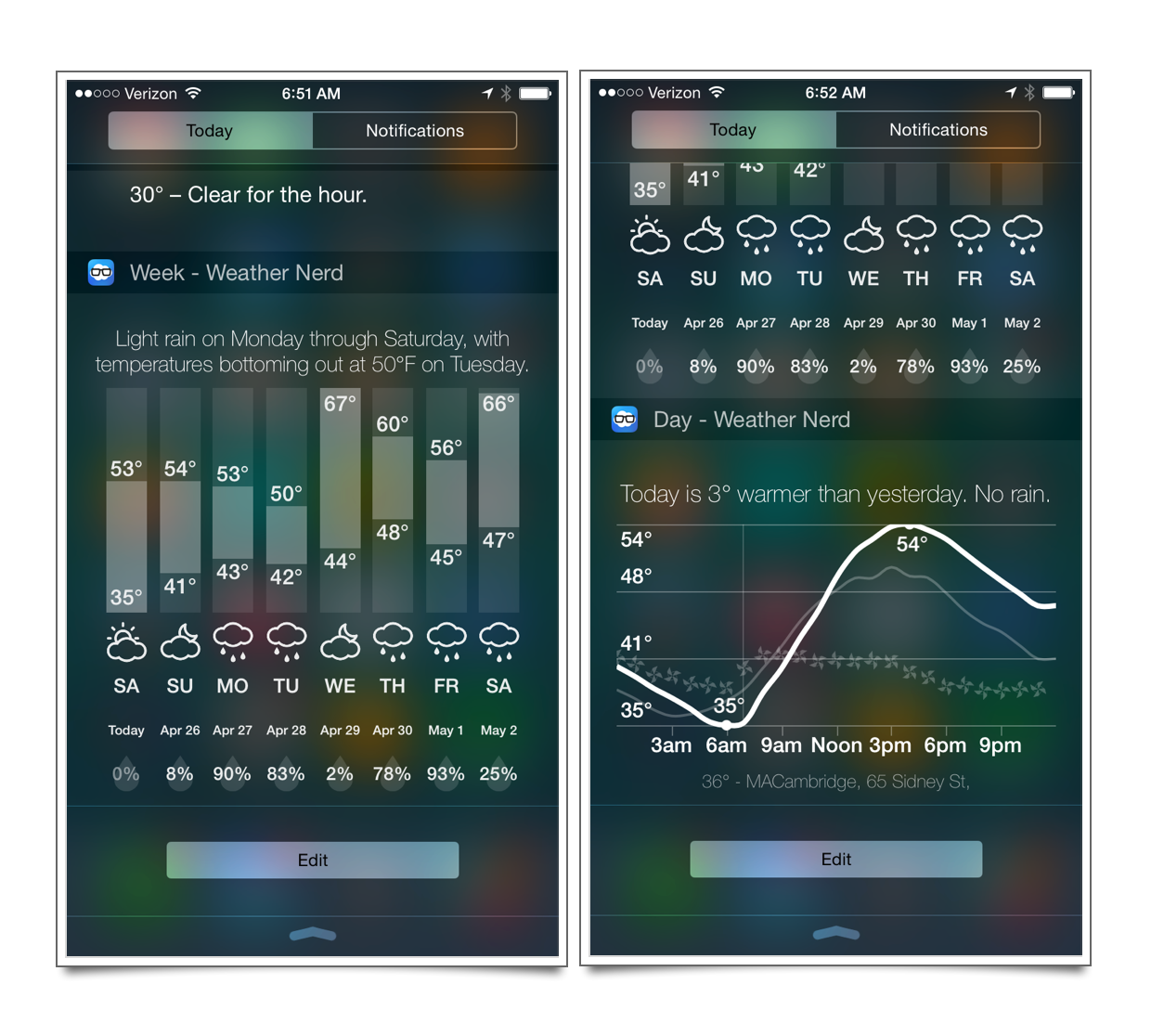
WeatherNerd provides two different Today widgets: today and weekly. They both look nice but are a bit large for my taste. I do appreciate that I can use one or the other.
There are several options within WeatherNerd, like daily notifications of a weather summary as well as turning off the share button.1
As with Fresh Air, I think a video highlights the nice interactions in WeatherNerd.
Both Fresh Air and WeatherNerd are powered by Forecast.io, the same people behind the iOS app Dark Sky.
Fresh Air | iPhone (and Apple Watch) | Free with $3 IAP
WeatherNerd | Universal (and Apple Watch) | $4
-
Maybe it’s just me, but unless there’s some major weather event, it’s unlikely anyone cares about my weather. Of course, I could be wrong. People seem to be all over pictures of burritos they can’t eat. ↩︎
