Curio 10 Released
The hardest part of reviewing Curio for Mac is explaining what it is. It’s like a light-box for information. Or maybe it’s a bulletin board of data. Or maybe it’s a mind mapping application that’s also a rich content organizer. None of these convey exactly what Curio can do. And now version 10 is out and it adds even more, which makes a direct comparison to another tool even more impossible.
The Basics of Curio###
Curio documents are divided up into pages called “Idea Spaces.” These are similar to slides in a slide deck. They can hold anything and can be reordered and nested to provide context.
The most basic elements of Curio all revolve around information capture. This Mac app not only supports almost any content type you can throw at it but it supports it natively. Create a Pages document from within Curio and the content is indexed for search. Double click it in Curio and it opens in Pages for editing.
Capture
Curio is a great little research tool. It integrates directly with Evernote to provide quick access to your library of notes. But it goes way beyond that now with the Curiota system capture app. Now you can cruise around the web or just your own file system to capture anything into Curiota and direct it to a Curio workspace.

Projects
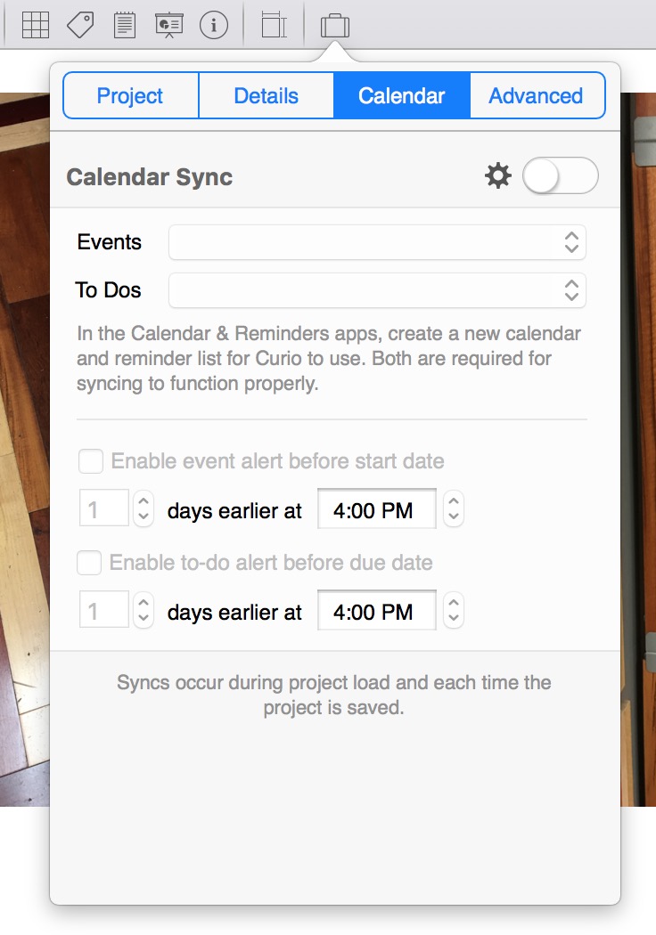
The calendar integration works well with the Curio native project management tools. Set time-lines and progress and get the convenience of reminders in your iCloud calendar. If all of your project work is done in Curio then you really get a huge amount of value for managing deadlines.
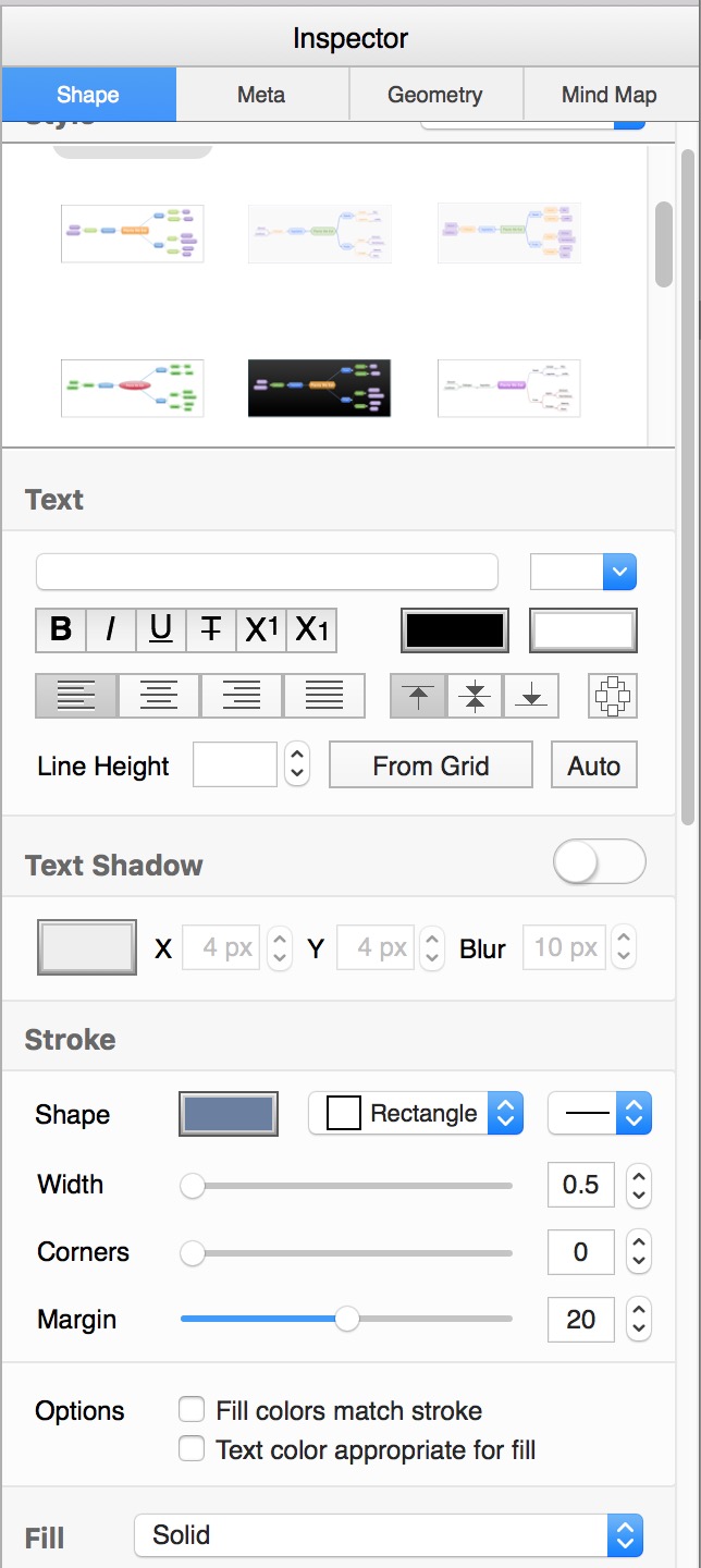
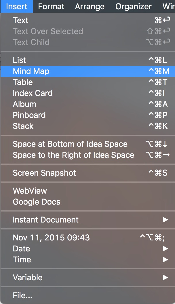
The variety of native content types in Curio is mind-boggling and it’s not a cheap version either. IF you like working with Mind Maps then Curio Mind Maps are going to be perfect. It provides a variety of quick ways for building out a map or transforming a nested list into a new map. There’s also plenty of formatting options to make great looking maps.
Curio has some great ways to bucket information, especially lists. The “Index Card” objects are perfect if you are familiar with apps like Scrivener. It makes lists portable little cards you can move around and organize on your workspace. The lists can be nested, formatted and include check boxes. The “Stack” is new in Curio 10 and it’s a terrific improvement of standard lists. Items in a stack can be rearranged through click and drag or turned into a task with a check box. As with most Curio data elements, even arbitrary files can be attached to a Stack item.

As with all Curio objects, you can insert a Mind Map or Stack anywhere on a workspace. You can insert any number of objects on a page and format each one differently.
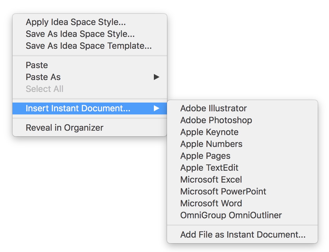
And then there are all of the other Instant Document types Curio supports. Inserting a Pages document is one click away. Double click the document to open it in Pages for editing. Save and close to have the content indexed in Curio for search.
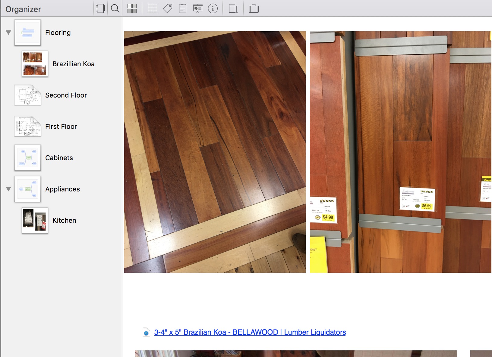
All of this comes together as a Curio project. These are particularly useful to me for organizing a large variety of content for a single area of work. For example, a new house design or a landscaping project at home. I can dump in photos, hyperlinks, YouTube videos, and PDFs. I create relationships between them or add notes. Heck, I can even add a star rating to images and filter all of the content in the workspace by rating.
Search
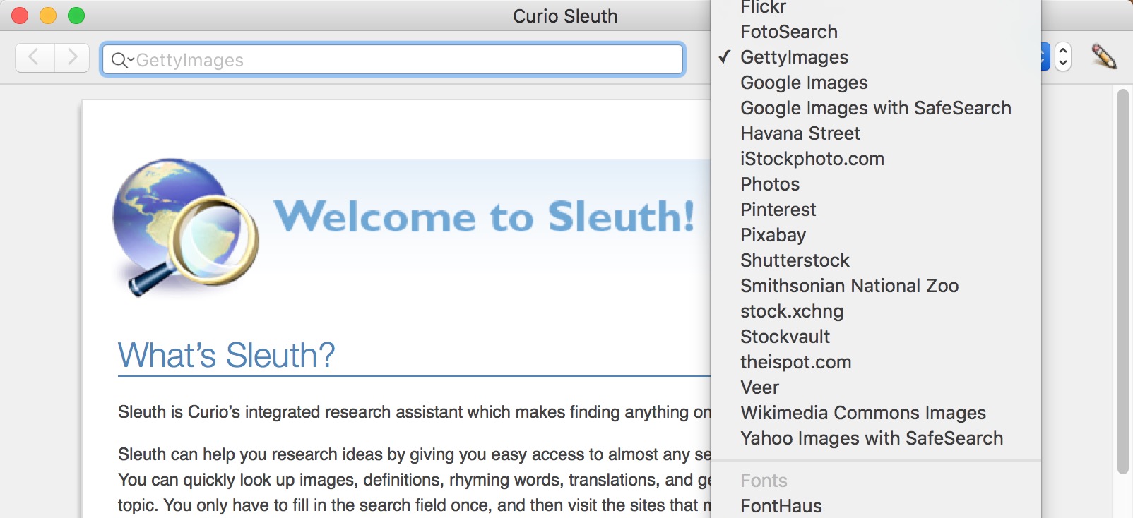
The Curio Sleuth functionality pre-dates the new Curiota companion app. It’s an easy way to perform web-based research and capture the results right into a Curio project. It’s still a useful feature but less valuable now that Curiota can capture information so fluidly.
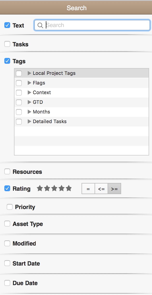
Since Curio is designed to capture a huge amount of information, it also makes it easy to find that information later. Every piece of meta-data is searchable in Curio, along with the object contents too. This makes me want to use the advanced features more. Ratings and due dates are more than fiddly toggles. They are actually useful when you want to slice and dice a big content-rich project.
The Cons
Curio is a premium application and comes with an appropriate price point. That makes it even more important to highlight the downsides. There are few negatives to Curio and someone with schizophrenic tendencies could argue with themselves for days about them.
Project pages can be slow to load when they have multiple content types or just a lot of images. For the most part, it’s not noticeable until a project gets big. But it does creep up when you get excited about loading a ton of stuff into a project.
There’s A LOT of functionality in Curio and it can be dizzying to navigate everything. I suggest focusing on learning about one feature category at a time and then moving on. Learn about Mind Maps, then List, then Instant Documents. Play with Google Docs integration for a day and then maybe graduate to object actions.
The price can be a turn-off if you already use Evernote or DEVONthink. I get it. But Curio is it’s own thing and it’s the best at what it does. You’ll pay for that kind of functionality. But I find myself returning to Curio for things it’s not really marketed for. It’s terrific for throwing together a quick timeline with a project Mind Map then exporting the page as a PDF.
It’s Not Everywhere
I want to use my giant phone to view a project workspace or capture a photo into my Curio project and I can’t. While I could publish a project as an interactive Web site there’s no native application on iOS. It’s weird, but I guess my biggest complaint is that I can’t use Curio more. It’s a big obvious complaint. Curio is a container for my research and if I have to wait until I get home to use it then it’s a non-starter for many projects.
I use Curio for projects that will only ever exist on my Mac. That’s a rare occurrence these days. When I do work in Curio I love it. It’s such a perfect research and organization tool. When the Evernote Mac app gets drunk and dreams of what it wants to be when it grows up, it dreams of being Curio.
Curio 10 | Mac Only | $130
