The New MindNode 5
I’ll be honest, I hate most mind-mapping apps. A good mapping app does more than just put text on lines. It should make it easy to capture, organize, and then use ideas. MindNode is one of a handful of apps that I can recommend.
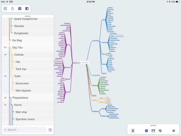
The new MindNode is just as beautiful as the old MindNode but many of the most innovative features have been refined and made more accessible. The new tool palettes make the app easy to use on iPad and iPhone but also highlight a unique perspective on task and list management.
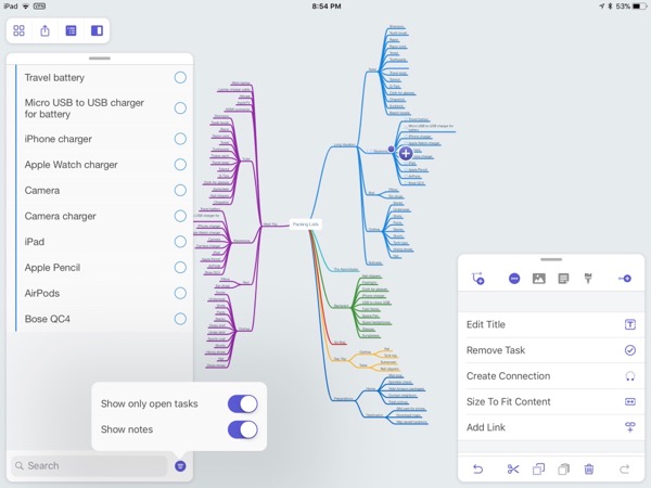
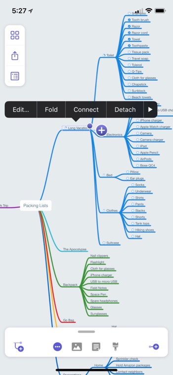
I really appreciate the diminutive panels on the iPhone. Even while collapsed, they are just a quick tap away. Tap and hold on a node to reveal a pop-over with additional functions. It’s a simplified interface that hides quite a bit of functionality.
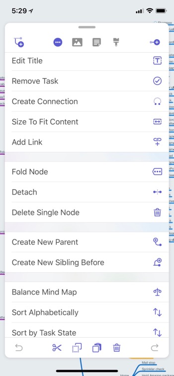
If I want to dive into the details of a node there’s a dizzying array of options. I really like how the panel dimensions are managed too. On first tap the panel expands slightly. If I want to see the entire panel, I just pull the edge and it expands to fill the iPhone screen.
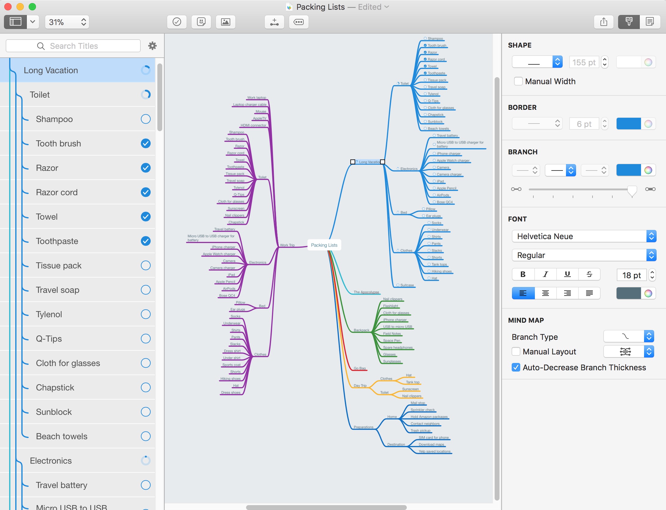
MindNode famously offers two different interaction modes, the traditional map view and a list view. I’ve always found the list view interesting but not that practical for the way I map out ideas. But what it is good for is managing a sequence of items like an outline or a task list. Tasks is MindNode are handled perfectly. Convert a branch to a task and now the list view shows check marks and progression wheels. And since the list view has a larger size it’s easier to check things off.
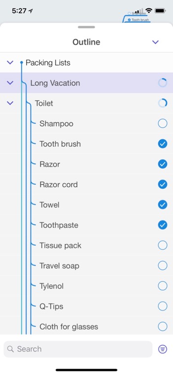
MindNode 5 adds the option to edit right within the list view. This is a nice change that makes the list view feel much more practical than in previous versions. If you’re new to idea mapping then I think this new list editing feature makes it much more approachable.
List view in MindNode is more than just an alternative view to a map. It’s now fully functional for editing and arranging but it’s also the only place on the iPhone to search for text.
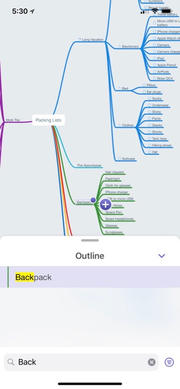
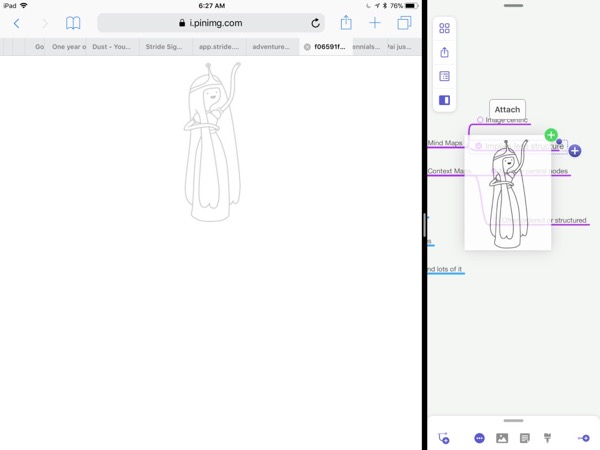
On the iPad, split screen is also very useful. Drag and drop between other apps and MindNode is a great way to get content into a map, including images.
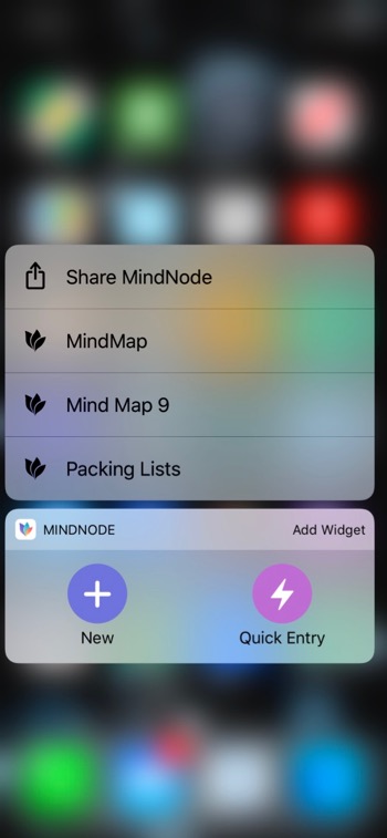
The Today screen widget is a good way to quickly jump to MindNode and start editing. It’s not as fluid as I would like and feels a bit more like a shortcut than a capture widget. The widget is easy to add on the iPad but it’s not as obvious on the iPhone. The easiest way (and maybe only way) is to use the force touch context menu and then tap the “Add” button to add to the Today widgets.
The Mac version of MindNode also brings some new quick capture, formatting, and note editing features. It’s a very nice looking application on the Mac and as with iOS, the simplified interface hides a lot of power.
I still prefer the power of iThoughts but MindNode continues to be a close runner up. The new versions are definitely worth the upgrade if you want an approachable and capable idea mapping application for Mac, iPhone, and iPad.
MindNode for iOS | Universal | $10 IAP
MindNode for Mac | $40 IAP
Be sure to check out all the videos by David Sparks. They hit a bunch of the new features but also explain general idea capture techniques with maps.
