Another iPad Pro Review
I’ve used the 2018 iPad Pro for 7 weeks and it’s time for a retrospective on my time with this new hardware. Here are 3600 words no one was waiting for.
TL;DR
It’s the best iPad yet. I’m using it more than I used my previous iPads and I’m using it in a lot of new ways. The software got old very quickly and I still find my Mac much more convenient for complex tasks. I use my iMac Pro less than I use this new iPad Pro which is quite a thing.
Surprise Sounds
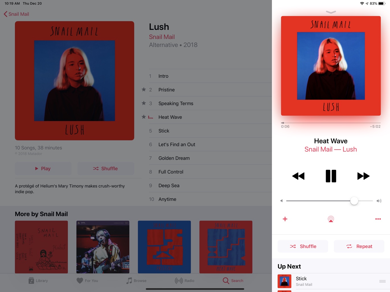
The first big surprise is how great the speakers are on the iPad Pro. I know that seems like the least useful part of an iPad Pro, but I find myself regularly using mine as a speaker. I’ll fire up Overcast and blast a podcast in my office while I work on my iMac. If I’m hanging out on the patio writing or working through my task list, I’ll often pop open Apple Music and start playing something right on the iPad Pro rather than putting on headphones and using my iPhone.
The iPad Pro with Apple Music is a nice combination. It’s a little baffling that I still can not use drag and drop to copy song, album, and artist links but I guess Apple has their hands full with expanding killing Connect features.

Pencil
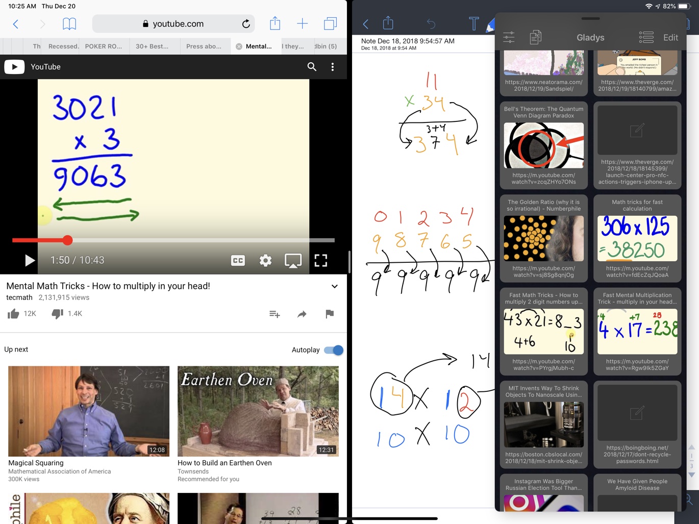
The Apple Pencil 2 continues to be a real highlight of this new hardware. I use the Pencil 2 ten times more often than with my previous iPad Pro. I absolutely love working in Notability with Split Screen. It’s a perfect way to take notes while watching a YouTube video or to noodle around with an idea while searching the web.
I do find it disingenuous that so many reviews praise the new Apple Pencil magnetic connection on the iPad Pro as being fool-proof. There are three different positions the Apple Pencil can dock on the new iPads. Only one of those will charge the Pencil. I also find that the new Pencil is not always recognized by iOS until I reattach and remove it again. While I think the new Pencil is much better it still has room for improvement. My biggest issue is still the same: plastic on glass feels out of control when drawing. I’d like to see more friction between the nib and the glass in future iterations.
Cellular
While I purcased my iPad Pro with a cellular option, I have not enabled it. To be honest, I’m a little afraid of screwing up the eSIM and permanently locking my device to a carrier. But I got a nice surprise while tethering to my iPhone XS… it actually works. With previous iPads, I found tethering to be a pain to initiate and nearly impossible to sustain. With the new iPad Pro and iPhone XS tethering works great. I’m not sure if I’ll ever need to enable the cellular on this new device. Maybe on my next long trip I’ll finally get around to trying.
FaceID
FaceID is good and bad. Apple has done a good job making FaceID work from multiple angles but I still regularly need to hold the iPad Pro awkwardly and show strain to show my face. When I’m perfectly positioned in front my iPad it’s a good experience. The other 50% of the time it’s much worse than TouchID.
Typing
I still really like the new Smart Keyboard. It’s solid and folds nicely to protect the iPad Pro. I still find some of the design and features maddening. I almost never want to switch to the Emoji keyboard, yet Apple places this key immediately next to the left shift key. This is terrible. I regularly switch the keyboard by mistakenly resting the edge of my hand the this key. There is no sane reason to elevate this key to such an important position. I’d much rather see this as a super shift function under another key. Maybe then we could get a proper escape key instead.
It makes no sense to me that there is not a keyboard shortcut to trigger Siri. The use of the power button is nutty and I often accidentally lock my device when I’m trying to trigger Siri. No one wants that gesture. It’s awkward at best and masochistic at worst.
Using “Hey Siri” sitting at my kitchen table with an iPhone, Apple Watch, and HomePod nearby is like yelling “SQUIRREL” at a dog park. Every device begins a silent rush to be the winner for my attention. This is an absurd interaction model when I already have my hands on a keyboard. As with Siri Shortcuts (which also can not trigger a Siri request), these failures make me want to use Siri less, not more. By all rights, the iPad Pro with Smart Keyboard could be the perfect Siri tool since I’m looking right at it and have my hands on a keyboard and near the screen (which will inevitably offer me an answer not available by voice).
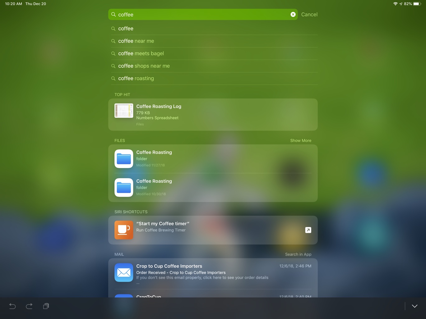
CMD-Space is my co-pilot on iPad Pro. This brings up Spotlight, which I use as my app launcher, but it also cancels Spotlight.
While “hate” is a pretty strong word, I do strongly dislike typing on my iPad Pro without the Smart Keyboard. The onscreen keyboard is much slower for me and far more error prone. I almost never have my iPad Pro disconnected from the Smart Keyboard.
I’ve read plenty of reviews complaining that the “desk mode” position of the new Smart Keyboard is too vertical. I actually use the desk mode a lot while I’m on the couch or sitting in bed. I tend to lean my iPad back a little and the nearly 90 degree angle suits me better. It’s personal preference but I like it a lot.
Split View
I’m not sure if I’ve gotten better with multi-tasking on the iPad Pro because I use it more or if I use it more because I made some effort to get better with it. The main take away is that I’m using iOS in new (and possibly more productive) ways on this new 12.9 inch iPad Pro. I almost always have Gladys in slide over mode. It’s perfect for grabbing links I just want to use temporarily or to stash a bit of text while I’m doing some research.

I still don’t like Split View that much because it’s frustrating to swap apps in and out. I will say that Split View is much more useful on the large iPad Pro since I get two nearly full screen apps to work with.
A common combination for me is Safari on one half and a note app like Notability on the other half with Gladys always hovering just at the edge of the screen. There’s plenty of room on the 12.9" iPad to work with all of these windows. I do regularly need to take a screen shot and use the built-in iOS annotation tools to grab a piece of information from Safari and put it in a note. It really feels like the iPad needs an easier way to capture and share small pieces of information between apps.
The drag and drop features of iOS 12 are still awkward and inconsistently supported between apps. When it does work, it’s great. Dragging and holding while switching apps is still very uncomfortable but I’m using it more often because I’m using my iPad more often.
Hardware
I don’t mind the USB-C connection on the new iPad Pro but I don’t find it all that useful yet. I purchased a USB-C dock from Amazon but I rarely need it. Unless Apple really takes the lead on USB-C options for the new iPad Pro, I feel like this is a dead-end connection for the device. There’s not enough support in iOS for external hardware. It’s a pain to have multiple connections around the house. Sure, there are reasonably good adapters for Lightning and USB-C plugs but in the weeks since I deployed them, it’s confused everyone in my family.
If Apple wants to make USB-C for iPad Pro happen, they should get out in front and start making useful hardware and making iOS more friendly toward external devices. Until I see that happening I will continue to think this is a dead-end port for the device.
I previously raved and complained about the size of the 12.9 inch iPad Pro. I will continue to do so but with much less complaining. As I expected, I’ve become more accustom to the weight of the larger iPad Pro. It still doesn’t feel nimble but it’s an adequate trade off for a wonderful screen. When I’m immersed in typing, I forget that I’m on an iPad. When I’m sketching or taking notes I appreciate the tremendous space available to the apps on a 12.9” screen. Finally, the split screen options on the 12.9 inch model are worth the price of the inconvenience created by the bulk of the body.
I still do not miss the headphone jack on my iPad Pro. I use Apple’s AirPods and they can switch between my phone and iPad without much trouble. If I was podcasting from my iPad I suppose I would use a USB-C dock and maybe flog myself as an additional punishment. Until I reach that level of masochism, I’ll stick with Bluetooth for headphones with my iPad Pro.
Mac Replacement
I can’t believe this is still a conversation. It’s as embarrassing as Mac versus Windows in 2018. Both sides of this debate are wrong.
The current iPad Pro can not replace my Mac. It may replace someone else’s Mac but they do not do the same things I do, or they have a much higher tolerance for wasting their time. Here’s what I still prefer to do on my Mac:
- Image processing is easier on my Mac. I have all of the best tools on my iPad Pro but the ease of automation on my Mac using Keyboard Maestro (or even the command line) means that processing every additional image on my iPad Pro takes 2X more of my time.
- Photo management is just easier on my Mac with a mouse and keyboard and multiple windows. Selectively importing from my camera is feels like the future after trying to do it on my iPad.
- OmniFocus on the Mac, with its multiple windows, is an entirely different experience from the iPad version. I mostly avoid “managing” tasks on the iPad Pro and instead prefer to use it for capture and as a daily roadmap of what I need to do. The Mac is where I organize everything and process my Inbox.
- Processing every inbox I have (Mail, DEVONthink, Notes, and OmniFocus) is an order of magnitude more work on my iPad Pro than on my Mac. Drag and drop of multiple items and using Mail plugins is terrific on the Mac (and not possible on the iPad). Using multiple windows with DEVONthink on the Mac makes moving items around much easier.
- Writing Macdrifter articles on my Mac is generally easier but less enjoyable than on my iPad Pro. On my Mac I can easily work with Markdown files in multiple editors like Sublime Text while I have Transmit open to quickly copy the URLs for uploaded images. I also really prefer to use Marked for preview and editing on my Mac.
Of course, everything to do with automation is much easier (and often more powerful) on my Mac.
Here’s what my iPad Pro can do that my Mac can not:
- I can access my work email and calendar on my iPad Pro but not on my Mac. That’s a pretty big one for me.
- Using PDFs with LiquidText on my iPad Pro is the only way I review technical documents now.
- Procreate and Linea on my iPad are far superior to my tools on my Mac for drawing.
- Taken handwritten notes on the Mac is not very easy, especially if I want to extract the OCR text. This is far easier on my iPad.
- HomeKit control with Siri is far better on my iPad Pro than my Mac.
- Easily get links to iOS AppStore apps. It’s not clear to me why this should not be built into every version of every AppStore.
Software
Here’s a brief list of the software I use the most on my iPad Pro. Many of these provide powerful features for the large split screen and Apple Pencil. Others are simply the only real option for working on iOS.

Coda
I use Coda mostly for managing servers I run, like the Macdrifter host. Coda is the originator for powerful web host management but it’s feeling a bit stale as iOS advances and Coda is missing these integrations. I’d love to send multiple files to Coda for uploading to my server but Coda doesn’t support this. I’d love to use Coda as a Markdown editor but it’s missing basic functionality like automatic bracket matching. I’d love to drag and drop from other apps directly onto my server in Coda, but the app doesn’t support iOS drag and drop at all. I’ve used other SFTP apps and all of them are less elegant than Coda (except for the discontinued Transmit app for iOS). The one thing Coda has that keeps me coming back is the credential syncing between my devices so that I can login anywhere.
CropSize
I use CropSize to resize all of the screenshots for Macdrifter by 50%. I don’t do much else with the app but because it’s fast and easy I find that I now prefer to do this with my iPad Pro instead of my Mac. I save all of my screenshots to a folder on iCloud Drive. That way, if I’m working on any device I know where all of the screenshots are, regardless of the source. My Mac screenshots are taken which Keyboard Maestro and automatically get saved to the same iCloud Drive folder.
DEVONthink to Go
Split View with Drag and Drop are surprisingly useful features of DEVONthink To Go (DTTG) on a large iPad. With the larger screen, the multi-touch gestures actually work well for moving files around. Grab a document in one folder and hold it. Use the other hand to navigate to a different database or folder and drop the document. I’m not sure this is easier than using the standard “move” command in DTTG.
I’ve settled into using DEVONthink To Go for long-term information storage and retrieval, rather than as a transactional system. The support for Split View as well as Drag and Drop makes this a useful model with other apps. I bring up DTTG next to apps like Gladys or Files and I drag over documents for long term storage.
This isn’t perfect, because some apps (like Drafts) provide an unrecognized document object to DEVONthink through Drag and Drop. Still, it’s nice to do a quick search in DEVONthink To Go and find exactly what I was looking for.
Drafts
Drafts is the ideal writing environment on an iPad Pro. It has a lot of built in keyboard shortcuts but these can be extended with user defined shortcuts. Drafts syncs through iCloud and makes edits available on my iPhone almost instantly. The Mac beta version of Drafts is also coming along nicely.
Gladys
As mentioned above, I use the heck out of Gladys on my iPad. I keep it in slide over mode and drop all kinds of stuff into Gladys that I want to use or share later. It’s not something I curate or organize very much. I barely use tag groups. But it has a feature that other apps like Copied does not: Access to the different forms of an object. I can extract the plain text version of a URL or just as easily get to the web image when iOS just wants to give me a URL.
Linea (and Linea Go)

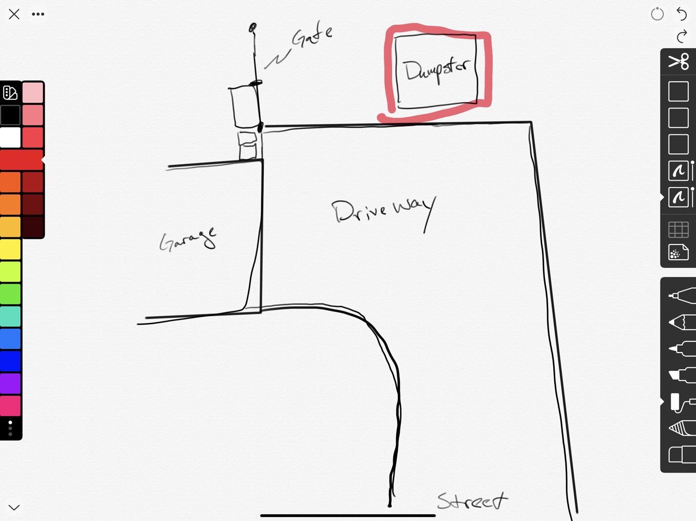
While I prefer Procreate for “art” creation, I really like the new version of Linea for general sketching. When I want to draw out a quick map or thinking about some server configuration I pop open Linea on my iPad Pro these days. The new line and shape snapping feature is very handy for getting straight lines. The implementation of layers is simple enough that I actually use them. Linea syncs between iOS devices with iCloud. This means drawings I create on my iPhone with Linea Go are instantly available on my iPad Pro.

LiquidText
I’ve written at length about LiquidText. Even if I only ever used my iPad for LiquidText, it would be worth the purchase price. The app is absolutely incredible for taking notes and helping me to distill an entire book down into just the important bits.
Notability
I use my iPad Pro every day for notes in meetings. I take most of those in Notability. Writing with the Apple Pencil 2 is fantastic, even if it’s not that much different from the previous version of the Pencil. Notability has superb handwriting recognition and the ink is fun to use. The app can search handwritten text across all note collections, which makes it something of a marvel.
OmniFocus
I’ve already reviewed OmniFocus 3, so my opinions are well documented. I still miss Things 3 but OmniFocus is the only app that seems to wrangle a complicated project the way I need. I work on a Windows PC during the day and the Web version of OmniFocus is still in beta (and still very limited). This means I mostly sit at my computer with OmniFocus open on my iPad Pro.
Procreate
Procreate is a stunning achievement. It feels like the iPad Pro is close to being at its peak for artistic work. The Pencil still has a little way to go to make it feel more like paper and pen but it’s close. With apps like Procreate, I really get the feel of physical art materials but I get the benefit of nearly infinite variations in the tools and a ridiculous number of layers and zoom levels. I’m using Procreate mostly for my own entertainment. It’s fun to draw and doodle and it feels natural in Procreate. It doesn’t sync with my iPhone so I’m now using Linea more but nothing beats the quality of the tools in Procreate for iPad.
Screens
I don’t use Screens a lot but it is a convenient way to quickly access my Mac for things I can’t do (or don’t want to do) on my iPad. It feels a bit ridiculous when using the giant iMac Pro screen from even the 12.9 inch iPad Pro. Most of what I use the iMac Pro for is trivial. Although I will be honest that sometimes I login just to use OmniFocus with multiple windows (it’s just easier than the iOS version).
Shortcuts
I’ve been using Apple’s Shortcuts app daily on my iPad. I especially like how it integrates with Spotlight on occasion. I say “on occasion” because as with most everything related to Shortcuts and Siri, it’s unpredictable when it will work. Some of my Shortcuts launch from Spotlight and other don’t. Some work with Siri and some don’t. While I find value in Shortcuts as a power user, I think Apple is uncommitted to this feature. My apologies to the Shortcuts team, which I can only assume wish they had more resources and a bigger budget. Keep fighting the good fight.
Tips, Tricks, and Foibles
Apps added into a Split View not show up in the app switcher unless they are launched as full screen first. This seems wrong.
Changing the “active” app of a split view pair of apps is by touch only and this often changes the selection cursor position in text editors. The trick is that you can still interact with the “non-active” app while typing in a text editor. Links and buttons will work in the inactive split window without stealing the selection focus. Just tap or drag what you want. If you want to type text in the other split app window, then you must swap the active state of the apps. Split View still has many rough edges.
Drag and drop from apps into the OmniFocus inbox will create new tasks. Drag text to create tasks (and sub tasks). Drag PDFs to create task with an attachment. Make a selection in Linea and drag that to OmniFocus to create a new task with the sketch attached as a PNG. The same goes for other apps that support drag and drop of selections, like Notability.
CMD-Opt-D to show the dock. I use this and Spotlight to swap Split View partners throughout the day.
CMD-Space to show Spotlight. This is perfect for grabbing apps to add to Split View. Hit CMD-Space again to cancel Spotlight.

The Apple Files app is a surprisingly useful tool in split view. I use it as another storage location that syncs to my other Apple devices. If you’re not into DEVONthink or Gladys, you can just drag a Drafts file or an image file and drop it on the Files app. Drafts creates a text document. Drag a project out of OmniFocus and you get a TaskPaper version of the project and tasks. Drag a note out of Apple Notes to create a rich text document in Files. Drag an email out of the Mail app to create an archive file (that can not be viewed in the Files app).
You can drag text files onto an existing Apple Notes entry to append the text to the note. The same goes for dropping images, URLs, lot even an entire PDF. They all are embeddable inside of an Apple Note by drag and drop.
Don’t forget you can use 4-Finger swipe to switch apps. It’s very forgettable.
A slow 5-Finger pinch will show the app switcher. A fast pinch will close the app. So weird.
